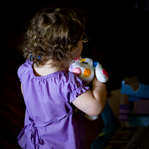
The subject faces in both are well lit, but I don't like the tone of the first one and the overexposed skin.
I like the second one much more but I would try to increase exposure a little to bring out the outfit she's wearing or try a light behind her to separate the subject/background. It looks like she blends into the back ground and the detail is lost on her dress.
In the first one her skin looks almost transparent or grey, especially in conjunction with that background. It doesn't seem like feel of the photo was intended to be lifeless, but it comes across that way.
The second one looks much more "alive," but her dress does blend into the background and her skin looks orange-tinted. This may or may not be your fault, but perhaps some editing is needed to compensate.









![[No title]](/data/xfmg/thumbnail/35/35269-511d1e0ac8ed5256fd706829d2ecb719.jpg?1734166932)


![[No title]](/data/xfmg/thumbnail/35/35265-c9ea3efd2c618a57ea136e63ad106880.jpg?1734166927)
![[No title]](/data/xfmg/thumbnail/35/35969-b6f009f356cac5fdbffb0729bddb9e25.jpg?1734167857)