Thanks. Im not usually one for desaturated colourings, my style is punched and vibrant, but she requested vintage and faded so I figured it would be a chance for me to try some new post processing.
Thanks for taking the time to comment.
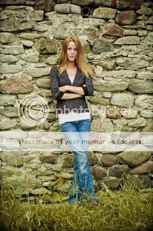
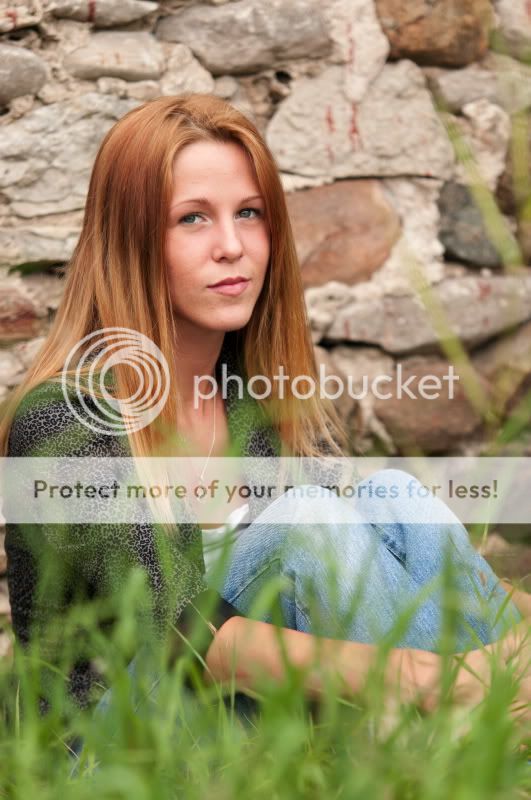
#3 is the best for me. Nice color, OOF grass frames her head nicely. #5 is a little too saturated for me, grass is going towards yellow, but she pops very nicely from the background.
I think all the photos you shared are a series. But each one of them has different WB, saturation, contrast etc. You need to stick with one that you like and stick with them. OR you can go to the extreme and go Black and White on some of them. Putting all these different PP in a series look weird to me. Thats my honest oppinion. I like the first PP the best.
I think all the photos you shared are a series. But each one of them has different WB, saturation, contrast etc. You need to stick with one that you like and stick with them. OR you can go to the extreme and go Black and White on some of them. Putting all these different PP in a series look weird to me. Thats my honest oppinion. I like the first PP the best.
I respect your opinion but hope we can agree to disagree.
Let me explain
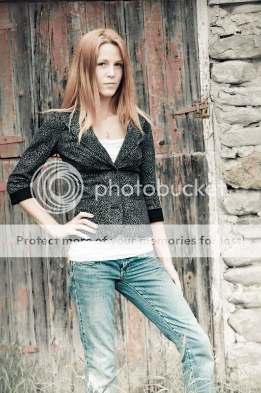
I post process in such a wide variety of ways to make my work stand out in the local market. I have always offered post processing included with the shoot, as the clients I attract expect it. This client received 100 post processed images. But wouldn't it be boring for them to all look the same? Photography is an art form and part of my expression is how I see the finished product. I don't see it the same way for every shot. My clients hire me as well for what they see in my portfolio and on the studio website. They trust my vision. At the same time, as I mentioned before, this client also trusted me to process the images to her liking as well. Image 2 & 4 are my take on what she meant by vintage and faded.
And like you said, your opinion is that having different post processing in a series looks weird. And I respect that. But too me, having the pose change and each image look the same in terms of WB and toning looks weird.
But thats the great thing about photography. You dont always have to follow the norms. Thanks for taking the time to comment.
I respect your opinion but hope we can agree to disagree.
Let me explain
I post process in such a wide variety of ways to make my work stand out in the local market. I have always offered post processing included with the shoot, as the clients I attract expect it. This client received 100 post processed images. But wouldn't it be boring for them to all look the same? Photography is an art form and part of my expression is how I see the finished product. I don't see it the same way for every shot. My clients hire me as well for what they see in my portfolio and on the studio website. They trust my vision. At the same time, as I mentioned before, this client also trusted me to process the images to her liking as well. Image 2 & 4 are my take on what she meant by vintage and faded.
And like you said, your opinion is that having different post processing in a series looks weird. And I respect that. But too me, having the pose change and each image look the same in terms of WB and toning looks weird.
i agree completely. having all the same pp gets boring. its monotonous. You need to try different things and oftentimes the customer will choose one he/she likes BECAUSE it stands out from the others.


![[No title]](/data/xfmg/thumbnail/34/34123-da7d55491fec06595061191321c92646.jpg?1619736293)
![[No title]](/data/xfmg/thumbnail/1/1592-cfae4a7ea791f96c6e2d03484be2e454.jpg?1619729144)
![[No title]](/data/xfmg/thumbnail/34/34120-9085bc65df236ba03977d33a60b852d3.jpg?1619736290)
![[No title]](/data/xfmg/thumbnail/34/34746-f8e4b50f9d9b0de43c95af3d2caf956b.jpg?1619736628)