A different Downtown picture

jlykins

TPF Noob!
Joined
Dec 1, 2007
Messages
1,235
Reaction score
3
Location
Cincinnati
Website
www.jlykinsphotos.com
Can others edit my Photos
Photos OK to edit
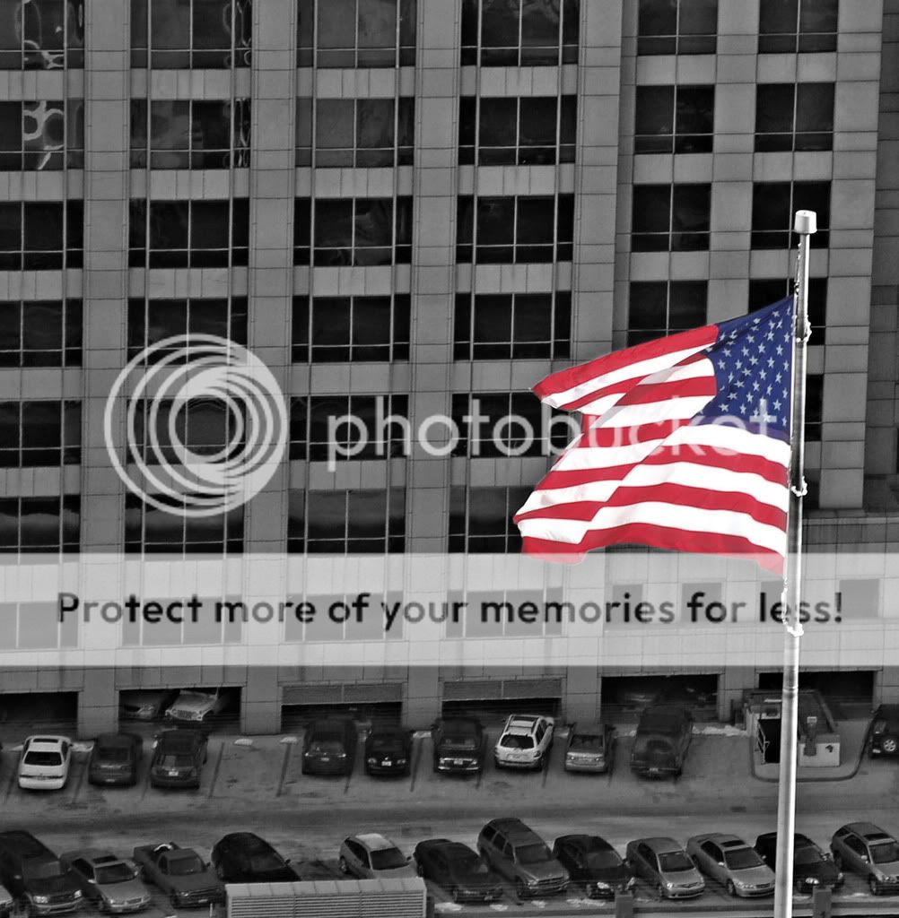
I spent a little while downtown today snaping some pictures. I really liked the way this turned out. I shot this from the Observation deck of the tallest building in Cincinnati. Settings were 200mm at f22.

AllAmerican.jpg
 
Personally I don't like the composition much. Smack dab in the center, with neither the road nor the building as a subject...can't really tell which is important. Also, your selective colouring leaves a little to be desired. Practice with that for a while.
(I don't think this selective colouring works well for the picture anyhow)

I do like the look of the windows on the building opposite. Maybe you should have aimed higher and got more of that...


Really I didn't want either one of those things to be the subject. When I saw the flag flying with the building behind it, I wanted the flag to be the subject. I intended for your eyes to go directlly to the flag, and the colors. Maybe I should have done some cropping on this to eliminate the lower portion of the pic. But at the same time, if I cropped out the lower section of the picture, I think you would loose all depth of field.
 
Strickly in my opinion I don't like it. Being a CDN we see the American flag all too much and it often makes me gag (ex. movies and american war movies, etc). In a way it's a good thing showing patriotism, but as American's know, they get a preconceived view from others about their ways..

I'd sooner take a repeative background like the building with all the windows and then just the flag. Wouldn't show a story or anything, but would make the flag seem more fitting i guess? Stand out more anyways.
 
Shot from the Carew tower I take it. I like the flag, and I can't see enough of them. Thanks for posting. A different crop my have helped, but what I was drawn to was first the flag but then the small cross above and right of the flag. It just struck me as appropriate. I think I would restore color to the cross and crop a little tighter to make the space between the flag and cross central. Just my opinion.
 
Shot from the Carew tower I take it. I like the flag, and I can't see enough of them. Thanks for posting. A different crop my have helped, but what I was drawn to was first the flag but then the small cross above and right of the flag. It just struck me as appropriate. I think I would restore color to the cross and crop a little tighter to make the space between the flag and cross central. Just my opinion.

To be honest I didn't even notice the cross untill you said something, I will have to work on that today. You are correct on shooting location. I took a couple of hundred shots up there but this was my favorite.
 
desaturate the flag.

dont listen to that canadian. more canadians complain about american flags than there are american flags to begin with.
 
I second jstuedle on the crop - the cross caught my eye in the top right. What about a crop keeping the cars parked at the foot of the building and on the right, crop at the corner of the balcony where the cross is (at least that's what I would do).

And please ignore shibby's political comments, not appropriate in TPF or to generalize for one nationality.
 
It's alright. This image doesn't strike me as especially interesting, possibly because it's not an extremely exciting composition, as Sideburns said earlier. Maybe attempt avertical crop to cut out some of the dead space on the left and right.
 
ok so this is what I have come up with. I desaturated the flag, I cropped out the cross entirely because I couldn't get it to look right when I started trying to crop to the edge of the lower roof.

AllAmerican3.jpg
 
Yeah, I like this better than the original image. The desaturation looks more in line with the black & white background now.
 

Most reactions

New Topics

Back
Top