A few of my favorites...

cassandra

TPF Noob!
Joined
Aug 17, 2011
Messages
23
Reaction score
0
Location
Florida
Can others edit my Photos
Photos OK to edit
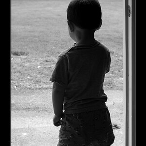
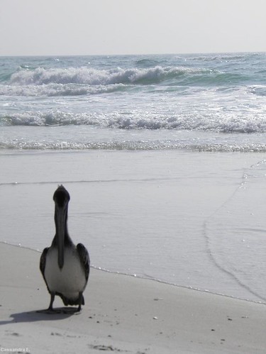
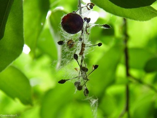
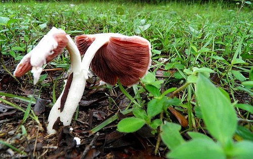
These are the first pictures I've posted anywhere, so I guess this will be my intro to proper C&C. Fun! All of these have been taken in the past year or so. I don't know if "favorites" necessarily means "best", but oh well.
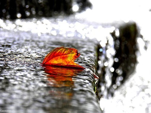
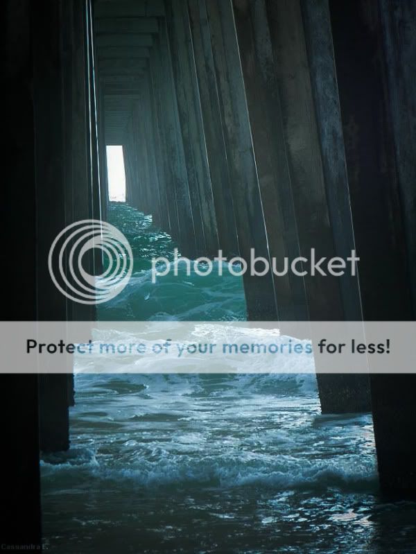
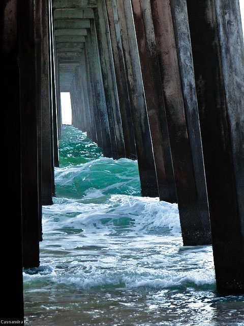


6054592290_4d5fdc0ffc_z.jpg


6054592272_12ffd4e278.jpg


6054592256_c679fd49f4.jpg


6054592206_7d3bd6b7e6.jpg


6054041909_874f4e3c9e.jpg
 
So #1I think is my favorite composition wise I just wish it werent so washed out. Maybe an easy fix with some editing. I would suggest changing your profile to say "it's ok to edit my photos" It can be really useful to see how some of these guys might edit this photo. Also I cant stop looking at #2 it has a very nice bokeh to it.
 
So #1I think is my favorite composition wise I just wish it werent so washed out. Maybe an easy fix with some editing. I would suggest changing your profile to say "it's ok to edit my photos" It can be really useful to see how some of these guys might edit this photo. Also I cant stop looking at #2 it has a very nice bokeh to it.

Thank you, #2 is probably my all-time favorite. And I have changed my profile and I'm interested to see what others come up with!
 
First one is awesome.

Oh what I would do for a RAW to work from here... I did the best I could...

watertunnel.jpg


But to give you an idea, I went +100 on contrast, and then did another +20!!!! I've never had to put that much into any image I've seen here... and honestly, I think it needs more but the image quality won't hold up to that kind of abuse. I also sharpened it slightly. If you have the RAW you can make this shot a REAL winner. It's salvagable. If you only have the jpeg there is only so much you'll be able to do, but it's still VERY neat.
 
I have to ask, what program did you use? I don't have any major editing software... My editing is pretty limited, and when I tried to increase the contrast I did not get such a nice result. It was WAY too harsh!
 
I have to ask, what program did you use? I don't have any major editing software... My editing is pretty limited, and when I tried to increase the contrast I did not get such a nice result. It was WAY too harsh!

Photoshop.

Nice edit, schwetty.
 
Both of these are fantastic, thanks guys!
 
I have to ask, what program did you use? I don't have any major editing software... My editing is pretty limited, and when I tried to increase the contrast I did not get such a nice result. It was WAY too harsh!

Photoshop.

Nice edit, schwetty.

Ah, that's what I thought. I need to invest in that soon...
 
Hey these are all pretty good - my two cents on each one:

#1's kinda been covered - the composition is great, just needed a little cropping and a lot of contrast. Great shot!

#2 is one I really like too - there are parts that are blown out (overexposed) but it just works in this shot and actually serves to really highlight the leaf. It doesn't distract me at all.

#3 I think is my least favorite of the bunch, and there are a couple things I can point out. First, try to make sure your horizon is level - in this shot it's slanted just a tiny bit to the left. Also, since the sun was behind your subject, your subject turned out pretty dark. Typically I'd say, "fill flash" but let's be honest, this was a nature shot and a shot of opportunity and I doubt the bird would have stood there and watched while you set up a softbox. The focus actually looks just a touch soft to me as well.

#4 I can't help but think that it would look better as a portrait crop, with the branch on the right side of the frame cropped out entirely.

#5 I love it, but this time I am going to complain about the blown highlights. Dropping the exposure down by a stop or so would have retained more detail in the mushrooms and given a bit more shadow depth to the grass, in my opinion.

Nice work and I look forward to seeing more!
 
#2 is actually my favorite, but since everybody else is editing #1, I'll play along.

6054566169_b3b45909fd_z.jpg


For what it's worth, I would have cropped it, but it would have removed your logo. As it is, there is a bit of dead space to the left and at the bottom.
 
Last edited:
I would have gotten a straighter shot on the 1st image to make it look like a door. Have seen this shot before but it was straight on.
2nd shot is the favorite though , nice colors .
-
Shoot well, Joe
 
#'s 1 and 2 are really good, especially the edited #1 pics every1 keeps doing :) Tell the truth, I really love the look of #2. It has potential, but I would like to know what it is :)
 

Most reactions

Back
Top