- Joined
- Sep 2, 2005
- Messages
- 14,455
- Reaction score
- 3,328
- Can others edit my Photos
- Photos OK to edit
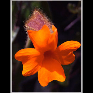
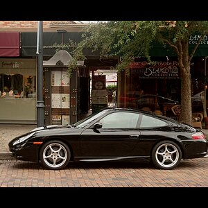
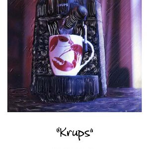
I would have gotten a straighter shot on the 1st image to make it look like a door. Have seen this shot before but it was straight on.
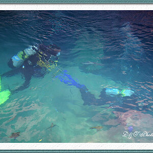
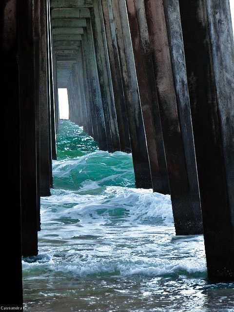
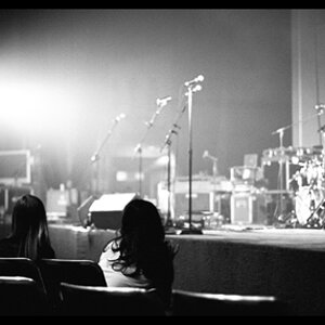
2nd shot is the favorite though , nice colors .
-
Shoot well, Joe
Oh god, no, straight would have ruined it.
")
![[No title]](/data/xfmg/thumbnail/34/34138-0ecadfd41de9ae178e53528e0eb1a32c.jpg?1619736310)