A few pics from a newbie!

Spacy

TPF Noob!
Joined
Feb 21, 2007
Messages
93
Reaction score
0
Location
Washington, DC
Website
www.joinedforces.org
Can others edit my Photos
Photos OK to edit
Here are a few pics I took recently. Some I took in Florida during my visit and some I took around the DC area. Please give me your honest opinion. I'm thick skinned and you won't hurt my feelings!

Pic 1 (Grapes at winery in St. Augustine, FL)

grapes1.jpg


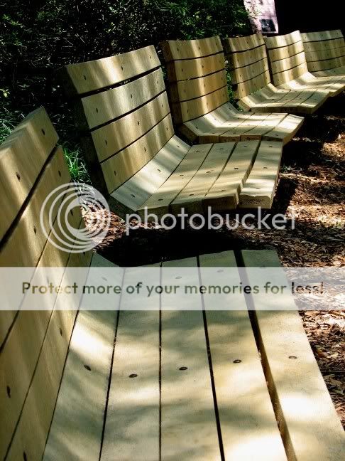
Pic 2 (Benches at park in FL)

benches.jpg


Pic 3 (Arlington back in November)

marilyngene096.jpg


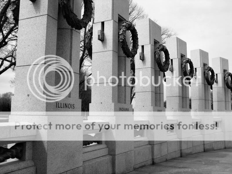
Pic 4 (World War II Memorial)

ww2memorial1.jpg
 
Hey,

1. The picture is quite OK, but a bit dull on colors somehow, not really bright is a better word for it maybe. It would have been nice if the last grapes, at the bottom of the picture, were also included.
2. Nice! Good eye for detail.
3. This one really stands out. The dept of field is enormously enhanced. Very good!
4. You like playing with lines is see? :) Also a nice picture although I would have included the first and last garland (?)
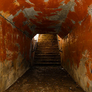
Kind regards,

Roger
 
Thanks Roger. I appreciate the input. I'm not really experienced in taking pictures as of yet. I just kind of point and snap, if you know what I mean! I'll try and edit the first pic and see if I can't figure out how to make it brighter.

You are right on the lines. I love them.
 
These were all taken with the Coolpix-camera, weren't they? I am asking a) because of their sizes and b) because my compact digital camera does not deal that well with against-the-light situations (such as in your first photo here), either. Even though mine's a Canon Powershot, I get these overly bright, radiating hot spots along with fairly bland colours with that one, too, if I don't watch things.

The photo that sure stands out for me is that of Arlington Cemetery. The patterns that those rows of headstones create will always be fascinating. And the autumn colours of the trees really help this photo much, too.

I am not quite so fond of the photo of the benches, because - while I do appreciate your concept here - I do miss the end of the last bench which just breaks through the frame but does not give this row of benches a ... how do I put it? ... visible vanishing point. They just vanish to outside your frame...

I very much agree with Roger on the inclusion of the garlands in the last ... and it is quite noisy. Why?
 
I'm not sure. The only thing I did on the last photo was make it black and white. I don't have a good photo editing program though. I was using just regular paint. It kinda sucks.

I'm working on my technique and trying to look at the entire scene before I take the picture. I'm very quick to just snap it and move on, not really taking a lot of time.

Thanks everyone!
 
Hey Spacy. I really like number one but I agree it could use better coloring. How's the editing knowledge coming. I believe as of last night you were going to give Gimp a try correct?
 
I would have liked it if you were tighter to the monument in #4. Giving it more of a flow from memorial to memorial. If there are many statues it ends up looking really cool flowing into the background giving it a nice depth of field. :)
 
Hey Spacy. I really like number one but I agree it could use better coloring. How's the editing knowledge coming. I believe as of last night you were going to give Gimp a try correct?
Ok... so I downloaded Gimp but couldn't understand how to use it. When you go into the program, it comes up in 3 different boxes. It's weird.

I downloaded Adobe Photoshop and so far, I like it but I still am not very familiar with it. I'm working on it.

Thanks for asking about me and I'm glad someone liked the grapes! lol I loved the grapes, but I'm just a newbie! :lol:

Thank you, theusher for the tips, too!
 
I really like #3 it has great depth.

1 and 4 have good composition but lack something. Better lighting/contast?
 

Most reactions

New Topics

Back
Top