What's new

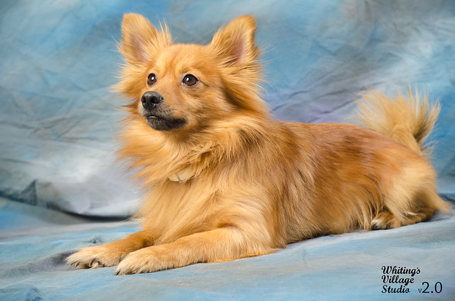
A few recent test photo's of mine...

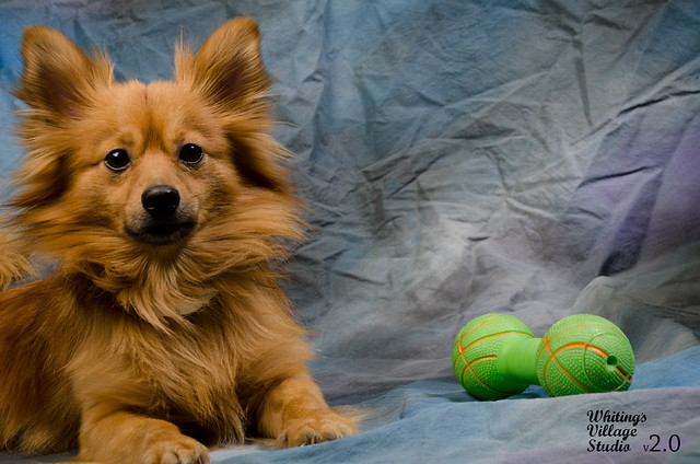
#1 is a little dark around the mouth for my tastes.

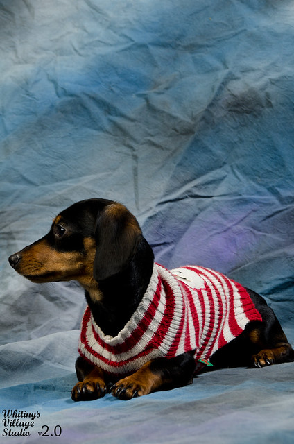
I think #2 would look better in landscape mode. He looks really crowded in portrait mode and there's a lot of unnecessary space above him.

Altogether very good shots. Great lighting.
 
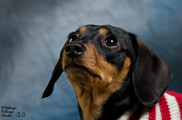
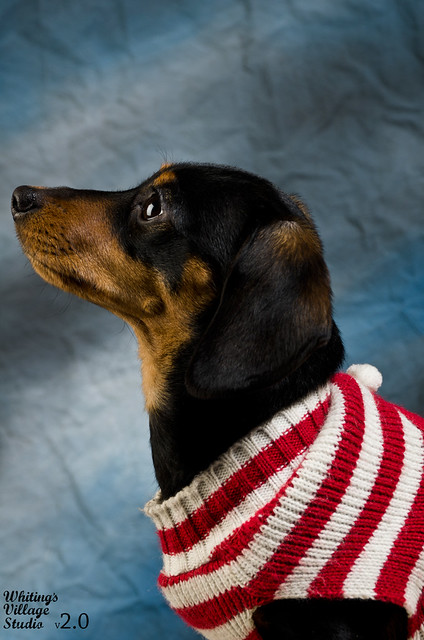
3 looks nice. All are slightly underexposed. 1 has shadow issues that may or may not be ok with a better exposure.
Move your subjects further in front of your backdrop by a couple of feet and you won't get the wrinkles so bad either.
 
Thanks guys! Exactly the kind of C&C I was looking for! I plan on doing this session again soon (these are my dogs, and this was done in my home studio,) so I will definitely try a little more exposure and see if that helps, as I agree that the mouth area on 1 is kind of on the dark side, and all three could use a little more light. I will also try and get them further away from the backdrop!

For the lighting, would you suggest using a lower shutter speed, or just increasing the light from my strobes? My settings when shooting were:

Camera:
Nikon D7000
Tamron 18-200mm f/3.5-6.3 lens
ISO:100
SS:250
f/11

Strobes:
Ultra600 set up to my right, and back further than the 1200 set up as a back light, with silver umbrella set at 1/8
Ultra1200 set up to the left of me as a fore light with softbox set at 1/8

Hot-Shoe Trigger
SB-600 set to 1/64 shooting to my immediate left to trigger the 1200, which in return trigger's the 600.
 
Just a WEE bit overcooked I think but not bad. Remember, reflectors are your friend for fill.
 
I recommend ironing the backdrop... those wrinkles are really strong. Sharp photos though. I would like #3 a lot more if it weren't for the bright outfit. I think the contrasty colors and tones doesn't fit the subject or the background and is very distracting.
 
Shutter speed does not affect strobe exposure, Aperture, ISO and Strobe power do

And in order to be a "Back" light it would have to be behind your subject.

You mean main and fill or Key and fill
 
Tried exposing a little more (like suggested,) during a session today. Too much, or almost on point?

1.)

Yodatest2web by Whyte Myke, on Flickr

The exposure is gorgeous compared to the other ones. You do have one hot spot on the dog's eyebrow. Just a small touch of reducing power.
 
I recommend ironing the backdrop... those wrinkles are really strong. Sharp photos though. I would like #3 a lot more if it weren't for the bright outfit. I think the contrasty colors and tones doesn't fit the subject or the background and is very distracting.

This. I believe they would look much better if ironed. I know you are focusing on lighting, but the wrinkles steal my attention. But the lightings coming along nicely!
 
yeah i think the second shoot photos are very well exposed. i just cannot get over the back drop i just dont like it at all. for me the color is distracting also, not just the wrinkles
 
Thanks again guys for the C&C! I did personally think that it may have been overcooked a tad bit. I'll remember next time to have someone help me and use one of my reflectors for fill!

As for the backdrop, I am definitely not 100% fond of it either, BUT, it is the only one I have at the moment (father gave it to me,) so that's why I've been using it, because it does look better than my out-dated 1970's flower wallpaper that I haven't changed yet ha ha! I do plan on grabbing both black and a white muslin's very soon to play with and open my options for backdrops. I'll re-visit this session once I get my backdrops.

Thanks again for the pointers guys! Very appreciated!!!!! :)
 
BTW good job of getting the dogs to sit still.
 

Create an account or login to comment

You must be a member in order to leave a comment

Create account

Create an account on our community. It's easy!

Log in

Already have an account? Log in here.

Back
Top Bottom