What's new

A few snaps from the weekend! C&C welcome :)

Hello there!
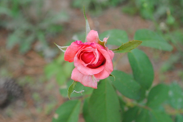
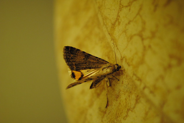
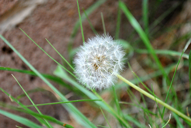
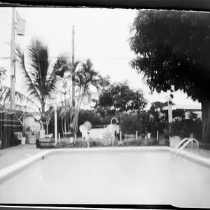
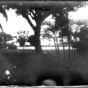
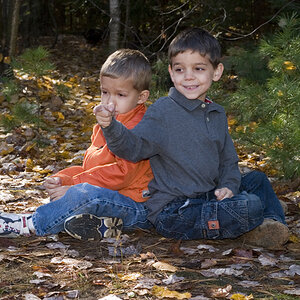
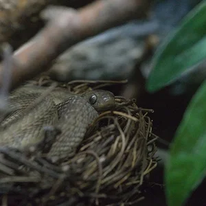
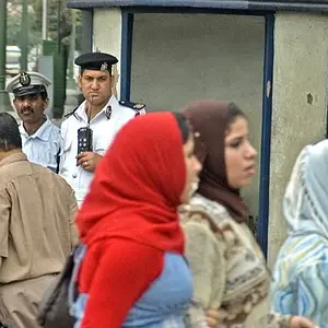
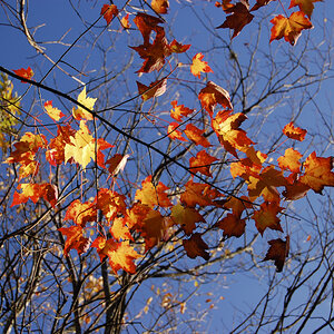
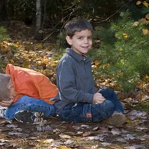
You have a lot of dead space in the first 3, for that kind of subjects it's usually better to work tight unless you have a good reason to do otherwise. Also, besides being small in the frame, the subject is centered both vertically and horizontally which is something you want to avoid, too. But remember it's not just about taking it off-center to any position just for the sake of doing it, but you rather have to think and decide before 'snapping' the shot where you want to place it and why.
 
I agree with LizardKing. Additionally, I think the Rule of Thirds isn't the final word on all compositions; I firmly believe it's more of a guide to help one visualize and consider alternatives during the composition process. But working with that guide would have helped some of these photos, notably 1, 2, and 3. So, it's something you might consider.

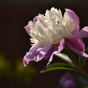
#1: Dead center, shot from above, too much dead space, all take away from what is a beautiful flower. Try getting a lot closer and shoot it from an angle or even underneath, but try to avoid cutting off petals. Well, play around with it, anyway. Get creative with flowers. Nearly everyone photographs flowers at some point, so it's easy to get bored with the same treatment over and over.

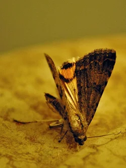
#2: I like this image. The only thing I'd do is crop it closer, perhaps rotate it 90° CW, and poke at the colour and curves a bit. It's clear the moth is crippled and dying, so I'd try to emphasize that. I use an 18-55 lens, too, and I see you did something I also do in my close-up shots: set the f-stop too low and miss the focal point. At f/5.6 at 55mm your DOF is very narrow, and here you've really got only the trailing wing in-focus; I assume you wanted the moth's face to be the focal point, but it is OOF. So, either keep trying to nail the face or go up a stop or two and get a wider DOF. Here's an edit that I think shows a bit more of the moth's plight and has a bit more drama, perhaps:

$7638959724_792dbb54f3_k.webp

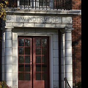
#3: Same thoughts as in #1. Also, the horizon seems severely tilted; that effect is rarely done well, so I'd tread carefully there.

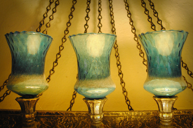
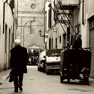
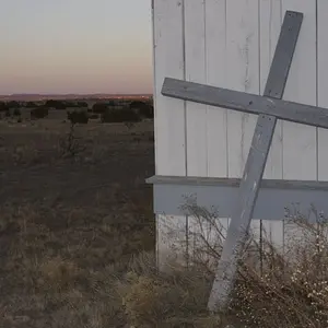
#4: This is really cool, and a fine example of when dead-centering actually works very well! There's wonderful texture and tone in those lamps. I love the colour and the shadows. The white balance might be a little off; it's difficult for me to be sure. And there's a stray spider web on the base of the left lamp that could be cloned out as it tends to distract. But this is a splendid photo. Great work!

I wouldn't consider these to be "snaps" at all.

 
By the way, watch out for the white balance when changing from outdoors to indoors... #2 is too yellow.
 
I like #1 but I think it could have been cropped a little and was it possibly under exposed? For some reason , it may just be me but it feels like it needs a little color saturation. Good work though thanks for sharing.
 
I agree with LizardKing. Additionally, I think the Rule of Thirds isn't the final word on all compositions; I firmly believe it's more of a guide to help one visualize and consider alternatives during the composition process. But working with that guide would have helped some of these photos, notably 1, 2, and 3. So, it's something you might consider.

#1: Dead center, shot from above, too much dead space, all take away from what is a beautiful flower. Try getting a lot closer and shoot it from an angle or even underneath, but try to avoid cutting off petals. Well, play around with it, anyway. Get creative with flowers. Nearly everyone photographs flowers at some point, so it's easy to get bored with the same treatment over and over.

#2: I like this image. The only thing I'd do is crop it closer, perhaps rotate it 90° CW, and poke at the colour and curves a bit. It's clear the moth is crippled and dying, so I'd try to emphasize that. I use an 18-55 lens, too, and I see you did something I also do in my close-up shots: set the f-stop too low and miss the focal point. At f/5.6 at 55mm your DOF is very narrow, and here you've really got only the trailing wing in-focus; I assume you wanted the moth's face to be the focal point, but it is OOF. So, either keep trying to nail the face or go up a stop or two and get a wider DOF. Here's an edit that I think shows a bit more of the moth's plight and has a bit more drama, perhaps:

View attachment 14728

#3: Same thoughts as in #1. Also, the horizon seems severely tilted; that effect is rarely done well, so I'd tread carefully there.

#4: This is really cool, and a fine example of when dead-centering actually works very well! There's wonderful texture and tone in those lamps. I love the colour and the shadows. The white balance might be a little off; it's difficult for me to be sure. And there's a stray spider web on the base of the left lamp that could be cloned out as it tends to distract. But this is a splendid photo. Great work!

I wouldn't consider these to be "snaps" at all.


Thanks Jaemie! All of that info is really helpful! :) Honestly before joining this forum I had never messed with my camera in manual mode. I had no idea how to make that stuff work right and so I've been practicing with it lately. A lot of which was going on here! I definitely see what you all mean when saying that dead center can fall flat and not be as interesting. I think sometimes my OCD just gets the best of me. I really like the edit you did with the moth though! It looks great. I hadn't seen the stray spider web before you pointed it out but now I do so I'll fix it! ;) Also I did take a picture of a flower from underneath because I liked that it was something different. I meant to upload it with this group but I guess I forgot so I'll do it now!
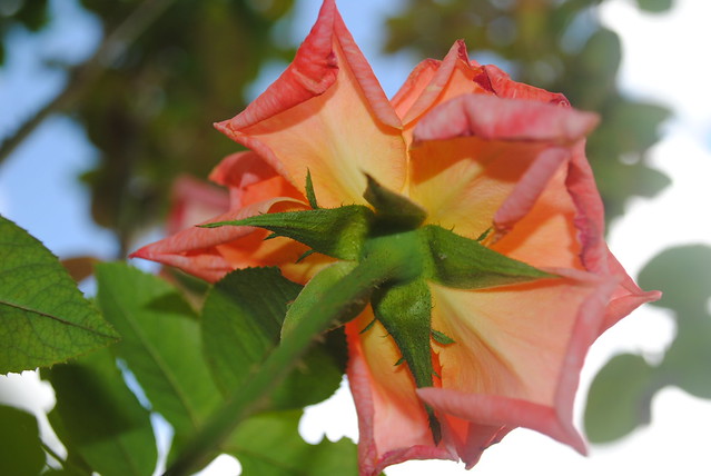


DSC_0685 by tanya7x, on Flickr

I'm not sure if I like how bright the right side of it is, but I'm still not very good with photoshopping so if anyone could fix it or thinks it needs to be fixed that would be awesome :)
 

DSC_0685 by tanya7x, on Flickr

I'm not sure if I like how bright the right side of it is, but I'm still not very good with photoshopping so if anyone could fix it or thinks it needs to be fixed that would be awesome :)

That's a much more interesting composition of a flower! Wonderful colour and the curling of the petals really holds my attention. Yes, the sky is blown on the right, and yes, parts of the flower are OOF, and the petals are cut off in a couple places, but... it's still a much better shot than your first image.

The overexposed sky on the right can be avoided several ways: you can meter on the sky, then adjust your exposure compensation back a step or two, or, use a graduated neutral density filter to selectively reduce exposure in your composition. Shooting in RAW will allow greater exposure adjustment in PP, as well.
 

Create an account or login to comment

You must be a member in order to leave a comment

Create account

Create an account on our community. It's easy!

Log in

Already have an account? Log in here.

Back
Top Bottom