A little Automotive pics, C&C please

prem729

TPF Noob!
Joined
Aug 2, 2010
Messages
9
Reaction score
0
Location
Hartford, ct
Can others edit my Photos
Photos OK to edit
Well lets get right to it. All were shot with a Canon 1000D (rebel xs) using the EF-S 18-55mm f/3.5-5.6 IS Lens.

1. 1/4sec f/5.6 ISO 400
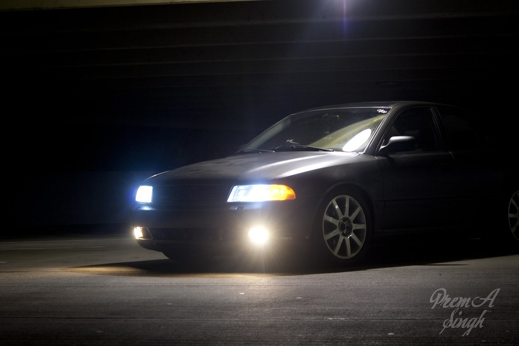
6759039171_0ea192b8e8_b.jpg


2. Same as above
6759041941_9beebc3bd1_b.jpg


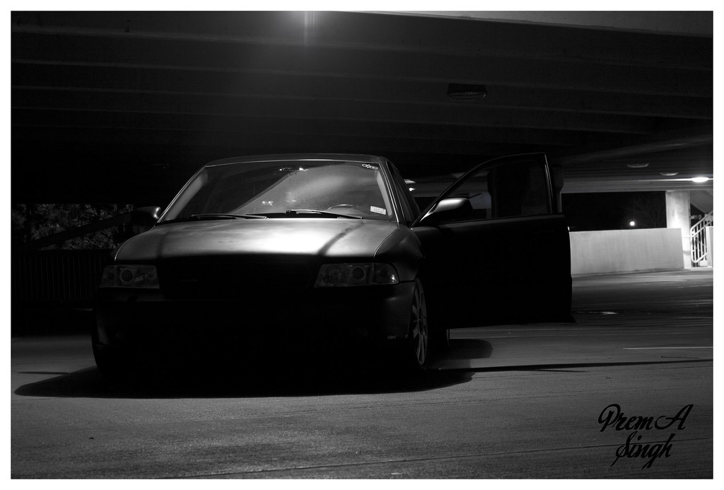
3. 1sec f/5.6 ISO400
6759043329_bbc65f02bc_b.jpg


you can't tell enough about the car, you only even know it's an Audi because of the last shot. Also, maybe this is more about the car than the shot lol, but the first shot with blue headlights, white fog lights and yellow running lights are just an odd look together for me. Maybe it's just me but I think the last shot would look better if it were symmetrical and the light was in the center of the emblem. Just my $.02
 
you can't tell enough about the car, you only even know it's an Audi because of the last shot. Also, maybe this is more about the car than the shot lol, but the first shot with blue headlights, white fog lights and yellow running lights are just an odd look together for me. Maybe it's just me but I think the last shot would look better if it were symmetrical and the light was in the center of the emblem. Just my $.02

The lights are stuck like that. LOL nothing I can do about those. I'll re shoot some of these with your suggestions
 
I don't shoot cars, but I have friends that do. They don't shoot at night unless they have enough lighting equipment. Shoot cars at dusk/dawn and stay low to the ground. As for symmetrical woodyracing is right.
Here's one I did.


50's Pontiac by inLights.ca, on Flickr
 
Love the 1st and last photos. Both capture a sense of expression and emotion. The first is intrigue, the latter an old tired worn out basset hound.
 
you can't tell enough about the car, you only even know it's an Audi because of the last shot. Also, maybe this is more about the car than the shot lol, but the first shot with blue headlights, white fog lights and yellow running lights are just an odd look together for me. Maybe it's just me but I think the last shot would look better if it were symmetrical and the light was in the center of the emblem. Just my $.02

pretty much agree with this.
 

Most reactions

New Topics

Back
Top