Josh66
Been spending a lot of time on here!
- Joined
- Oct 31, 2007
- Messages
- 14,593
- Reaction score
- 1,239
- Location
- Cedar Hill, Texas
- Can others edit my Photos
- Photos NOT OK to edit
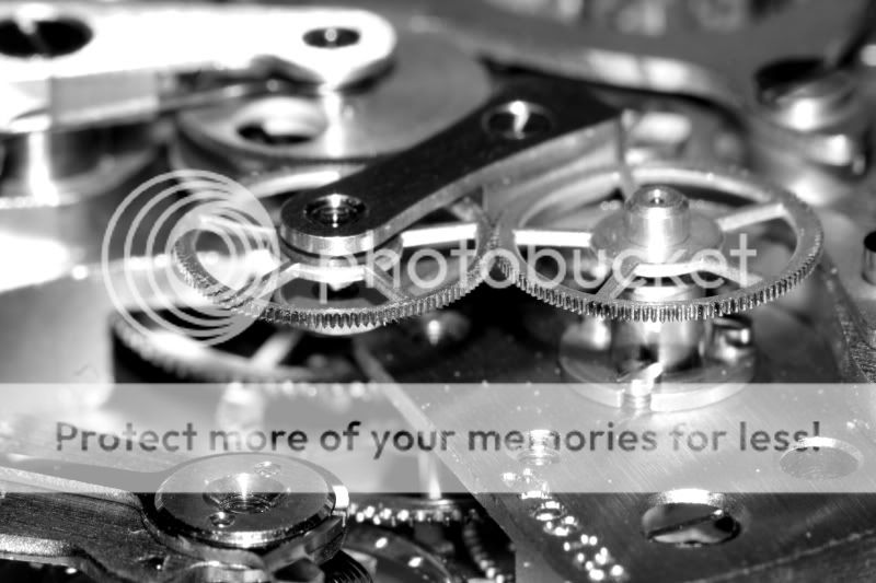
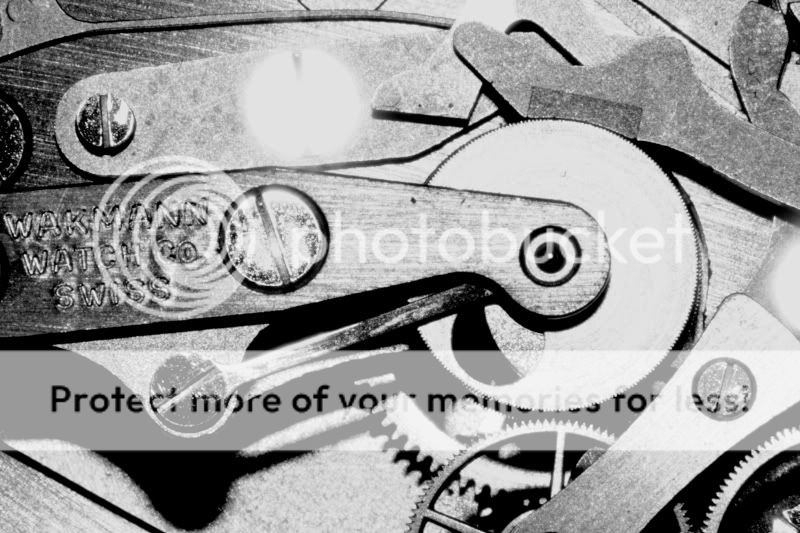
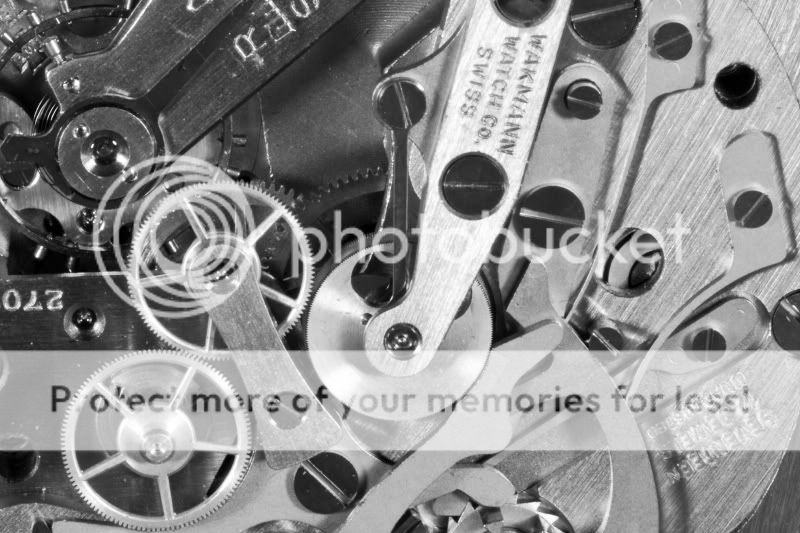
...Well, more of a clock really - but still Swiss.
1
2
3
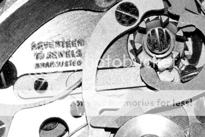
These were all shot with a 350D w/ 100mm Macro (all shot at 1:1 too, BTW). I normally don't do B&W with digital (seems like I can never get it to look as good as film), but I want to get better at it so I thought I better try a few.
I know the flash (pop-up flash) completely blew out some areas... I'm working on that. After I figure something out for better lighting I plan on re-shooting this clock. I want to try it with the 70-200mm+50mm, via macro coupler (that should give me 4:1, right?) too - but I don't think I'll have enough DOF for something like this... I'll give it a try anyway though and see how it comes out.
Anyway, what do you guys think? Did I go too far with the contrast? I don't think so, but I wanted to know what you thought.
I think I like #2 the best, followed by #1.
PS - If anybody knows how to get this thing working again that would help too.")
1
2
3
These were all shot with a 350D w/ 100mm Macro (all shot at 1:1 too, BTW). I normally don't do B&W with digital (seems like I can never get it to look as good as film), but I want to get better at it so I thought I better try a few.
I know the flash (pop-up flash) completely blew out some areas... I'm working on that. After I figure something out for better lighting I plan on re-shooting this clock. I want to try it with the 70-200mm+50mm, via macro coupler (that should give me 4:1, right?) too - but I don't think I'll have enough DOF for something like this... I'll give it a try anyway though and see how it comes out.
Anyway, what do you guys think? Did I go too far with the contrast? I don't think so, but I wanted to know what you thought.
I think I like #2 the best, followed by #1.
PS - If anybody knows how to get this thing working again that would help too.
Last edited:


![[No title]](/data/xfmg/thumbnail/39/39292-4169a355b794ae9735845c4ad45d06ff.jpg?1619738958)


![[No title]](/data/xfmg/thumbnail/31/31744-f06a1a9bb9c74e3b8b332878f5fe71f1.jpg?1619734986)
![[No title]](/data/xfmg/thumbnail/31/31746-12607d714ca2713b95250821c881aea9.jpg?1619734987)

![[No title]](/data/xfmg/thumbnail/37/37606-3c9ffb5906173fa2aa489341967e1468.jpg?1619738148)