What's new

Abandoned Farmhouse: C&C appreciated

kanuski

No longer a newbie, moving up!
Joined
Sep 23, 2012
Messages
212
Reaction score
35
Location
Saskatchewan, Canada
Can others edit my Photos
Photos OK to edit
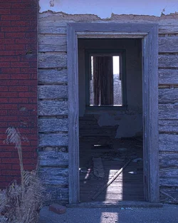
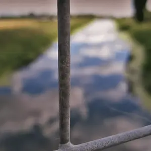
I was playing with HDR yesterday and this was one of my favorites. I posted it to 500px and was surprised to see the attention that it received. I would like to know why. What is it about this shot that I did right? All C&C welcome.

$270A8792-Edit.webp
500px
Flickr
 
Too much blue in this one...The composition is good though. Simple, minimalistic decay...Have you tried to change the whole shot in PP and give it a warm colour? Just wondering how this would look like if it is warmer in colour...
 
I was playing with HDR yesterday and this was one of my favorites. I posted it to 500px and was surprised to see the attention that it received. I would like to know why. What is it about this shot that I did right? All C&C welcome.

View attachment 74206
500px
Flickr

3 things jump out about this picture that might explain the 500px reaction, all of which are nice elements from a compositional perspective:

1. Texture....there's lots of it in the shot (brick, weathered board, smooth paint or plaster).
2. Frame within a frame within a frame. I love to frame shots or focal points within a door or window or arch. Well, here you've managed to do just that...and then frame the frame. Good eye to spot that.
3. Light and dark contrast. Our eye is naturally drawn to the light. Which means that you pull us past the foreground, in to the house and out the window. It adds perspective beyond just having a shot of a house with a bright-lit wall and some deep shadow.
 
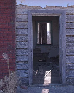
Thanks IzzieK, I just adjusted the color balance and removed some blue in this one.
$270A8792-Edit-2.webp
 
Thanks JoeW. I appreciate the comments.
 
IMO...

This is underexposed and has WB issues.

I don't really understand the content either, but I know that doesn't necessarily matter
 
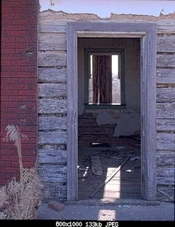
I like it, but it was 0.5 degrees off plumb, and I lightened the shadows even more.

$270A8792-Edit-2 - Version 2.webp
 
IMO...

This is underexposed and has WB issues.

I don't really understand the content either, but I know that doesn't necessarily matter
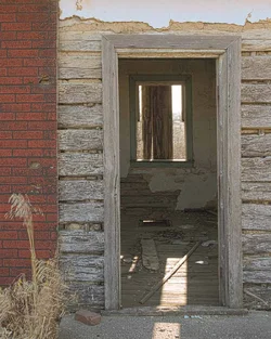
$270A8792-Edit-3.webp
I think this is a more realistic white balance and it is a little brighter.
 
I think your last edit and Designer's suggested edit both look better than the original, but that which one would be more appropriate would depend on the mood you're trying to convey. Designer's "darker bluish" edit suggests a late evening (or even night) vibe, whereas your last one suggests a late afternoon session. I guess which one's best depends on if you're going for 'mood' or 'realism'.

 
I think your last edit and Designer's suggested edit both look better than the original, but that which one would be more appropriate would depend on the mood you're trying to convey. Designer's "darker bluish" edit suggests a late evening (or even night) vibe, whereas your last one suggests a late afternoon session. I guess which one's best depends on if you're going for 'mood' or 'realism'.
I agree. I like Designer`s version the best myself.
 

Create an account or login to comment

You must be a member in order to leave a comment

Create account

Create an account on our community. It's easy!

Log in

Already have an account? Log in here.

Back
Top Bottom