What's new

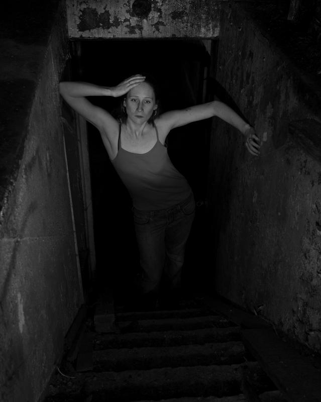
Abandoned power station shoot - opinions on this one?

tirediron

Watch the Birdy!
Staff member
Joined
Jul 8, 2005
Messages
45,715
Reaction score
14,785
Location
Victoria, BC
Can others edit my Photos
Photos OK to edit
From a 'just for fun' shoot yesterday with Leda; no real goal or intention, just a great location in a ~100 year old abandoned power station (More images from the set later). I saw this stairway leading down into the sub-basement of the structure and just had to use it. Set up was one speedlight @ 1/16 into a 30" Ezybox high and down, and a second @ 1/8 with a Flashbender rolled into a snoot at floor level. I got the lighting I want, but I'm trying to decide if the image is a keeper or not....
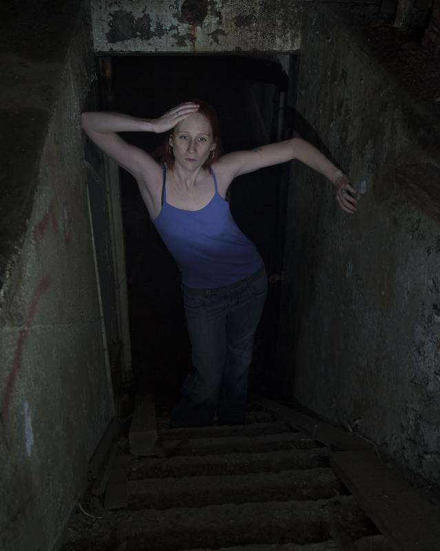
Leda%20(4).jpg


LedaA.jpg


Thanks!
 
it's a weird sort of combination of creepy and sexy. I'm not even sure the weird combo is bad. I just can't even decide how I feel about it, which is probably a good thing.
 
I do like your choice of lighting, but overall its not giving me much of a reaction :( sorry
 
it's a weird sort of combination of creepy and sexy. I'm not even sure the weird combo is bad. I just can't even decide how I feel about it, which is probably a good thing.

This, there is a lot right about this but there is something "wrong" that pulls me out of where my brain wants to go with it and I THINK it might be her clothes that is throwing me. She has a great pose and expression, like she owns the darkness below but her clothes are just soooo out of place, I want to see her in something dark, old, not modern...
 
Well I love it and hate it. Agree you nailed the lighting and i love the shot. Model is good for the scene, but clothing and to a lesser extent pose and expression seem out of place and strange, especially her right hand. Just a redneck opinion though, thanks for the opportunity.
 
Neat idea, anyway.

My initial reactions were...

1. I wish her dissapearing was more gradual. If you did this in raw you may be able to correct it in post. Different color clothes might have helped.
2. Her expression and pose don't mesh well with the scene, so I'd say experiment with that or try to push the disparity even further so it's obviously on purpose.
3. It seems a bit underexposed... not just dark, but actually not exposed enough. You know what I mean.
4. It's a little hard to tell what area she's in because it's SO dark... might be nice if that were brought up a bit as well.
 

Create an account or login to comment

You must be a member in order to leave a comment

Create account

Create an account on our community. It's easy!

Log in

Already have an account? Log in here.

New Topics

Back
Top Bottom