Abstract? Opinions?

tirediron

Watch the Birdy!
Staff member
Supporting Member
Joined
Jul 8, 2005
Messages
45,747
Reaction score
14,806
Location
Victoria, BC
Website
www.johnsphotography.ca
Can others edit my Photos
Photos OK to edit
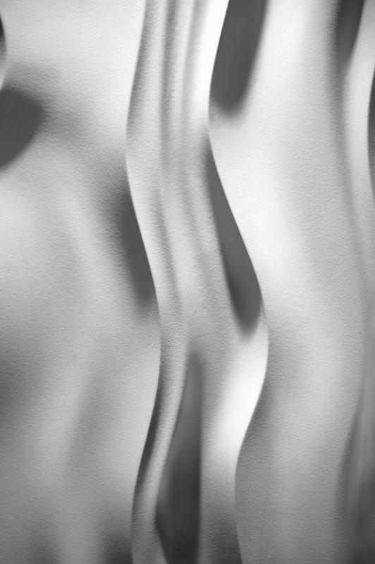
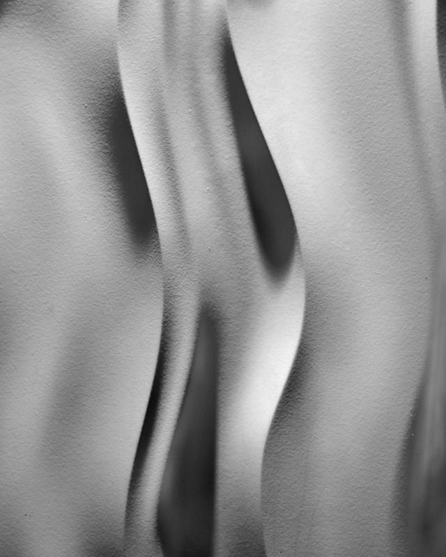
This was part of the decoration in the lobby of a hotel I was staying at for Image Quest last weekend. I'm not much on abstracts, but there was a photo here somewhere, but I'm not sure I captured it. Thoughts, suggestions, recommendations?

Thanks!


Abstract.jpg
 
I like the texture and the shadows. An interesting shot.
 
Has a sort of "figure/ground" duality to it with just a few seconds' worth of viewing!! That makes it interesting. I like it somewhat, and yet, that dark shadow and that slice of a sphere at the extreme upper left is creating a visual tension or "pull" that keeps me from enjoying the composition. Those two shapes just seem out of place in this otherwise long, tall, and "stretched" sort of abstract...the dissonance caused by those two upper left corner items is working against the repetition and the undulating, echoing, vertical lines that are the major thrust of the entire shot. Perhaps some cloning (looks like that might be tricky with that texture?) or a very slight crop, then cloning would really,really pull this together 100 percent and make it a real humdinger. Just my thoughts. YMMV.
 
I'm OK with the shadow as part of the pattern but agree on cropping or cloning the sliver near the upper right corner.

Actually, after I typed the above, I held up a card to crop almost all of the intensely dark shadow in the upper left, and I think it works that way too. This also would make the aspect ratio fit the vertical thrust of the image better. Your choice on a strong image that would work well either way.
 
I really like this image.

I also find don't mind the shadow in the top left as it works with the rest of the image. Part of the same "pattern" if we can call it that.
 
Like Derrel, I found that the shadow in the upper left corner was pulling my eye away from the curve. I really like the curve, it's abstract and interesting...but a little bit of cropping may really help this image.
 
I'm in agreement on both counts. The form is very organic, the texture adds to that. I find it's a little low on contrast but that's more a personal issue ;) The dark shadow on the upper left is a distraction, perhaps cropping the top 1/3 will benefit?
 
Thanks very much everyone! I had concerns about the shadow as well, but I wasn't sure that they were valid. Apparently they were. I'll take it back to the pixel room and work on another edit this evening..
 
"THE PIXEL ROOM"--I like that!!!
 
Looks much better IMO. But now the little shadow on the right side stands out.

I'm also wondering if this image would work, if rotated to a horizontal.
 
Looks much better IMO. But now the little shadow on the right side stands out.

But if you now crop the little shadow on the right side out, you are removing a full dimension out of the picture, leaving only the middle
s-curve to stick out.

At the moment, the right s-curve could be a layer on top of the middle one ...depends how you put your eye on it, if anyone can follow me? ;-)

But I also see that the middle s-curve is popping out quite heavily without the right shadow.

Interesting picture this one, it's what you want to make out of it, or leave more options for the viewer, just by removing some small shadow lines!
 
Last edited:

Most reactions

Back
Top