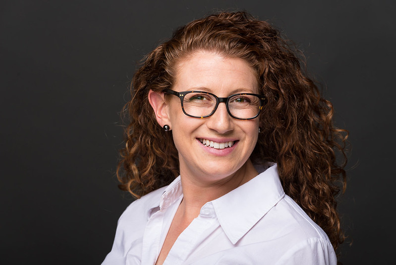
For professional use #3, she looks relaxed and confident.
Agree with this. Also just as a suggestion, but when you're posing seated subjects like this, really try and avoid quite so much of an angle between head and body. Fortunately her shirt collar covers it in most, but in one or two you can see the rather unattractive neck-wrinkle that this produces. As well, it tends to look a little forced. Generally <30 degrees is sufficient. Regardless, good, strong set!
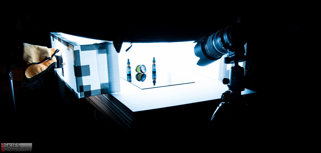 Behind the Scenes
")


![[No title]](/data/xfmg/thumbnail/32/32929-22e23acc63d6ecb25e5ee941be87121f.jpg?1734162700)


![[No title]](/data/xfmg/thumbnail/30/30885-2764c7a15a288ed06f3903d3a2756832.jpg?1734158890)


![[No title]](/data/xfmg/thumbnail/36/36401-dfb1077e5917eb47c5acf9c208e7be2a.jpg?1734168787)


