Starskream666
No longer a newbie, moving up!
- Joined
- Jul 6, 2011
- Messages
- 598
- Reaction score
- 56
- Location
- England, West Yorkshire
- Can others edit my Photos
- Photos NOT OK to edit
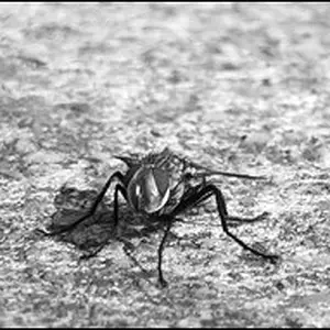
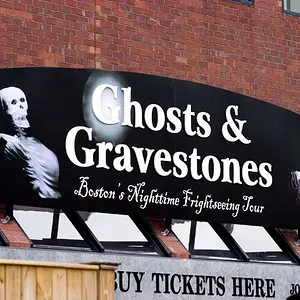
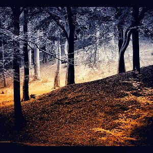
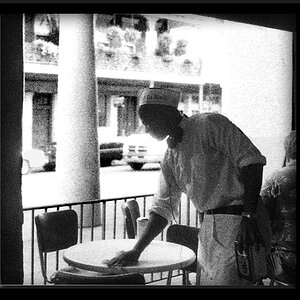
I need to take some photos for my mum's deli and I would appreciate some tips... I'm thinking a few of the food stations and the actual sandwiches... here are a few examples i took today... i'm not really happy with any of them but I want some advice on how to do it properly.
Cheers


Cheers


![[No title]](/data/xfmg/thumbnail/41/41933-d5af292b78e4b91211e86e0f3205eda8.jpg?1734176289)