Anything Wrong Here?

Alpha

Troll Extraordinaire
Joined
Mar 15, 2005
Messages
5,451
Reaction score
41
Location
San Francisco
Can others edit my Photos
Photos NOT OK to edit
So help me God if someone tries to move this thread.

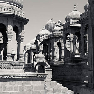
Can anyone find anything wrong with this photo?

Shot on APX100. ATM i'm too lazy to edit out the thin white line on the right hand side.

 
(noob here, take with salt)

Technically, most everything is fine...except that I think that the ground is too light. The stark contrast with the ground and the foreground elements somewhat hurts my eyes. I can't put it any better than that (UPDATE: I think the word I am looking for is 'jarring'). Just a tad less brightness/exposure on the ground would do the trick.

Her shirt details look lost in the front, but who really cares, right?

Nice lighting on the foreground subjects, overall tonal balance looks nice (other than that very bright ground), and contrast in the upper third of the shot is really pleasing (mane/blond hair on dark treeline background).

There is a sense of feeling and emotion between the subjects, but to be honest, these types of pictures don't really do it for me.
 
I should have known better, I suppose, than to show something shot on APX100. For anyone who knows what this film looks like shot at ISO100...well, that's just how it looks (extremely contrasty).
 
other than the rein on the bottom being cut off (which isn't a real big deal) and the high contrast, I think it looks alright. Not sure that means anything though:lol:
 
I don't consider the contrast to be problematic. And I don't mean to sound arrogant here, but you'll have to trust that I know the film that I shoot with. Every time I shoot a roll of this film at ISO 100, I expect that all of the shots are going to turn out like that.
 
I should have known better, I suppose, than to show something shot on APX100. For anyone who knows what this film looks like shot at ISO100...well, that's just how it looks (extremely contrasty).

Don't make excuses for the medium you are using. Either you like/wanted it that contrasty and your film choice served you well, or you didn't like it/want it that contrasty, in which case it didn't.

You were asking about the end result, and I commented on it. In that particular shot, I felt the very high contrast between the foreground and the actual ground to be jarring. There are *other* shots where I find that the contrast serves the photo well.

Anyways, I assume that you disagree that there is a problem, so let's leave it at that. :D
 
Fair enough...and the opinion is welcome. I suppose I should have asked "Contrast aside...is there anything wrong?"
 
Love it! The contrast is fine IMO, the emotion is great. I think the very light background works well here.
But if you really want me to nitpick: the white spot on the horse's head (I know there is a name for it, but...?) is merging into the field. It changes the shape of his (her?) head.


pascal
 
I personally LOVE contrasty black and whites, and that's what you have here.

I even like the graininess on her skin... fix that thin white line and youve got a winner.

I even think the white part on the horses head is fine, enough of it is contrasted not to make it bad.
 
I personally like high contrast b&w's.
I think its a good picture. Id hang it on my wall.
 
What happens if you give it a small crop on the bottom? Just enough so that the reins don't drop right along the bottom of the shot, and so that the...well, what I almost want to see is the line of the horse's head point into the corner of the picture. There's a strong diagonal line, but the line shifts in about the bottom centimeter or two of the picture, and leads me to look at the white space instead of the girl and the horse. A little crop might fix that...or it might not (I haven't tried it).
 
IIRC, the rein isn't cut off entirely in the actual neg. Also, geometrically speaking, the curve of her butt actually mirrors the curve of the reins, and I think that a crop from the bottom would leave her as just too much of a torso. But the point's well taken.
 
well.. to me.. but that is just untalented and biased me ... the image is out of vertical balance.

a square crop could still save it for me maybe
 
spoken like a true 6x6 user

I am curious though what you mean by "out of vertical balance" ?
 

Most reactions

New Topics

Back
Top