What's new

Are these any good ?

vivdub

TPF Noob!
Joined
Mar 14, 2015
Messages
78
Reaction score
12
Can others edit my Photos
Photos OK to edit
Few days back I took some images of one of my friend, I want your comments on these.
Please be a less harsh, since I am an amateur and using not so modern equipment.
IMG_5465_e2.webp
IMG_5467_e.webp
IMG_5547_e.webp

Thanks
 
I like them.

Seems like many portraits are made in "portrait" orientation, but I don't mind landscape. Please see below for my opinion.

For #1, I think there's a bit too much negative space around the model. Maybe a tad more contrast?

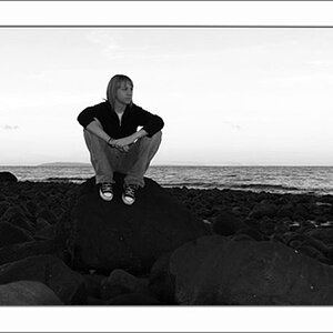
For #2, I like the black and white conversion, and for the most part, I like the posing. I don't know what it is about his mouth open, but I'm not a fan of it. I'd personally like it if his mouth were closed slightly more (or even completely closed). Perhaps slightly more depth, as well?

For #3, this is my personal opinion, but I'm not a fan of the processing/colors. Maybe add more contrast, as well? Otherwise, I like it. It possibly could have benefited from a reflector to provide additional lighting to his face?

Anyways, I'm just a hobbyist, so I'm sure others will chime in with more advice. :smile:
 
I like them.

Seems like many portraits are made in "portrait" orientation, but I don't mind landscape. Please see below for my opinion.
.......

Thanks for reply and opinion.

1. OK. I tried to crop but that thing on left was getting half cut, so I left it complete and reduced its brightness to whatever I could.

2. Well its a pose, he intentionally did it.

3. ok
 
It's in the background, so it's not a big deal if it is cut in half. Crop to an 8x10 size and it will be fine.
 
#1 I would select the subject and pop the contrast a bit while leaving the background as it is
#2. I like everything about it.....................good job
#3. Green hair is distracting, this might make another good BW conversion.
 
#1 I would select the subject and pop the contrast a bit while leaving the background as it is
#2. I like everything about it.....................good job
#3. Green hair is distracting, this might make another good BW conversion.

Thanks for these.
Good suggestion for #3.
 
I like the first two very much. The third one has too much saturation giving the chap's skin a strange colour.
 
I like the first two very much. The third one has too much saturation giving the chap's skin a strange colour.

ok Thanks.
I was just trying to edit a bit differently, something didn't worked good on that.
 
They look really good! I like all three, I think my favorite would be #2 or #3. Very nice photos!
 
#2 has the best overall, total quality, and the best composition. In most cases, there needs to be MORE room for the person's eyes "to look into", otherwise it can create awkward visual tension. Placing the eyes on what is called the short side of the frame is generally un-pleasing. And that is why #2 is so much better than 1 or 3: the man has just a bit more visual space, for his line of gaze, in shot #2 than in the others. Keep in mind: this effect seems to be exaggerated in a horizontal shot, and less in a 'tall" picture.

Cropping off just a little bit off the left hand side of #2 would improve the photo.
 
here is what I mean by cropping, to allow more room for the eyes "to look into", and keeping the "short side" of the frame opposite the direction of gaze.
IMG_5465_cropped.webp


IMG_5547_cropped_BW.webp


IMG_5467_cropped.webp
 
#2 has the best overall, total quality, and the best composition. In most cases, there needs to be MORE room for the person's eyes "to look into", otherwise it can create awkward visual tension. ............

Thanks I initially didn't understood what you meant, but the edited pictures explained it.
I also never read this thing ever, from where you found this info ? Personal experience ?
 
Yes, the personal experience, and also the shared experience of thousands of people involved in the fine arts. This is a well-known psychological principle, relating to "visual tension". I figured the edits would show what a slight cropping would do. Keep up the good work!
 

Create an account or login to comment

You must be a member in order to leave a comment

Create account

Create an account on our community. It's easy!

Log in

Already have an account? Log in here.

New Topics

Back
Top Bottom