What's new

Are these portfolio worthy?

It seems to me that if you have a portfolio that you should be beyond asking a bunch of random internet yahoos if your pictures are portfolio worthy.

That said, as others have said... no. They're not. All kinds of issues and I don't think they're even as good as most of what you have on your portfolio currently. However, I do get a sense of some spark of creativity from what you've tried to do with the shots and with the shots on your site. You just need some greater understanding of composition and some work on technical aspects, and you'll likely have something very nice going for you.

Just the opinion of yet another random internet yahoo.
 
It seems to me that if you have a portfolio that you should be beyond asking a bunch of random internet yahoos if your pictures are portfolio worthy.

That said, as others have said... no. They're not. All kinds of issues and I don't think they're even as good as most of what you have on your portfolio currently. However, I do get a sense of some spark of creativity from what you've tried to do with the shots and with the shots on your site. You just need some greater understanding of composition and some work on technical aspects, and you'll likely have something very nice going for you.

Just the opinion of yet another random internet yahoo.

Any good resources other than this forum?

What is technically wrong with them? This will help me research my mistakes and do better next time.
 
C&C per req: (by #4, I'm assuming you mean the girl reposed on the JD road grader). As mentioned, a lot of issues which would put it out of the portfolio category in my mind: THe exposure is shot; her dress is completely blown with almost no detail anywhere, as are the tops of the rear wheels and blade leveling wheels, not to mention the sky, her face and upper arm. The use of a couple of diffused strobes would have REALLY helped with this, or shooting for HDR.

The next major issue for me is the background. The house really detracts from the overall composition. If moving the grader wasn't an option, consider compositing a different background.

I can't say for sure, but it appears that her face is slightly softly focused, but that may just be due to the highlights.

The pose is a matter of taste, but IMO, it doesn't really work with the grader as a prop; having her sitting on the deck, one leg on the hitch would have worked well, or standing on the deck leaning against a levelling wheel.

The idea is good ('though I wish she was smiling, or at least not looking annoyed), but the technical aspects could use a LOT of work.

Just my $00.02 worth - your mileage may vary.

~John

 
C&C per req: (by #4, I'm assuming you mean the girl reposed on the JD road grader). As mentioned, a lot of issues which would put it out of the portfolio category in my mind: THe exposure is shot; her dress is completely blown with almost no detail anywhere, as are the tops of the rear wheels and blade leveling wheels, not to mention the sky, her face and upper arm. The use of a couple of diffused strobes would have REALLY helped with this, or shooting for HDR.

The next major issue for me is the background. The house really detracts from the overall composition. If moving the grader wasn't an option, consider compositing a different background.

I can't say for sure, but it appears that her face is slightly softly focused, but that may just be due to the highlights.

The pose is a matter of taste, but IMO, it doesn't really work with the grader as a prop; having her sitting on the deck, one leg on the hitch would have worked well, or standing on the deck leaning against a levelling wheel.

The idea is good ('though I wish she was smiling, or at least not looking annoyed), but the technical aspects could use a LOT of work.

Just my $00.02 worth - your mileage may vary.

~John

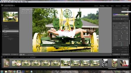
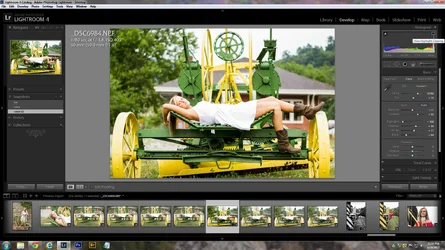
Thanks for the feedback. When you say completely blown out, are you saying it's actually clipped? I ask because Lightroom is telling me only the top part is clipped. I posted a screenshot, on the second screenshot I pulled back all the way on the highlights and I then saw no clippings. I can't do anything about the pose now but as far as the exposure goes, would you say #2 is better?

I was using 1.8 and I know you have very little room to play with, but I wanted the house out of focus as much as possible.

$1.webp$2.webp
 
The second image is definitely much improved, however looking at the histogram, it appears that here may still be some clipping/blown highlights. Regardless, if you have to make an adjustment of that magnitude in post, then the original capture probably needed more work prior to actually making the exposure. If your intent is to use these to promote yourself as a professional (paid) photographer I would suggest taking a little more time to work on the basics.
 
I had one flash with me at the time, but did not use it.

Should I have used a smaller aperture, faster shutter speed, etc? What would you have done to control the exposure?

My first thought is to lower my ISO to 100, this would get rid of any grain and at the same time make the camera less sensitive to light in turn possibly not giving me blown highlights.
 
The problem you've got with that scene is a very wide dynamic range. My methodology would have been to spot-meter the dress for correct exposure and then use strobes to bring in the rest of scene. Increasing the aperture (using a smaller 'f' #) would have resulted in more of the image being in focus and rendering the background even more distracting. Decreasing the ISO would definitely have reduced the noise in the image, BUT you would still have had to adjust the exposure to account for it. Think of correct exposure as an equilateral triangle. If you adjust one of the legs (aperture, ISO, shutter-speed) you need to adjust the others to account for it.
 
Allow me to jump into this conversation. I would start with the intent of the image. Images work when they tell a story, or create an interesting juxtaposition, or showcase some particular aspect of the subject. The technical aspects serve to achieve the objective of the image, while staying away from distracting or competing elements. So...

This image can be seen as “young vs. old” (young model vs.old machine), or “soft vs. hard” (soft lines of the model vs. hard lines of the machine), or some other interpretation. Part of the issue with the image is that it doesn’t really tell me why that particular combination of setting and model pose was used. If the focus is on the model, then the machinery needs to be in a supporting (secondary) role, and the background becomes the third party in this composition.

The exposure should be driven by the need to highlight the main subject. Assuming that the main subject is the model, the exposure is over-exposing her face and her dress as I see almost no detail in the dress. Lowering the exposure would also have served to make the background darker and less prominent. Secondly, the depth-of-field needs to be adjusted so that the background (the third party) is out of focus and is not intruding into the image. In this case, that would have meant using a wide-open aperture to get a narrow depth-of-field to isolate your subject from the background.

Another method for reducing the visual competition in the image would have been to use a flash to light the model, with sufficient power to reduce the contribution of the ambient by 1-2 stops. That would have darkened by background and kept the viewer attention on the model.

In terms of posing, the pose looks awkward, especially the way the arm is held behind the head. Depending on what you wanted the image to convey, you need to create a visual entry point, and then a flow that guides our eye and helps us explore the image. Usually, the entry points are either the eyes of the main subject, or the point of maximum sharpness/contrast, or the brightness. In this image, all three are present, but they belong to different parts of the image. The brightest portion is the model’s dress, while the maximum sharpness/contrast belongs to themachinery, and we have to work to find her eyes. The image does not give us a feeling of flow.

Looking at the images on your website, I see the background intruding too often, intruding because it does not provide a good supporting (ie, non-competing) setting for the main subject. In other cases, you’ve used the technique of having the background washed out, but at the cost of affecting your main subject exposure. There is a tendency to center the main subject, which makes the images more static and doesn’t invite exploration.

In terms of advice, I cannot really improve on the suggestions that Lew Thorton made in another thread, and which I have quoted in my signature.
 
pGriz and tirediron have pretty much said it all but..................

I look at this picture and I have no idea what you want me to look at. There are things in focus all over and they are unrelated to each other. Her dress is very bright, which draws the eye, her boots are standing out in look-at-me kinds of position.

The sky was included, the house in the background was included, everything within 50 ft that could draw the eye was included in the shot.
You can't depend on an f stop to create the illusion for the viewer.
The f stop works only in cooperation with the composition.

I don't think you knew exactly which part of the picture was important when you shot it because nothing about the model was arranged to draw the eye to one place.
 
1st: Nothing to special about it. Could be better if you did some selective coloring. Perhaps pick out an important color that you want the viewer to focus on.

2nd: This one could definetly be, had you not cropped her head off and there was some sort of theme to it. I love perspective shots so, I like this one even with the crop.

3rd: Same as the 1st. Just not much going on, ecpesially at that wide of an angle. I would have had her doing some sort of interesting pose or perhaps something like a backflip or cartwheel across the frame. This wide of a shot needs some sort of action.

4th: Too much going on and her dress looks over exposed. I would have picked a less complicated object, like a simple tractor and perhaps a cowboy hat to go with that(although maybe that's a little too obvious, not sure).

Keep shooting!
 

Create an account or login to comment

You must be a member in order to leave a comment

Create account

Create an account on our community. It's easy!

Log in

Already have an account? Log in here.

Back
Top Bottom