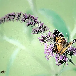
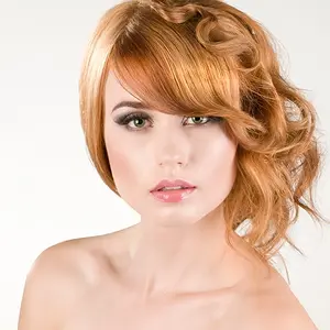
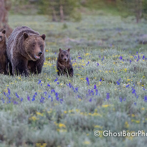
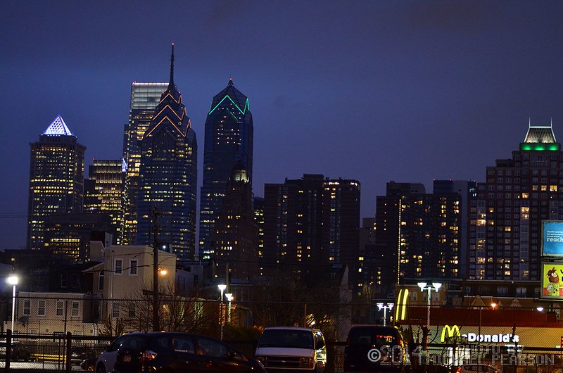
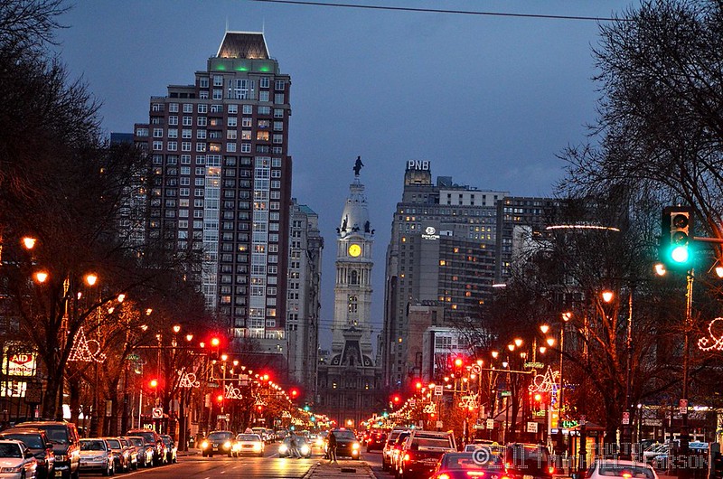
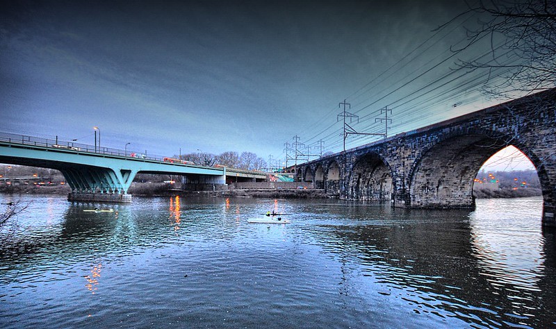
Numbers 2 & 3 could do with some straightening out. They're not quite slanted enough for it to feel deliberate. I agree with MisterMiagi also, I'd love to see a long exposure on number 3!
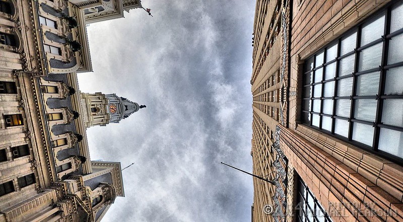
Agree, the 2nd is tilted. I like the 3rd one. The 4th has a composition i like but i do not like the post processing (Too much clarity and too bright for me).





![[No title]](/data/xfmg/thumbnail/39/39185-29433e4f46e4b0bd394d10962886594c.jpg?1734173059)
![[No title]](/data/xfmg/thumbnail/32/32935-452d7573a35ee2f5d0b9ad6463de680e.jpg?1734162731)

![[No title]](/data/xfmg/thumbnail/37/37602-1ef8dbb1c2d0e4ff347ee65d328c3603.jpg?1734170730)
![[No title]](/data/xfmg/thumbnail/32/32926-ec27ecead8c80d803404500d8f888dbf.jpg?1734162683)