Assorted collection from latest roll - advice?

Fishpaste

TPF Noob!
Joined
Jul 8, 2010
Messages
198
Reaction score
10
Can others edit my Photos
Photos OK to edit
Hi guys,

I processed roll 11 today after a bit of a break. I'm trying to work on my composition, but I'm really hitting a wall and I realized that few if any photos are really "saying" anything. They certainly seemed interesting at the time, but looking over the result and comparing to what others are posting, I can't help but feel disappointed.

I know a few basic composition rules, but there's something still lacking. Do you have ideas for a noob to explore, exercises to practice, etc, that will help me make better compositions? I realize there's no magic bullet, and I need the "eye" but maybe I can train myself to "see".

R1-04386-016A-Copy.jpg
 
Last edited:
Question, are these shot with a digital or 35mm?

Regardless, (and recognizing that I'm also a newbie), this is what my eye sees

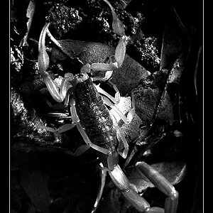
1. The thing that bothers me most about this one is the lack of sharpness. I have a friend whose photography is miles beyond mine (but still lets me tag along on shoots sometimes) has a rule that (with the exception of "artsy" shots) if an image isn't crystal sharp he doesn't even bother processing it. If you have a clear subject but that subject isn't clear, it detracts from the image a lot. So the background blur is nice, but the spider is just too fuzzy. Also, I think that if you're going for a really macro look, the spider should fill much more of the frame; if you're going for more of a scene you might stop down quite a bit to get more of the scene (maybe the web or something) in focus.

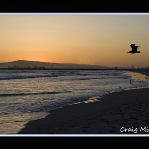
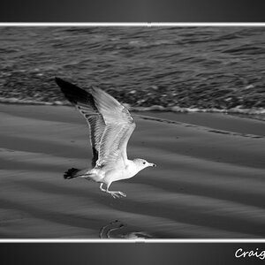
2. I like this one, though you could reduce the noise in the upper sky. Also, the land is just blurry enough that it makes for the same uncomfortable blurriness in no. 1, but not quite blurred enough to imply motion in the bird. Also the horizon's not quite straight.

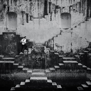
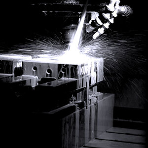
3. I think it's just not obvious enough what the shot is of. That doesn't mean it has to be a recognizable object, but I think there should be at least a clear texture or shape standing out. The things on the left and right of the frame distract. Maybe getting much closer with a lower angle and showing the lines of the light (I'm assuming that's what it is) as the move away, something like that. Look up some abstract/textural photography, pretty much all the successful examples I've seen are very simple, mostly uniform throughout, but still very clear.

4. This one's nice imo but a little too closed in and a little too washed out. It looks like it was shot in direct sunlight and it's really hard to make direct sunlight look good for outdoor/landscape shots. Shooting this at dawn or dusk would make it stronger I think.

5. This one's nice as well, I think it could've used a little more shape though. You've got that nice curve of the beach but the rocks break it up and the cliff looks cool but there's not enough of it.

So that's just what my eye sees, more experienced members will undoubtedly give you better advice. I'd say overall if you're trying to practice something (this is something I'm working on as well) is getting more simple shots out of complex scenes, looking for simple shapes and lines that won't get cluttered by lots of contrasting textures.
 
Sounds like you've hit a bit of a creative block.

You mention that you know a few composition rules - a quick google search came up with this 10 Top Photography Composition Rules | Photography Mad
which has several, maybe that will help?

What about giving yourself an assignment of sorts - find a bunch of images done by other photographers that you like, really study what makes them good, and then go out and try to replicate them? That would be a good exercise. Then you can take what you've learned from that to make your own unique images.
 
Hi Forrey,

These are all 35mm, although I process the photos at my local drugstore and ask for a CD instead of prints.

Thank you for your input. I don't want to offer excuses (that's cheap) but some explanations based on what you mentioned to give you a better idea of my thought process:

1) I was experimenting using the pseudo-macro by inverting the lens. This will probably be the last time I try it as I can't help but get very soft images as in the above, even if I get the focus point right on.

2) How do I deal with the noise? (ie what causes it in the first place?). The blur of the terrain was probably the result of tracking the eagle. The alternative would be a more blurry bird. However, I think I should invest in a lens with some zoom anyway.

3) This is the inside of a lighthouse prism-lens. Is this better?

4) This was shot at noon. I realize that's the worst time to shoot, but we were on the move the whole day and I wanted a shot. I guess I should have closed the aperture a bit or selected a faster shutter speed.

5) I agree that this is busy and indistinct. It was really beautiful in person though (one of the photographer's dilemmas). It's interesting that you say that you want to see more of the cliff, because I ended up cropping it away along with the rather empty sky. Here's the original shot.

Again, thanks for the advice. I'll keep it in mind next time I'm shooting.
 
Last edited:
Hi BlackSheep,

Thanks for the advice. I guess I need to find out who's my favorite photographer :D My friend loaned me a book on Ansel Adams which captivated me. I don't think I can even approach that level of ability though.
 
What's the viewfinder like on a Zenit ET? Is it difficult to critically focus?

I like the view of the cliffs and shore. Pretty tidy shot. Good job :thumbup:
 
Hi Dots,

The viewfinder is tricky to use and get a sharp focus.

The part itself is a yellowish plastic with numerous little prisms in the center which are supposed to help by distorting the image (looks a bit pixelated) when out of focus, but it's not always obvious. It's also a smaller angle than what ends up on film, so I often have to crop to match what I saw through the viewfinder. My friend's Pentax has a different viewfinder and it's very apparent when the focus is off (image is cut in half).

The camera doesn't represent the epitome of craftsmanship either. My first rolls were almost all blurry until I figured out the problem and fixed the camera. The focus might still be a bit off, but I've tweaked it as best as I could.

Thanks for the feedback!

EDIT - here's a schematic from the manual:

pict9.jpg
 
Last edited:
Hi BlackSheep,

Thanks for the advice. I guess I need to find out who's my favorite photographer :D My friend loaned me a book on Ansel Adams which captivated me. I don't think I can even approach that level of ability though.

What? Why on earth not? He tells you exactly what he does. It is very technical stuff, but there's no reason why you can't at least try to get at least close to his images -compositionally- if that is the type of photography you like.

But that isn't really the point - are you having fun shooting, and seeing progress in your images?
 
Thanks for the info and illustration. I've had a couple of Zenits. Don't remember which ones. Or what type of focussing screens. Maybe just a plain, ground-glass type that clarified when in focus. The split-field type i find much easier to use. As long as you can find an vertical/diagonal edge. With slow lenses though i think one half of the circle goes black and the other quite dim.

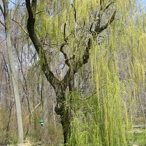
There seems to be more photos showing up in your stream than before, or i didn't notice them. I like the bird in flight and really like the tree image.
 
The photos should have all been there. Maybe they didn't load properly at first. Thanks for your comments!
 

Most reactions

New Topics

Back
Top