.Cipher,
Take my comments with a grain of salt as I'm a newbie and may be blowing smoke.
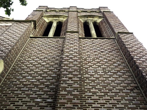
The first pic doesn't really appeal to me. It seems washed out with no real single point of interest. The arches/openings in the bell tower(?) are somewhat interesting, but they're overpowered by the vast expanse of bricks below them. Also, by centering the bell tower(?) in the frame, the rule of thirds is violated and while symmetry is attained, it's a little boring.
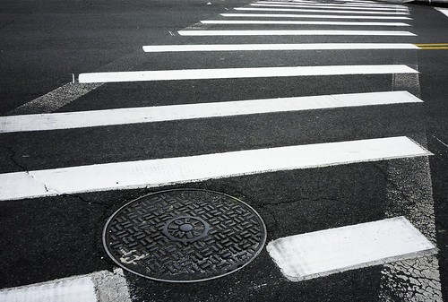
The second pic is FAR more interesting to me! I like that the manhole cover is not centered and that the crosswalk paint leads off to the upper right giving my eye somewhere to go. I think that I'd like to see more of the detail and texture in the manhole cover with different lighting or cropping, but overall, a much more interesting and dynamic picture!
Again, my critique may be amateurish, so take from it what's useful to you and ignore the rest.