D-B-J
Been spending a lot of time on here!
- Joined
- Apr 13, 2010
- Messages
- 9,027
- Reaction score
- 2,175
- Can others edit my Photos
- Photos OK to edit
Hey everyone! I went to New Hampshire on Saturday.... over 500 miles of driving, 14 hours total time, 500+ photos, and all along I encountered rain, snow, sleet, clouds, and even some blue skies.
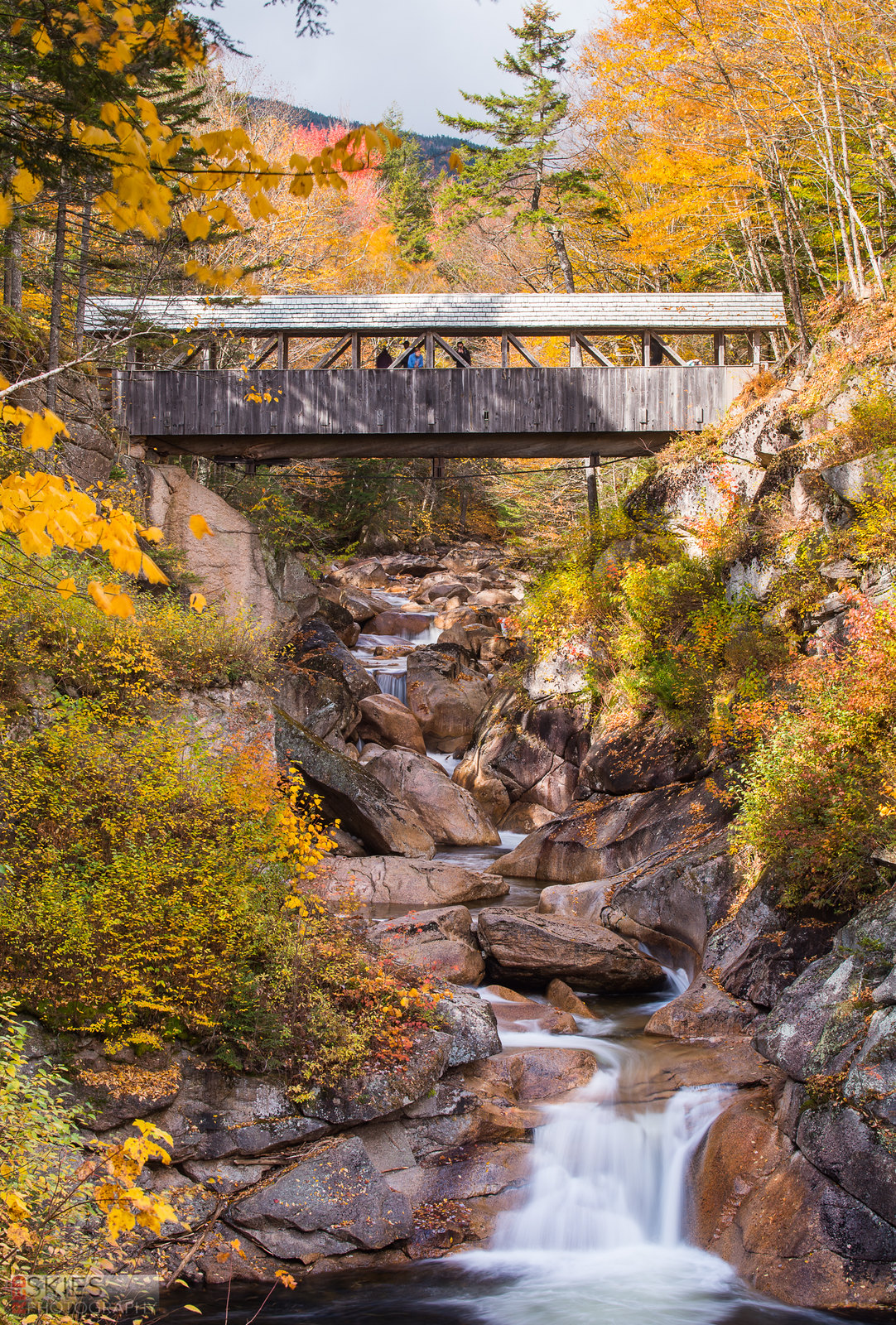
My first stop was right before Franconia Notch begins, at the Flume Gorge. I have shots of the Gorge, but this bridge afterwards was just perfect--really sums up the classic "Fall in New England" concept.
 _RSP9149 by f_one_eight, on Flickr
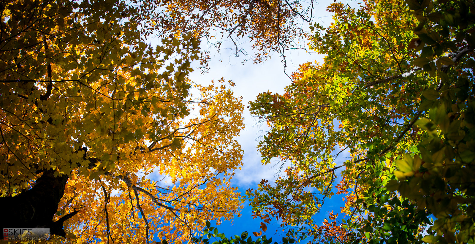
There weren't blue skies often, but when there were I took advantage of them!
 _RSP9141 by f_one_eight, on Flickr
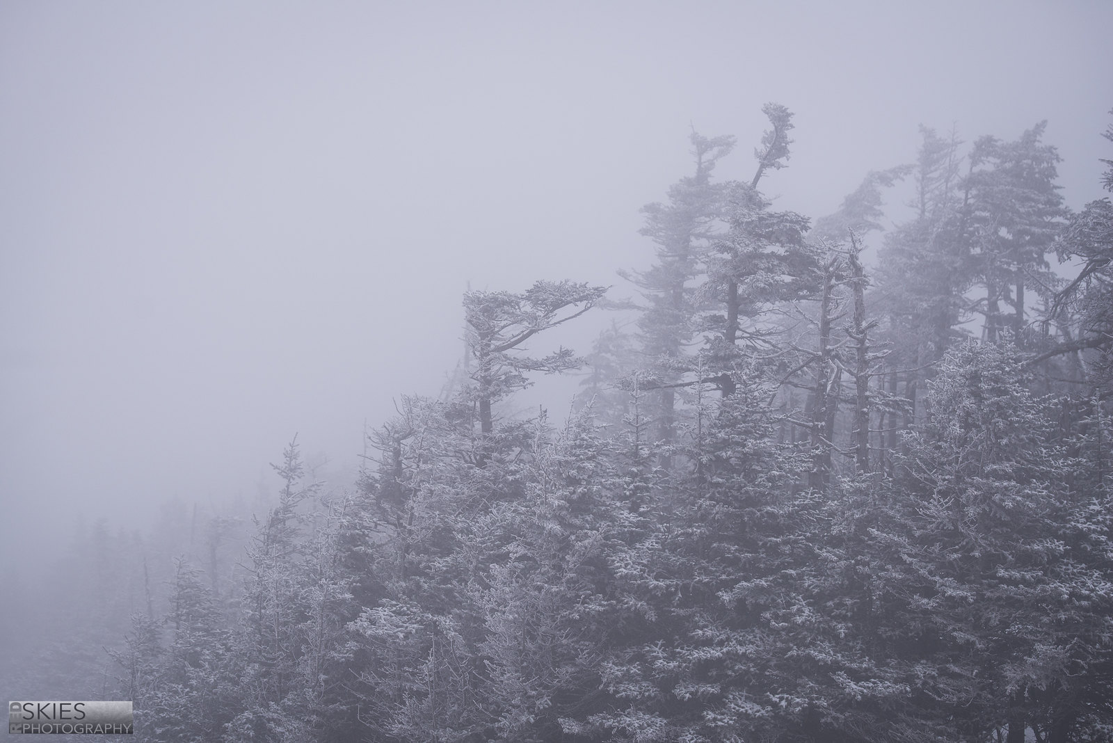
After Flume Gorge, I went to Falling Waters, but the hike was more arduous than I expected (and I was alone), so I decided to forego that option and head over to Cannon Mountain. At the top of the mountain... I was met with quite a surprise... 18 degrees and 30mph winds!
 _RSP9302 by f_one_eight, on Flickr
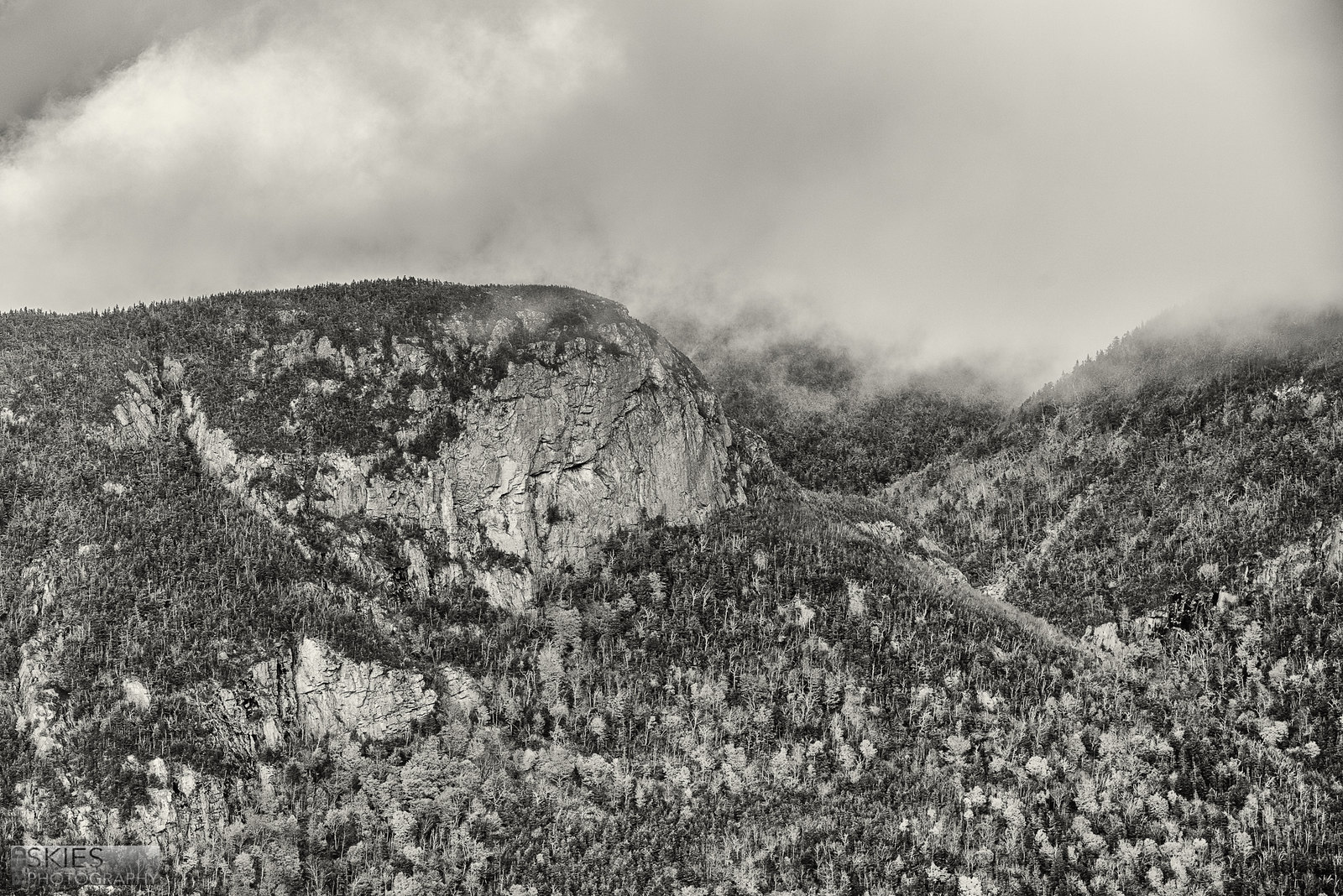
On the tram ride down I elbowed my way to the front window, and as we broke through the bottom of the clouds... well.. it was just gorgeous.
 _RSP9403-Edit by f_one_eight, on Flickr
And lastly, this photo really sums up the whole feeling of being in the Notch--beauty all around, lovely light, and plenty of color.
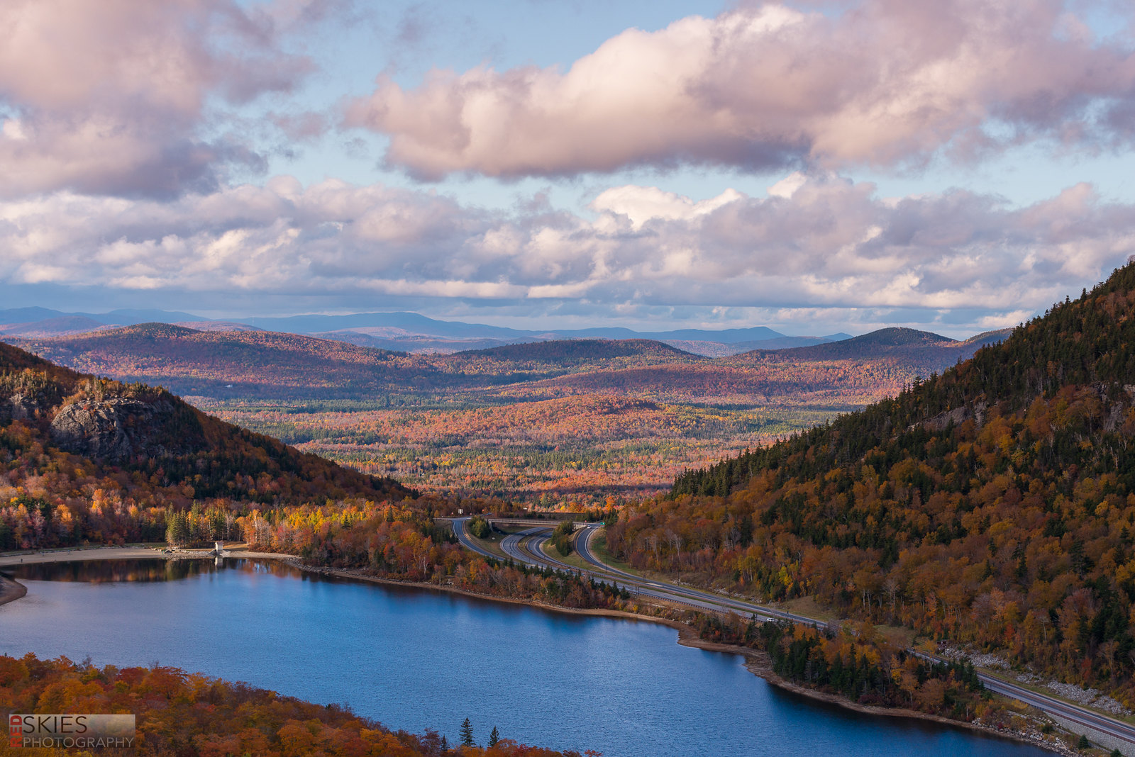 _RSP9435 by f_one_eight, on Flickr
I welcome critique on all of these, but I realize I posted a few, so any critique is better than none!
Cheers,
Jake
My first stop was right before Franconia Notch begins, at the Flume Gorge. I have shots of the Gorge, but this bridge afterwards was just perfect--really sums up the classic "Fall in New England" concept.
_RSP9149 by f_one_eight, on FlickrThere weren't blue skies often, but when there were I took advantage of them!
_RSP9141 by f_one_eight, on FlickrAfter Flume Gorge, I went to Falling Waters, but the hike was more arduous than I expected (and I was alone), so I decided to forego that option and head over to Cannon Mountain. At the top of the mountain... I was met with quite a surprise... 18 degrees and 30mph winds!
_RSP9302 by f_one_eight, on FlickrOn the tram ride down I elbowed my way to the front window, and as we broke through the bottom of the clouds... well.. it was just gorgeous.
_RSP9403-Edit by f_one_eight, on FlickrAnd lastly, this photo really sums up the whole feeling of being in the Notch--beauty all around, lovely light, and plenty of color.
_RSP9435 by f_one_eight, on FlickrI welcome critique on all of these, but I realize I posted a few, so any critique is better than none!
Cheers,
Jake


![[No title]](/data/xfmg/thumbnail/36/36644-d48bde7a35945a119c05c18e8c748c27.jpg?1734169161)
![[No title]](/data/xfmg/thumbnail/37/37536-3578b4f283f738d862be62d896fa52d5.jpg?1734170692)

![[No title]](/data/xfmg/thumbnail/37/37538-d4704bfd4f0e4b1941649d81ff8edf2c.jpg?1734170693)
![[No title]](/data/xfmg/thumbnail/30/30860-944669dcf33f1f20df14586c78ed2608.jpg?1734158815)


