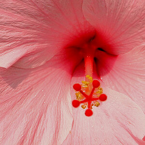
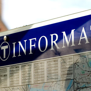
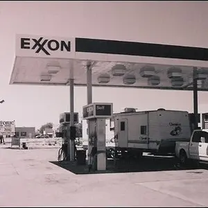
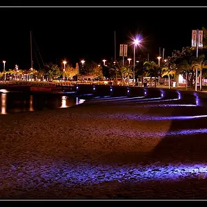
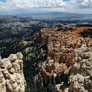
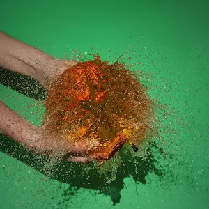
I like the first one but i think it could do with a bit more contrast and there's to much empty space in the top right. I like the idea of the secont but again there's alot of empty space to the left of it, maybe thats what you're going for but personaly I would of taken it portrait to reduce this.



![[No title]](/data/xfmg/thumbnail/37/37128-189b79232a3c6bf0c2c530e4eea0b8cd.jpg?1734169834)
![[No title]](/data/xfmg/thumbnail/34/34686-9d6b51a2427064204f762b07c8b00f70.jpg?1734165692)
![[No title]](/data/xfmg/thumbnail/34/34689-7546fa5b2c817c48b60563925693cd53.jpg?1734165695)
![[No title]](/data/xfmg/thumbnail/39/39480-e4e26ffe5c6148262ac81eff975a5c0e.jpg?1734173580)

![[No title]](/data/xfmg/thumbnail/37/37125-c083e505c2e7d8f15f717a96de782959.jpg?1734169833)