Its tough to critique photos of someones kids, since most parents have no ability to see their kids for who/what they actually are. Thats not necessarily a bad thing, but it does mean that what the parent sees is not what the rest of the world sees. So any critique of the images, comes loaded with all kinds of emotional landmines. However, youve asked for comments, and you have received some very good ones.
First of all, depth-of-field. At a focal length of f/2 and focusing at a distance of three feet, your depth of field is about 1 inch deep (211.5-30.5). To get 6 of DOF at that distance, you will need to stop the lens down to at least f/11. Given that youre dealing with a subject thats always moving, youll probably also need to have a shutter speed of at least 1/125 to avoid motion blur. At ISO 100, the amount of light you need to get those exposure values is direct sunlight. If youre not posing your kid in the sun, then you either go high on the ISO, or more open in aperture (with lower DOF), and slower shutter (with more risk of motion blur). So to be able to shoot with adequate DOF and minimize both motion blur and ISO noise, youll need to go to flash.
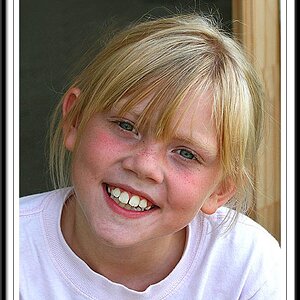
Your pictures 3, 4, and 5 were taken with your boy in front on a large window. The good things were that you were at your kids eye level, there was obviously a good interaction with you, and the pictures are more-or-less well exposed. However, you have to keep in mind the background of your shots you dont see it, but the camera does. Another thing when we dont know the person being photographed, we stay interested if we can read a story in the picture.
So. Pic 1: appear to be out of focus, background too clear, light on right needs somewhat more fill from front.
Pic. 2: Same comments as above. Picture is too centered. Kids looking directly at the camera and smiling great for the parent, but not too interesting for the rest of us.
Pic 3. Lights good. Focus is good. Babys face at the 1/3 mark (better composition), and is looking away dynamic. Less good is the background, and that we cant see the eyes.
Pic 4. Lights good, but needs some fill on the right. Focus is off (too soft). Can see eyes but no catchlights (because you were shooting down, not at eye level or even a bit up). Engagement is there, but positioning of the face almost at dead center makes the composition static. Background is somewhat distracting (dark thing growing out of head on left, and bright out-of-focus thing on right).
Pic 5. Exposures a little on the bright side. Focus is off (actually, not surprising given the DOF youre working with). Catchlights in the eyes are good. Kinda wish you left the top of his head in the picture. Positioning to right of frame is good.
Oh, and BJs a crusty character, but he gives good advice. Have a look at Dees shots she has some really good ones elsewhere.



 ) but I do also see my grandma's foot sticking out of his head in #4 as you mentioned and the soft focus (which I seem to have an ongoing struggle with). But, I CAN handle comments on how I took the picture without getting emotional. So, what do you suggest I do to get the blurry background but still keep BOTH eyes in focus? Also, I do see the overexposure - will work on that as well. Question about keeping the whole head vs. cutting the top off (sounds grisly!) - when is it appropriate to cut the top off a bit? And how much is enough? Thank you so much!