spag_187
TPF Noob!
- Joined
- Feb 21, 2010
- Messages
- 16
- Reaction score
- 0
- Location
- Los Angeles
- Can others edit my Photos
- Photos OK to edit
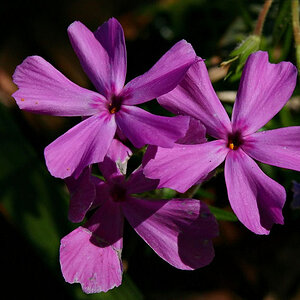
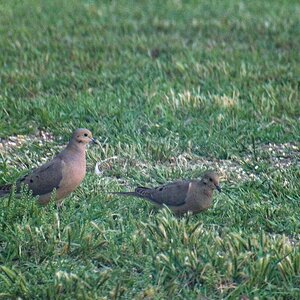
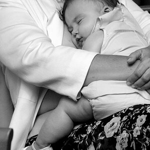
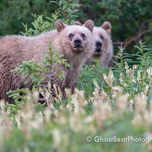
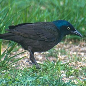
Well, I can't really find too many interesting things to shoot around the house. I need to get out! Anyhow, a few pics for your C&C. Since buying my first DSLR, I have started to experiment with the different settings of my camera. These were shot in RAW.
Here goes...


Here goes...

![[No title]](/data/xfmg/thumbnail/34/34125-d7028823900ffcf1cfce62bf748dea24.jpg?1619736295)
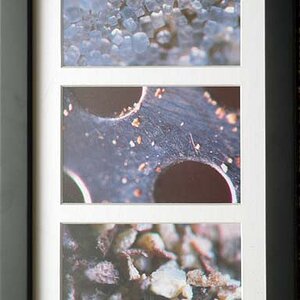


![[No title]](/data/xfmg/thumbnail/34/34122-fb99897e57c9440aede4be4fdc5f1352.jpg?1619736292)