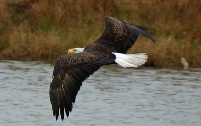
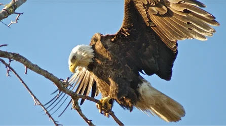
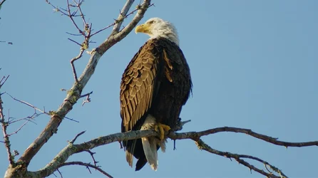
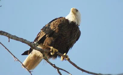
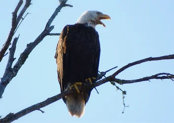
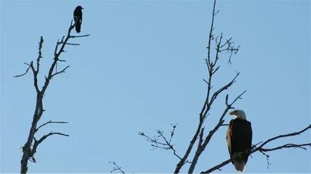
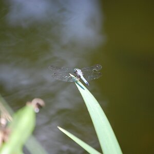
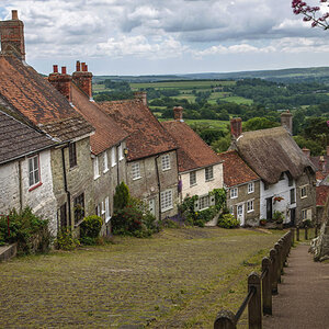
Yup, tough crowd! :mrgreen: First impressions: Right side - top one is too closely cropped for my liking, but then that may just be me - bottom one, not bad except for the shadow across the middle of the bird. Left side - these are all fairly decent images.
A couple of general points, you might get more responses if you number the images in your postings - this makes it a lot easier for reviewers to refer to them and it means they don't have to flip back and forth to make sure they have the right image. Second point - all of your images are centred in the frame - this is not always the best placement. Check out the rule of thirds for placing subjects in an image. Third point - these are all too closely cropped for my liking, maybe that is just me, but I like to see a bit of the "environment" around the subject, in this case birds, as I think a certain amount of foreground/background is interesting. The first one (top left) comes the closest to what I am thinking. My 0.02¢ FWIW.
WesternGuy