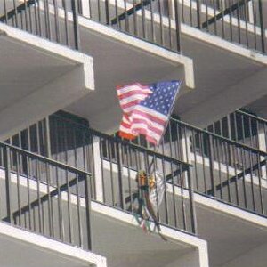
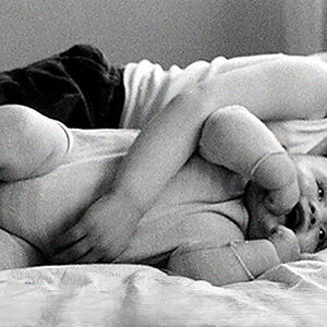
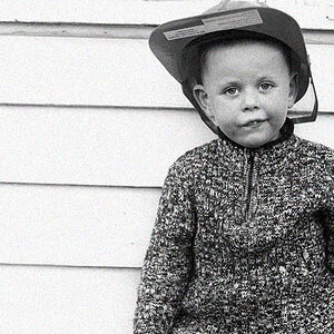
These are nice pictures, but you need to be careful not to cut off feet and hands when framing. It's a mistake I make ALL THE TIME. #1 you could have had less space at the top of the frame and allowed for the feet. Also, I don't care for the post running straight up the girl's back. Maybe off to the side would have looked better. In #2, it might have felt better shot horizontally.
#3 is your strongest shot here, in my opinion. It just looks a little underexposed. This is a nicely posed picture. He looks very natural and comfortable.
#4 is nice too, but your subject is just too far away and your steps/horizon are a little too centrally located. You should try to have either more sky or more steps, try not to split them in the center of your frame. Also, it is a little tilted.
Cheers!



![[No title]](/data/xfmg/thumbnail/38/38725-bdf734721ecaad862bb3e3a856c81df5.jpg?1734172598)