lrc3233
TPF Noob!
- Joined
- Oct 2, 2011
- Messages
- 12
- Reaction score
- 1
- Location
- Boston
- Can others edit my Photos
- Photos OK to edit
So, I am several months in to learning about photography and my camera and have been taking pictures around India (New Delhi, Agra) where we are staying for the next few months. I think I have improved since my first post (here http://www.thephotoforum.com/forum/...8-another-beginner-c-c-please-porcupines.html) and I am often happy with many of the photos that come from my camera, but I know I can improve and the only people looking at my images are my husband and my parents. I have picked a few of what I think are the best (or more accurately, my favorite...maybe not the same) for here. So suggestions for improvements technically, compositionally, or otherwise would be most welcome.
All of these photos were shot with a Nikon D5100 with a Tamron 18-200mm lens mostly in Aperture Priority mode. Not the best lens, but I take what I can get.
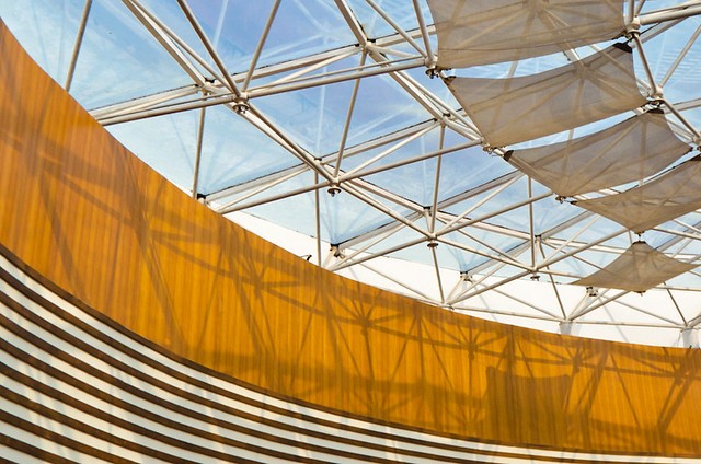
Abstract shot of a mall ceiling.
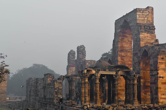
Ruins in Delhi of Qutb Minar complex. I think all the different brick colors and color intensity in the foreground fading rapidly due to the heavy fog makes it look like a painting.

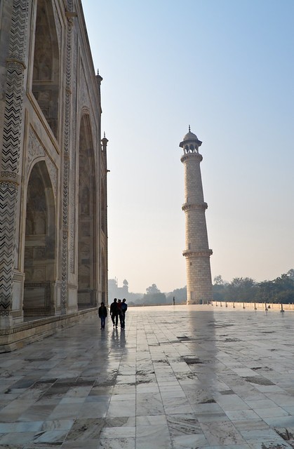
Shot straight up of the ceiling of a dome in the entrance gate to the Taj Mahal.
I just think it's an interesting photo.
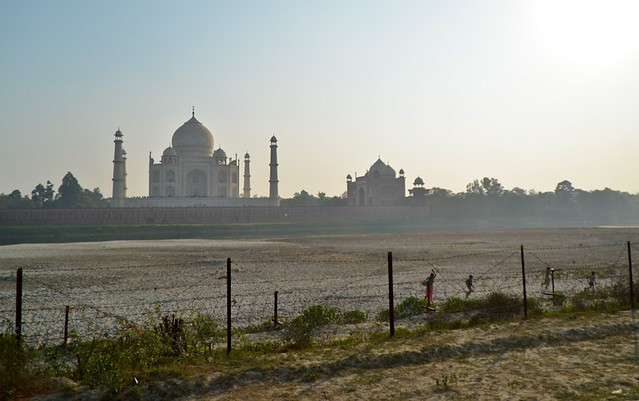
Taj Mahal + People. Why is the tower tilted? Should I 'shop it straight?
Thanks for any constructive comments.
Also a couple of questions:
-Is it better to crop photos to adhere to a "standard" print size ratio (4:5, 2:3, 5:7) or it doesn't matter? Only if you're planning on printing them?
-After reading KenRockwell.com I have put my ISO on auto and it seems to work great, but is there a reason I shouldn't? I understand basically how ISO works but I wouldn't say i've gotten used to setting it well on my own. Is this auto setting detrimental?
-After uploading my edited photos to flickr, I noticed the color saturation was not the same as it looked in lightroom. After some research I found out that's because different browsers support different color profiles...is there any way around this? Does anyone have any advice about how they handle it? That is super frustrating.
Thanks again!
All of these photos were shot with a Nikon D5100 with a Tamron 18-200mm lens mostly in Aperture Priority mode. Not the best lens, but I take what I can get.
Abstract shot of a mall ceiling.
Ruins in Delhi of Qutb Minar complex. I think all the different brick colors and color intensity in the foreground fading rapidly due to the heavy fog makes it look like a painting.
Shot straight up of the ceiling of a dome in the entrance gate to the Taj Mahal.
I just think it's an interesting photo.
Taj Mahal + People. Why is the tower tilted? Should I 'shop it straight?
Thanks for any constructive comments.
Also a couple of questions:
-Is it better to crop photos to adhere to a "standard" print size ratio (4:5, 2:3, 5:7) or it doesn't matter? Only if you're planning on printing them?
-After reading KenRockwell.com I have put my ISO on auto and it seems to work great, but is there a reason I shouldn't? I understand basically how ISO works but I wouldn't say i've gotten used to setting it well on my own. Is this auto setting detrimental?
-After uploading my edited photos to flickr, I noticed the color saturation was not the same as it looked in lightroom. After some research I found out that's because different browsers support different color profiles...is there any way around this? Does anyone have any advice about how they handle it? That is super frustrating.
Thanks again!
")


![[No title]](/data/xfmg/thumbnail/37/37604-7ad625e983f92f880eb65a264eeef5e4.jpg?1734170732)


![[No title]](/data/xfmg/thumbnail/37/37533-7e5a25ced65c369c377ecf341b05e1d0.jpg?1734170690)


