in my choice of words and I promise to do better in explaining why I said what I siad.
yes I said the wrong words in the wrong manner and I aplogisie for that.
I WAS WRONG!
I have no problem admitting when I am wrong.. ! sorry neaa to upset you also and others..
Maybe I was in too much of a rush but no excuses I was WRONG.
thanks for pointing it out.! I mean it.
I haven't spoken to a civilized person in years. Just Eskimo's only.! I guess it is showing too much.
Maybe I can TRY again.. (while I am smiling) I like it here,
I like all the people the photos and the varied subject matters that help me escape the reality of my surroundings.
That said.. let me try to express myself in a bit more dignified manner.
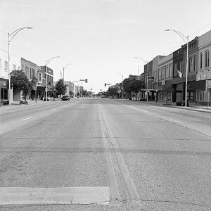
#1 this composition has too much open space, the buildings are too far away, maybe a different lens would have provided a remedy. but the lack of detail and overall low contrast. my eyes are searching for something to focus on and all I can stop at is / are the clouds. so in my opinon there is too much open space and not enough detail to "capture" my attention.
And then again when lookiing at how a member cropped it.. it seems better, the composition is more pleasing, to view, but detail is lacking.
I have constantly said.. I am no body.. I am nothing. it is not my intent to offend, and I do mean no insults to anyone. I am much harsher on my own mistakes, but I try to learn from them..
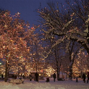
#2 same as above. too much open space, and I really don't know what I am lookinig at. That is what puzzles me. the color seems wrong, but one of the aspects of Great photography is fill the frame with detail. Photograhy is a constant learning process.
I have said this many times to many of my students.. that try and take in too much into the viewfinder that is too far away. Fill the frame with detail
#3 Half the viewfinder is filled with detail.. . but look at how sharp those blue lines are.. the rope comng off the ship.. THAT is what I like to see in an image.. detail.. sharp detail. notice how the depth is increasing make the image life-likness appearing.. THIS IS what makes me so curious as to all of the detail on the other side.. the right side.. I think (my opinion) that the right side of the ship would provide a more interestng composition.
the buildings look sorta nice. but they don't have the detail that the blue rope and the objects on that side of the ship would have.
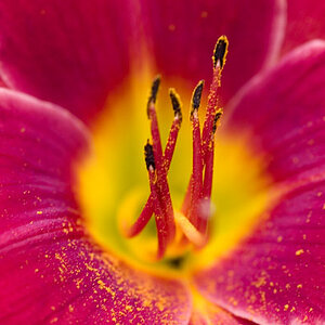
#4 as I said in different words before is exquisite, wonderul feeling.
Mysterious feeling Orange and Black. wonderfull contrast and mysterous intrique. I love it bravo !
and that is my honest opinion! and it is only an opinion.. don't take me so serious.. but I was wrong in not explaining it all out in detail and I hope this helps.! I use pencils all the time.. only because I make so many mistakes that I can use that thing on the end to fix my mistakes.
I will do my best.. and be on my guard to prevent any more misunderstandings!



![[No title]](/data/xfmg/thumbnail/32/32170-3fce4409fbea1f5e9818209c7e87c1ea.jpg?1734161046)
![[No title]](/data/xfmg/thumbnail/42/42280-60cc6d4893a2f440eac7dd2248e733a9.jpg?1734176695)
![[No title]](/data/xfmg/thumbnail/39/39469-3f2d242112dec8dc3e7b2836cc85afec.jpg?1734173560)