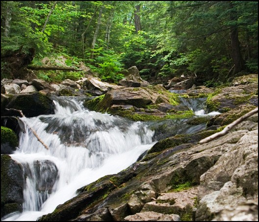
Big Pup Falls

35mm is 2:3 (4x6, 6x9, 8x12), medium format is 1:1 (square), 6:7 (6x7, 12x14), or 2:3. Large format is 4:5 (4x5, 8x10, 16x20). If you want to follow that idea, you have a lot of choices, and those are just common ratios.
 
personally for landscapes I don't use any aspect ratio, I usually crop some off the top of bottom to give it that panoramic type look and leave it at that.

Another thing you could do for this picture is go into PS and darken up the right side of the picture. The rocks on the right wouldn't be a bad touch at all if they werent so bright.
 
I would also recommend a slower shutter speed. I know someone mentioned a faster one but I'd be curious to see the differences there too. I use a ND8 filter for water shots and aim for a shutter speed of 1 - 2 seconds. The water just blurs a bit more and looks softer. Probably just a matter of preference though.

Bushkill-Falls.jpg


I've also REALLY wanted to try this affect at sunset too so that the water would be reflecting the colors of the sky (assuming you had the right angle). Something else to think about. It'd probably be a hard shot though as you'd need the right angle, equip, and weather conditions.
 
I have never gone for a 1 - 2 second shutter for waterfalls. I typically go for a 1/11 - 1/15. I tend to worry about motion blur on the trees, etc. As for darkening the picture, perhaps I will try that out tonight if I have a moment. Thanks for the idea.
 
blur in the trees IMO adds to the whole effect, pine being my favorite for wind blur. RMH, I love the water, but it is a little over exposed for my tastes. Could be just a bad angle of the sun for the shot, but I definitely love your approach.
 
I mis the green of the trees in the first image. Although i agree that the rocks on the right is distracting, I really think the big green trees should be lost just for the rocks.
 
while the bright green of the trees does pull the eye a little, the white of the water pulls more. The only reason the rocks are so distracting is because they are alot closer to the falls, and seem to be either sticking out at you, or just plain in the way.
 
I just played around with the cropping again tonight and there just didn't seem to be a better way to do it.. If anyone has an idea feel free to post.

Once again thanks for the comments.
 
yeah, I agree.. there isn't much that cropping can do. I did a little photoshop work, though I haven't been using photoshop but for a month or so. heres what I came up with.

Big_Pup_River_Falls_IMG_3998chop.jpg


The color on the rocks is pretty bad, I should have redone those, but I also made the trees a little more bold to help grab your attention to that part of the picture.
 
Thanks for letting us post edits. Here's a 6x7 crop that I think works well and has a good balance. You still might want to edit the stick out (either one or both), but I like the feel of this.

Big_Pup_River_Falls_IMG_3998-mod.jpg
 
I like the cropped image... it really accentuates the waterfall.
 
i cropped left right & top a bit, makes it more focused for me,

bigpupriverfallsimg3998chopex6.jpg


and i just noticed i missed a little rock on the bottom right corner, i'd have cropped up to get rid of that also... but i'm stupid :p
 
Torus34 said:
Should you get a chance to re-shoot, do run a series of shots with various shorter exposures. You may not to freeze the water, but a bit more definition might be interesting. I'll be at Watkins Glen and Diablo Falls in the NY Finger Lakes region this coming week. I will practice what I preach.

Have fun there it's a beautiful area.

And as to my opinion I didn't like the rock that was out of focus on the right I felt it was distracting but I feel that you want rock on that side to make the shot more interesting so #2 was my favorite of th reworks.
 
markc said:
Thanks for letting us post edits. Here's a 6x7 crop that I think works well and has a good balance. You still might want to edit the stick out (either one or both), but I like the feel of this.

Big_Pup_River_Falls_IMG_3998-mod.jpg
This is the crop that works best for me. I like the balance and especially the composition. The greatest element of composition is in the lower-left ROT and the lines seem to converge in the upper-right ROT. The diagonal lines in the image envokes a sense of action and supports the flowing stream. The sticks don't bother me, it would probably be an improvement to the image if the stick on the right was cloned out.
 
meotter said:
i cropped left right & top a bit, makes it more focused for me
I like this one two. One of my favorite exercises is to see how many workable images I can make from one capture. The goal for me is to get it in-camera, but I think cropping is a great way to train the eye.
 

Most reactions

Back
Top