vonnagy
have kiwi, will travel...
- Joined
- Sep 8, 2003
- Messages
- 3,759
- Reaction score
- 30
- Location
- -36.855339, 174.762384
- Can others edit my Photos
- Photos NOT OK to edit
This a basic digital black & white tutorial for newbies.
Quick Reference:
Burning: Darkening an area of an image
Dodging: Lightening an area of an image
My method may not be the best, so I am hoping I'll get a lot of feedback here. I'll start off by doing a comparison with the original image and the final outcome:
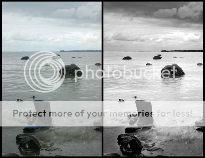
The colours are a bit lacking here (except for that one bit of blue on the gumboot) and to me this images screams for black and white conversion! Before i do anything I apply the voodoocat unsharp mask method to make sure that my image is nice and crisp. The next step is to do the actual black and white conversion. I use an adjustment layer here called channel mixer. For this particular image, i used 60% blue (note: i seldom use blue but it works here), 20% green and 20% red. Here is the result of the channer mixer:

Yep, its still a little flat, the sky is washed out. I am too dern lazy to use my burn tools, so what i did was duplicate the original layer applied a multiply mask. After applying the multiply mask at 100%, I deleted the everything below the horizon in that layer. The multiply mask acts like a the burn tool tool over a large area:

Sky looks a bit better now..but thats not good enough! I want an INTENSE sky. no problem, just duplicate the multiply layer again. So now you you have 2 layers that darken the sky to give it that brooding effect. I set the opacity of this layer to 55%:

Alright, now my foreground needs a bit of help. Unlike the sky which was washed out... my foreground is a bit dark. Not a problem, duplicate the original layer and a apply a screen mask. I deleted the everything above the horizon and and I also used my eraser tool to paint the highlights to suite my own preference. The screen mask acts like the dodge tool over a large area:
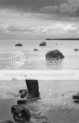
Good sky, good foreground..hrrrm.. the greys in this pic look a little flat. Lets jack up the contrast adjustment layer 15 notches:

Sweet! Well for my final touch, I am going to tweak the curves adjustment layer ever so slightly to give me my final outcome. Though its difficult to tell at first, the curves add a bit 'definition' to the sky and foreground:

Other notes:
To lighten or darken sections of an image, I always start off by using multiply masks/screen masks instead of the dodge and burn tools. The reason for this is:
a. It covers the entire image, so if the entire sky needs to be burned I don't have to wear out my mouse hand waving it over the sky
b. It distributes the effect evenly - you don't have to worry about overburning a particular area, undoing, repeating and wasting time
After applying the mask, I just delete any part of the mask I don't like. The burn and dodge tools do come in handy when you want to hone in on the details of image and doing fine touch ups.
So do the multiply/screens masks tackle macro jobs, burn/dodge tools handle micro jobs. You'll drive you self bonkers trying to use the burn and dodge tools over a large area!!
Notice that i didn't use the levels adjustment layer here at all! I seldom use this because it has a tendency to strip out the tonality of image - the screen/multiply masks I have found are the best ways of digging out digital information that is buried within your photo. More on levels later...
Hopefully this will be helpful to someone out there! If you would like to see the original psd file, pm and I'll send a small version. Please post back your better photoshop b&w methods here too, if you have a better way doing something- let us all know!
Enjoy!
Quick Reference:
Burning: Darkening an area of an image
Dodging: Lightening an area of an image
My method may not be the best, so I am hoping I'll get a lot of feedback here. I'll start off by doing a comparison with the original image and the final outcome:
The colours are a bit lacking here (except for that one bit of blue on the gumboot) and to me this images screams for black and white conversion! Before i do anything I apply the voodoocat unsharp mask method to make sure that my image is nice and crisp. The next step is to do the actual black and white conversion. I use an adjustment layer here called channel mixer. For this particular image, i used 60% blue (note: i seldom use blue but it works here), 20% green and 20% red. Here is the result of the channer mixer:
Yep, its still a little flat, the sky is washed out. I am too dern lazy to use my burn tools, so what i did was duplicate the original layer applied a multiply mask. After applying the multiply mask at 100%, I deleted the everything below the horizon in that layer. The multiply mask acts like a the burn tool tool over a large area:
Sky looks a bit better now..but thats not good enough! I want an INTENSE sky. no problem, just duplicate the multiply layer again. So now you you have 2 layers that darken the sky to give it that brooding effect. I set the opacity of this layer to 55%:
Alright, now my foreground needs a bit of help. Unlike the sky which was washed out... my foreground is a bit dark. Not a problem, duplicate the original layer and a apply a screen mask. I deleted the everything above the horizon and and I also used my eraser tool to paint the highlights to suite my own preference. The screen mask acts like the dodge tool over a large area:
Good sky, good foreground..hrrrm.. the greys in this pic look a little flat. Lets jack up the contrast adjustment layer 15 notches:
Sweet! Well for my final touch, I am going to tweak the curves adjustment layer ever so slightly to give me my final outcome. Though its difficult to tell at first, the curves add a bit 'definition' to the sky and foreground:
Other notes:
To lighten or darken sections of an image, I always start off by using multiply masks/screen masks instead of the dodge and burn tools. The reason for this is:
a. It covers the entire image, so if the entire sky needs to be burned I don't have to wear out my mouse hand waving it over the sky
b. It distributes the effect evenly - you don't have to worry about overburning a particular area, undoing, repeating and wasting time
After applying the mask, I just delete any part of the mask I don't like. The burn and dodge tools do come in handy when you want to hone in on the details of image and doing fine touch ups.
So do the multiply/screens masks tackle macro jobs, burn/dodge tools handle micro jobs. You'll drive you self bonkers trying to use the burn and dodge tools over a large area!!
Notice that i didn't use the levels adjustment layer here at all! I seldom use this because it has a tendency to strip out the tonality of image - the screen/multiply masks I have found are the best ways of digging out digital information that is buried within your photo. More on levels later...
Hopefully this will be helpful to someone out there! If you would like to see the original psd file, pm and I'll send a small version. Please post back your better photoshop b&w methods here too, if you have a better way doing something- let us all know!
Enjoy!
 Thanks for this!


