I'm just nailing the bad, so:
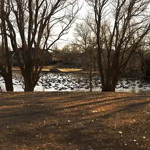
1. Too much sky. But still - it's nice.
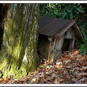
2. I like this one. Some might say it's snap-shot-ish, but I like it. Looks like a martian landscape.
3. This one is too simple to be abstract. A little shaked too.
4. I think I've seen too many of these.
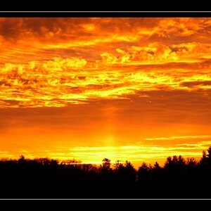
5. That black line down there. Cut it off.
6. Well. What to say here. Overexposured due to the fact that it's made in a shadow and pointing outside it.
Overall: the 1,2 and 5 pop out the whole lot. The other need some work. Don't give up!
AFAIK,JMO




![[No title]](/data/xfmg/thumbnail/37/37607-69784b19e25bd0ba68e92ff4cfdfa8ff.jpg?1734170734)