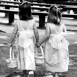
Bored around the House. 1st try at portraits.

Exercise some judgment in what you post and post only your best.

I agree with the exercise judgement, but don't necessarily post your best. If you have some photos where you dont know what you did wrong or how they can be improved, post those up as well. Just make sure you are specific in what you are asking for and give enough information to help the CCer out :)
 
TylerF,
Had an opportunity to look over your images as well as others feedback and will agree that it is pretty bad. But the good news, if you don't change anything, it can't get any worse THEREFORE there's ONLY room for improvement.
General trend of your images is this:
Skin Tones: - redish, oversaturated.
Lighting - although not placed in optimal location but do give a sense of ratio (I like non-flat lighting).
Posing. The moment you simulate shadows and highlight using lights (as you did) you have to pose accordingly HOWEVERimages 2&3 you have flat pose with split lighting - NO NO !!! image one his head it tooo much to HIS left -- hence lack of flatter.
For lighting and posing, I usually recommend this site Portrait Lighting If you truly want to learn posing and lighting, start there and go through it thoroughly.
If you have more Qs, feel free to PM and ask.
 
Thank you so much everyone! I think I'm gonna give it another go tonight or tomorrow.
 
If its any consulation...I think you're doing better than me and I HAVE two 5k continuous softbox lights, muslins and stands...LoL...

Keep it up...I've gotten frustrated and have slowed down a bit...Its been two weeks since I've even touched my E3. Don't give up!
 
Lol thank you. Pick up that camera! You don't have to shoot portraits all the time. I bring my camera everywhere but work. And even at work I play with cameras!(Best Buy) haha
 
I think the background spot is blowing out too much in the first photo. You should get a dimmer for that shop light. The sheet you are using in wrinkled too and it ends up looking like, well a wrinkled sheet. I agree that they are too dark, especially when contrasted with the spot on the background, it makes the subjects feel even darker. I think the spot works the best in the third image though. I would like it to go a touch higher so it could separate the top of her head from the background a little.

I think they are a good start and you just need to keep playing around and study portrait photography guidelines some more (there are a lot). I feel a lot of the framing and camera height doesn't quite work, but with some minor adjustments it could.

I think a lot of people have been rude to you to. You have thick skin and I guess that is good for the internet. If someone just wants to comment "I don't like it." they should probably skip commenting, because it doesn't help the person asking for feedback at all, and it probably makes the person feel bad a little. IMO these crits really are not about if you like something or not, it's almost irrelevant. The goal is to articulate what you think is successful in the images and what isn't, and why--from a technical and conceptual standpoint. I know a lot of people are new to talking about these things, but I hope people realize that saying, "I don't like it." compared to "I don't think this works because..." will get across the same idea, but one is a little more useful for the presenter. It takes a lot of courage to post creative work; it is a very vulnerable position to be in.
 
Thank you for your comments. I just posted another thread with some more portraits I tried this morning. I am a lot happier with them
 

Most reactions

New Topics

Back
Top