What's new

Boudoir Shoot...do these work or no?

kathyt

Been spending a lot of time on here!
Joined
Oct 11, 2012
Messages
3,759
Reaction score
1,888
Can others edit my Photos
Photos OK to edit
I do boudoir-ish type sessions but never this skimpy at all, but I wanted to give it a try. I never shoot in my own house with only natural light but this is my attempt at such. I am generally only an on location photographer. These models are my make-up artists that I use for my own clients. If you could let me know which ones you like or don't like and why that would be very helpful. I hope these are appropriate to put on the forum. I guess I will find out real quick. :) I think they are very classy and tasteful. Thank you.
$IMG_0007-2-Edit.webp$IMG_0007-2-Edit-Edit.webp$IMG_0006-2-Edit-Edit.webp$IMG_0314-Edit.webp$IMG_0012-2-Edit.webp$IMG_0038-Edit-3.webp$IMG_0038-Edit-3-Edit.webp$IMG_0066-Edit-Edit.webp
 
1st 5th and last are the best, I think. not a big fan of the random patch lof leg and hand that are the only things in focus on 3 and 4. I dont think the pose and lighting are patricularly flattering in 6/7. Not enough tonal variation for the B/W conversion to work well in 2. I'd like to see a bit more face in the last one. Clone out the protruding spigot in 5 and it's the clear winner to me. Gives off a great vibe, is a very technically sound shot. You capture that sort of reflected contentment she seems to be feeling. Protrudes sexiness in a very subtle way.
 
1st 5th and last are the best, I think. not a big fan of the random patch lof leg and hand that are the only things in focus on 3 and 4. I dont think the pose and lighting are patricularly flattering in 6/7. Not enough tonal variation for the B/W conversion to work well in 2. I'd like to see a bit more face in the last one. Clone out the protruding spigot in 5 and it's the clear winner to me. Gives off a great vibe, is a very technically sound shot. You capture that sort of reflected contentment she seems to be feeling. Protrudes sexiness in a very subtle way.

I felt the same way about 6/7 but I wanted to get another opinion. It doesn't help that her hand is on her stomach either. When you say spigot are you referring to the champagne reflection in the glass? That does look pretty gross! I just now looked at it like that. Back to LR I go. Thank you.

no, I'm talking about the actual water spigot on the right edge of the frame in image 5.

Oooh. Got it. Laughing! The reflection in her champagne glass does look like a goober though. :)
 
I like 5 the best ....only remove the green bottle as it adds nothing to your shot.....I would soften this image overall and make it dreamy....it does not need to be tack sharp. I like 2 better than 1 You said she was a makeup artist but for me that is too much makeup along with the dark hair roots, I guess that is why I like the B&W better.
 
Hmmm... I can't really put my finger on it, but I don't find these working for me. This is not a type of photography with which I have any experience, but as a guy... ;) Seriously though, with a model that attractive and shapely, and clearly confident in front of the camera, I think this set missed somehow.
 
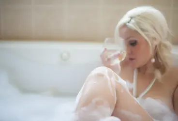
The first one works pretty well IMO. Legs & bubbles placed just to hide the goodies, it's causal but sensual and sexy as well. I wish for a better angle and/or expression on her face with this pose though. Do you have this pose with her looking up at the camera?

The next couple (not counting B&W) don't work for me. The selective focus placed on her hands/knees just isn't doing it for me. Maybe it's the composition...I'm not sure.

The one with the wine bottle is nice, aside from the tap being in the frame. But she looks a tad uncomfortable...her neck is a bit pinched and her shoulder is a bit shrugged. It just doesn't portray the feeling of relaxed comfort, which would really make this one special. Uncomfortable is pretty much the opposite of sexy.

The ones in front of the window just aren't working for me either.
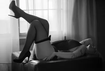
The standing one seems to be a poor pose and the one where she's laying down seems like it could have been a better pose and composition.

I don't want to say that it's not good work...there are plenty of good points that I didn't mention. :)
 
Thanks guys. I am gonna have to say I agree. This was fun to do once but I'll tell you what...it was alot of work! I will stick to what I do know.
 
Love # 5! While u are in LR can u get rid of the knob on the tub in 1 and 5? It will perfect these! Also, not a fan of 6 and 7...this pose almost makes her look pregnant.
 
Thanks guys. I am gonna have to say I agree. This was fun to do once but I'll tell you what...it was alot of work! I will stick to what I do know.
I don't know...I think you're pretty close to really pulling this off...the bathtub, bubble etc. is a good theme, it's just a matter of pulling it all together. I haven't shot this type of stuff, but those who do, often say that it takes a few sessions for model (and photographer for that matter) to find their comfort zones and really start to create magic.
 
The girl in the tub is pretty good. I don't like the eyelashes, they're simply over the top for my taste. The selective focus ones are, for me, the strongest ones for a couple of reasons: The lean more in the "suggest, don't show" direction, and they do a better job of pulling the viewer into the frame -- one feels more as if one is there, rather than looking at a picture (this is more about having elements very much in the foreground than the focus, but whatever).

The white objects on the tub, the knobs or whatever, has been called out already -- clone those bad boys out in all shots!

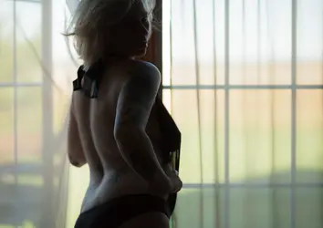
The girl with the ink is more problematic. The first image is extremely unflattering, it appears to be making her waist look wider, not narrower! It's also more "show" and less "hint" with the fabric draped over the nipple, which puts it in an uncomfortable no mans land between showing and teasing -- I got no problem with showing, or teasing, but I prefer an image that's made up its mind.

The last one has some real potential. I'd have had her arch her back, aggressively. Poses like that, oddly enough, look better the more uncomfortable the model is! Still, it's pretty good as-is, mostly emphasizing her strong points.
 
I wouldnt give up, it just takes time. I have never done this but one thing is that your model is attractive. That is a huge plus when doing this type of stuff. Look at this site ---> raw photo design, they do some really good work in their boudoir section. There is some good inspiration there for the future.
 
I wouldnt give up, it just takes time. I have never done this but one thing is that your model is attractive. That is a huge plus when doing this type of stuff. Look at this site ---> raw photo design, they do some really good work in their boudoir section. There is some good inspiration there for the future.

I will check it out. Thanks Brian.
 
while I WANT to love 1&2 I don't. The unbalance bothers me, but the pearls really get to me. The pearls are just plain personal distaste. I think they look cheezy. The pose I like in general, it's the flow of the bathtub line that leads you out of the image that kills me worst of all.

3 I like the out of focus subject and wine glass, but I might have chosen to have maybe the wine glass on the tub in focus while the subject was laid back relaxing. The knee in focus KIND OF doesn't work for me. Again the tub flowing out of the image while her shoulder is cropped off... throwing my balance, as is the lines in the tiles.

4 The tub is still throwing my balance here. I like the out of focus, but where your focus does land is a bit odd. I'd prefer it was her soapy fingers.

5 The tub's leading lines are something you could really use in this pose. This is personal opinion so take it for what it's worth: I'd edit out the diamond tiles. WHY? because they will be/are dated and you want timeless. I'd also edit out the window and faucet

6 doesn't work for me. YOu aren't silhouetting the form, but I can see what little bit of cellulite she has on her arms looking like cottage cheese. The chemise or whatever she has on the front of her combined with the wall or whatever is behind her work very against you here. The black and white doesn't do anything for me either.

8The pose is a great one for boudoir, but the angle is killing this one. THe light fall off on her head and arm hurt, the angle is just bad and the balance is off.
These don't seem to jive with your wedding work I saw.
 

Most reactions

Back
Top Bottom