Boylesque Dancer Isaiah

DanOstergren

TPF Supporters
Supporting Member
Joined
Jun 2, 2013
Messages
4,493
Reaction score
4,141
My friend Isaiah. He does some really amazing boylesque shows in Portland OR. I titled this series "Otherside".

The black poofy thing he is wearing is something I made out of a tutu that I sometimes like to put on the people I photograph. The black and white tones are my own "recipe" of layer masks. Sorry for the watermark, I know it's distracting. After today I will be making it MUCH less prominent.

600927_4853134280709_2086101590_n_zps5a73a07f.jpg


72911_4853122160406_1395188058_n_zps98860bcc.jpg


487796_4853121760396_1496810448_n_zps15bac485.jpg


417973_10200461800762043_1411315477_n_zpsab6e4010.jpg


486662_10200461801402059_1717380247_n_zps8f44ec21.jpg


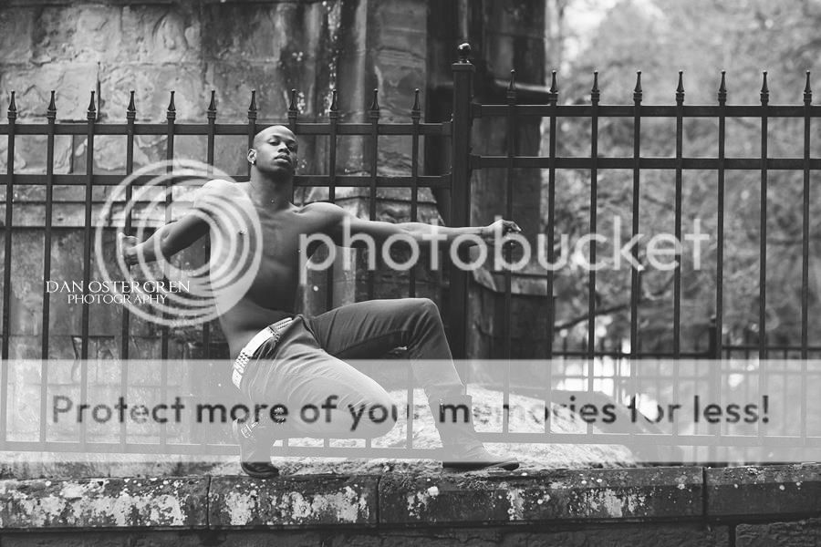
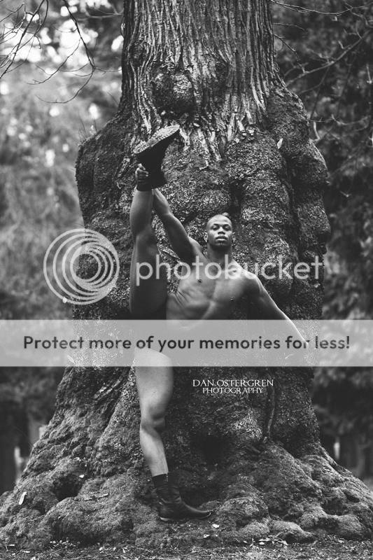
I miss this guy. He's so sweet, and so talented.
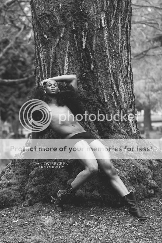
 
Last edited:
These are all good. If I had to pick a favorite I'd say the first because it almost looks like a sculpture.

Again I don't like the watermark as it is too distracting. And the 3rd one down is a bit tilted which may be intentional but either way I should be fixed.
 
The dude is awesome. What a wonderful model.

I quite dislike your b&w recipe, it looks washed out and bland, but that's a matter of taste.

I feel like you're finding great backgrounds, and a great model, and simply sticking them together. This isn't a bad start, but I think (as with the Doll image) you could do better by staring and thinking more, and moving the model around relative to your backgrounds.

In the first one we have a large vertical obelisk in the background. How could you have used that better to create a more graphically powerful and balanced image? Your model could echo that shape, or create a balancing line to that shape, but in either case a little separation would have helped. I think the pose from the second photo could work well placed next to that vertical shape.

The second one has that great doorway shape with the hints of religious overtones, just sort of randomly coming out of his head. Again, I think this is a background shape that could have complemented a pose very effectively.
 
My comments may not be welcome, but to me, these lack the full range of tonality that good B&W shows... interesting subject, a mix of some cliche and some excellent poses. I feel like the lighting is off, or a little flat in the last two. I also like#1.. although #2 is cute... hamming it up like that.

Oh.. and the watermark.. is ... distracting.. lol!
 
These are all good. If I had to pick a favorite I'd say the first because it almost looks like a sculpture.

Again I don't like the watermark as it is too distracting. And the 3rd one down is a bit tilted which may be intentional but either way I should be fixed.
Thanks! I noticed on the third one that the tilt was off a little bit too. I'm on the fence if I like it or if it needs to be corrected.
 
The dude is awesome. What a wonderful model.

I quite dislike your b&w recipe, it looks washed out and bland, but that's a matter of taste.

I feel like you're finding great backgrounds, and a great model, and simply sticking them together. This isn't a bad start, but I think (as with the Doll image) you could do better by staring and thinking more, and moving the model around relative to your backgrounds.

In the first one we have a large vertical obelisk in the background. How could you have used that better to create a more graphically powerful and balanced image? Your model could echo that shape, or create a balancing line to that shape, but in either case a little separation would have helped. I think the pose from the second photo could work well placed next to that vertical shape.

The second one has that great doorway shape with the hints of religious overtones, just sort of randomly coming out of his head. Again, I think this is a background shape that could have complemented a pose very effectively.

Wow, thank you! These are all really great pointers.

If I can ask, how would you do the black and white processing?
 
My comments may not be welcome, but to me, these lack the full range of tonality that good B&W shows... interesting subject, a mix of some cliche and some excellent poses. I feel like the lighting is off, or a little flat in the last two. I also like#1.. although #2 is cute... hamming it up like that.

Oh.. and the watermark.. is ... distracting.. lol!
Your comments are more than welcome and appreciated.

Black and white is still a bit of a new ballgame for me. I feel like I need to do a lot of studying and practice with it.
The lighting on those last two are my least favorite as well, particularly the last one, although the pose and scene in the last one are my favorite.
 
Wow, thank you! These are all really great pointers.

If I can ask, how would you do the black and white processing?

Well, my default processing involves giant pools of inky blackness, a habit I am trying to break myself of ;)

I generally do like the blacks to be darker, even when I am restraining myself.

For these I would go higher contrast, to counterpoint the drama of the man. I might actually got with somewhat selective processing, because I *do* like the sort of grey midtones of the background, I like the idea of this dude inside that banal, tired, last-century, conservative space. This might be a be excessive, but maybe something like this:

$foo2.jpg

I left the contrast/tone curve alone on the background and just darkened the whole thing, and gave him a much punchier contrast curve. He probably looks a bit "composited in" here, which means I took it too far. But, it's a concept, anyways.

You could get much the same effect in-camera by hitting him with a strobe, and letting the background go with ambient light.
 
$guyonrock.jpg

See I am a full black and white white type of guy.
 
Wow, thank you! These are all really great pointers.

If I can ask, how would you do the black and white processing?

Well, my default processing involves giant pools of inky blackness, a habit I am trying to break myself of ;)

I generally do like the blacks to be darker, even when I am restraining myself.

For these I would go higher contrast, to counterpoint the drama of the man. I might actually got with somewhat selective processing, because I *do* like the sort of grey midtones of the background, I like the idea of this dude inside that banal, tired, last-century, conservative space. This might be a be excessive, but maybe something like this:

View attachment 46815

I left the contrast/tone curve alone on the background and just darkened the whole thing, and gave him a much punchier contrast curve. He probably looks a bit "composited in" here, which means I took it too far. But, it's a concept, anyways.

You could get much the same effect in-camera by hitting him with a strobe, and letting the background go with ambient light.

I really like where this is going. And I think I'll try using my speedlite soon to experiment with black and white with strobes. I just really like natural light and try to avoid using my speedlite unless I absolutely have to. Sometimes the artificial light just goes with the mood though.
 

Most reactions

New Topics

Back
Top