Broken Home

jocose

TPF Noob!
Joined
Sep 16, 2005
Messages
3,059
Reaction score
118
Location
dans la pissoir
Website
www.musingsofjocose.com
Can others edit my Photos
Photos NOT OK to edit
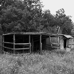
As I got no response on another pic I posted, I shall try again with this one :)

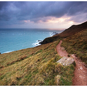
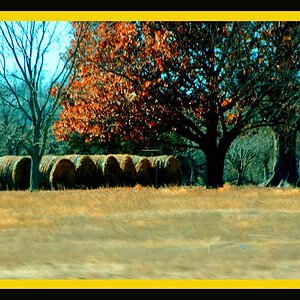
I'm looking mostly for feedback on the adjustments I did. I still trying to learn how to use Elements, and the best way is just to do. Anyway, any and all feedback is welcome.

Thanks!

20051022172552_img_2731.jpg
 
still no comments? Is it that the pic is so good that I have left everyone speechless? Or perhaps that it's so bad that no one really knows what to say?
 
jocose said:
still no comments? Is it that the pic is so good that I have left everyone speechless? Or perhaps that it's so bad that no one really knows what to say?

an optimist! :mrgreen:
 
jocose said:
still no comments? Is it that the pic is so good that I have left everyone speechless? Or perhaps that it's so bad that no one really knows what to say?

And the pessimist... ;)

I'd say something about the picture but I can't see the picture...oh well.
 
Thats kinda cool. The conversion is right on!
 
I agree...optimist, pessimist, and good conversion. But the photo is missing something :???: Or maybe it just feels like it's missing something because of the title?

Maybe if the home was shown tattered in the bg? Maybe the crop is just too tight? Right now, I'm not even sure what I'm looking at. Could even be part of a head stone?
 
Let me get this started off - the overall impression of the image is that there's a blob of white in the middle and then a blob of black surrounding it. A tighter crop would help some of those cracks along with the darkness behind them create negative spaces...
I've taken lots of pictures of houses where the house number is visible and overall it makes the picture confusing because the viewer can't help but wonder what the number stands for. :(

Good try but make a habit of thinking of what your subject is and how the surroundings compliment the message about it. In this case the shattered stone being dense even though there's cracks in it is the subject and it takes up good 60-80% of the image. Remember the rule of thirds, it is best to keep the subject to one third. The background is just a tree and leaves and they don't tell you anything about the subject at all.
 
Thanks all for the input and suggestions. As I'm basically trying to teach myself all about photography, I appreciate all of your suggestions and input.

The stone was the address sign for an apartment complex in St. Louis. I like the idea of having the tattered house in the background, but there really wasn't any. Actually the apartments looked really nice, and the grounds were well maintained...just this stone leaning against the tree.

As far as the conversion, I changed it to B/W. Then I put the stone on its own layer. I lightened, and brought down the dark shadows on it, then I did the opposite on the background (I think. I did it weeks ago).

Anyway, again, I appreciate the input, and I look forward to more comments on future posts!
 

Most reactions

Back
Top