What's new

(C&C) 6 photos- Sunsets, Twilights, and Skyscapes

GreggS

TPF Noob!
Joined
Jun 10, 2012
Messages
94
Reaction score
11
Location
Madison, WI
Can others edit my Photos
Photos OK to edit
Hi. I'm looking for some feedback on some initial sunset and landscape photos I've recently done. Thanks.

1.
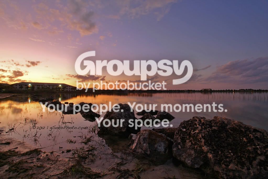
NLVLakeRocksonShorelinewatermarked.jpg


2.
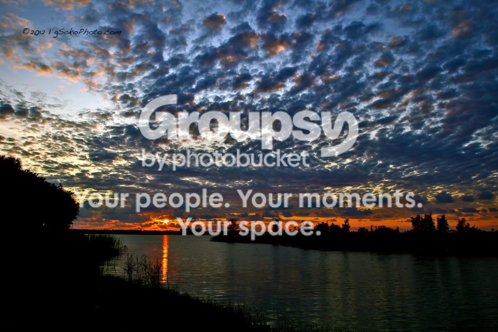
LakeComoSunsetWM.jpg


3.
FierySunsetOverSanibelWM.jpg


4.
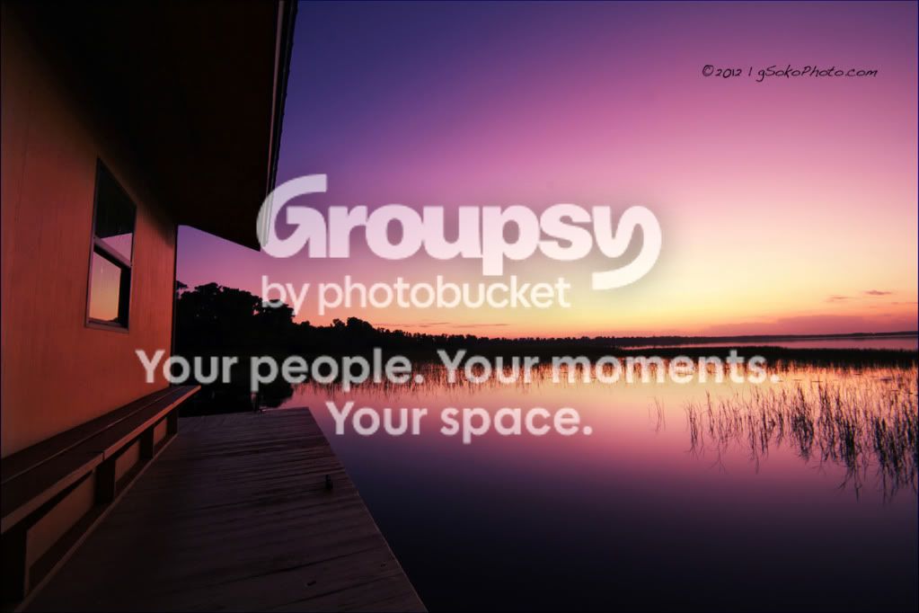
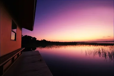
SunsetBoathouseWM.jpg


5.
NLVLakefrontBonfireWM.jpg


6.
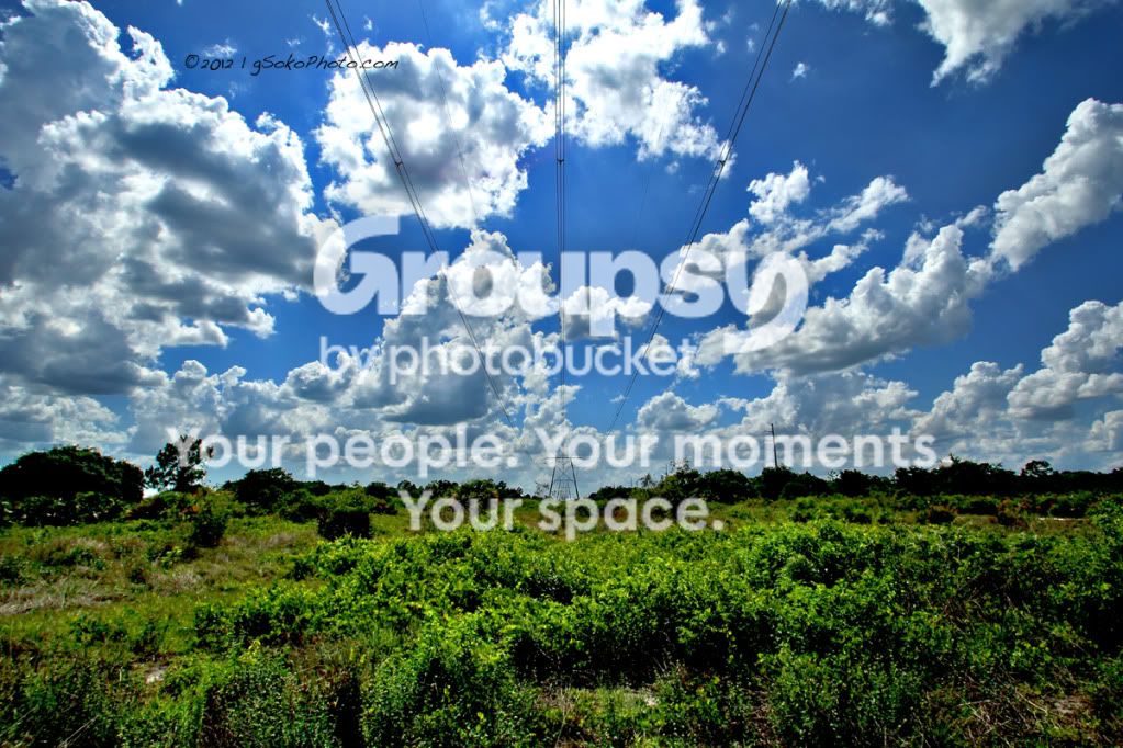
PowerLineSkyscapeWM.jpg
 
They're pretty. the ghosting in 6 is a little distracting in the grass in the foreground. The fainlty lit spots in 3 directly under the sunset should probably be cloned out, IMHO. THe house/hotel area in 1 is a little noisy. 2 seems a little tilted.

Ultimately they're all very pretty, and aside from the few minor quibbles I outlined above, they're very well taken, but none of them really has anything going for it, other than pure beauty. Which it's really hard to make a picture stand out on beauty alone. You can ooh and ahh your friends with pure beauty, but they won't really be considered anything other than pretty pictures if they're just beautiful.

They all have good components of composition, the color is awesome in them, the contrast is dead on. Stunning really, but none of them show anything to keep people interested for more than a second. I look at them once, think 'oh pretty' and then I never need to see those pictures again.

I dont necessarily think every photograph has to tell a story, but if you want them to be anything more than just pretty pictures, there has to be something of interest there. With today's technology, we are flooded daily with stunningly gorgeous images.
 
Hiya :)

#1: Beautiful. Lights on structure are distracting. The first thing I looked at was your watermark.
#2: Horizon seems tilted. If you removed the watermark, that would be a wonderful sky.
#3: Oh look, the sky was made in 2012.
#4: Lovely 2012 evening.
#5: ..meh
#6: Foreground underwhelms, but the sky is great! And look, it's from 2012, too!

Okay sorry. Honestly, 1 and 2 are very nice. The rest don't move me. And ya, I really, really, really hate distracting watermarks.
 
Hiya :)

#1: Beautiful. Lights on structure are distracting. The first thing I looked at was your watermark.
#2: Horizon seems tilted. If you removed the watermark, that would be a wonderful sky.
#3: Oh look, the sky was made in 2012.
#4: Lovely 2012 evening.
#5: ..meh
#6: Foreground underwhelms, but the sky is great! And look, it's from 2012, too!

Okay sorry. Honestly, 1 and 2 are very nice. The rest don't move me. And ya, I really, really, really hate distracting watermarks.


Thanks for the feedback on the actual photos. I appreciate the the non-2012 remarks. For the watermark... I suppose everyone can share their opinion, and mine on watermarks is that they exist for a reason. I'd like to protect my work. Obviously those watermarks on not on my original photos...but when I upload them to a site where one can simply right click, save as, I think a watermark is acceptable, especially since I post in the context of soliciting feedback on quality, and not selling images.
 
Hiya :)

#1: Beautiful. Lights on structure are distracting. The first thing I looked at was your watermark.
#2: Horizon seems tilted. If you removed the watermark, that would be a wonderful sky.
#3: Oh look, the sky was made in 2012.
#4: Lovely 2012 evening.
#5: ..meh
#6: Foreground underwhelms, but the sky is great! And look, it's from 2012, too!

Okay sorry. Honestly, 1 and 2 are very nice. The rest don't move me. And ya, I really, really, really hate distracting watermarks.


Thanks for the feedback on the actual photos. I appreciate the the non-2012 remarks. For the watermark... I suppose everyone can share their opinion, and mine on watermarks is that they exist for a reason. I'd like to protect my work. Obviously those watermarks on not on my original photos...but when I upload them to a site where one can simply right click, save as, I think a watermark is acceptable, especially since I post in the context of soliciting feedback on quality, and not selling images.

sure, its your prerogative, but anybody who would want to steal the photos could quite easily crop or clone out your watermark. Especially since you tend to put it in areas with not much going on in the background. For instance, the watermark in #4 could be cloned out in all of 4 seconds. In fact every one of these could EASILY be cropped or cloned out in less than a minute by anybody with even rudimentary photoshop skills. If you're going to use a watermark for the reasons you stated, then it should probably be in the middle and in a complicated area of the photo that would be difficult to clone out.
 
yeah, was gonna echo. I used to put watermarks dead center so they could not be cropped out. then I realized two things.

1. anyone with half a brain and decent skillz can edit out a watermark, not counting embedded digimark types.

2. My stuff isn't worth stealing anyway and I should be flattered at this point in my journey if anyone wants to "steal" a pic of mine.

lol
 
LOL

**Stolen** (with two moves. a swipe of the stamp and a swipe of the heal. Done and Done) muahahahahaha

...just F'in with ya man...long as you know it's more of a "look at me, this is mine" thing vs. a true security thing. ;-) I'd hate for you to be under any illusions or false sense of security. Nothing is safe on the web these days.


$SunsetBoathouseWM-1.webp
 
fair enough everyone...you got me. however i'm going to delete this thread because it's completely gotten from the topic I posted for which was a C&C of some of my shots. This being my first day on this forum, I would have thought it would have been a little more insightful.
 
Just havin' fun man, it's late night boredom. I'm sure others will chime in with some "insightful" critique for ya. It's not that far off topic anyway, plus the added posts and attention will get you more looks...more looks = more chance at comments and critique.

They are nice pics and I personally don't have any critique for ya...plus I'm just a noob anyway.
 
actually I do have a suggestion. Pic 3 has way too much sky...I think it would look better with say about top 1/3 of the sky cropped off. Nothing really up there to hold interest or add to the photo...like in shot 2 with the cool clouds.

Pic 1, horizon is dead center...it could use a crop imo as well. Rocks are cool with lines into the building, assuming that's your focus...so the extra sky at top doesn't do much for it anyway...won't hurt to crop it.
 
They are amazing!
With the 2nd and 3rd one, I reckon you might be able to get a Grad ND Filter and you can capture some of the foreground. Really depends on what your objective is in those shots.
 
I'll try to explain my feelings when looking at some of these shots.

#1
The first thing I thought was "lovely colours". My eyes went straight to the house and the sun, so that line might have worked (it led my eyes to the sun, without me being aware of it). Good foreground interest. I hate it when people comment on watermarks.. Or rather, signatures. This isn't a watermark, not really. Watermarks cross the entire image. This is merely a signature, making sure the viewer knows who has taken the photo. Anyway, I'd probably crop off some of the sky. The image has lots of weight in the bottom half, and keeping so much sky can make the viewer a little confused on which part of the photo that has the "main interest". I this case, I'd say it's the foreground rocks and the water + the sun. So cropping off 50% of the sky would make the impression on the viewer stronger, and we're not left wondering whether there is something awesome to look at in the sky. As a general rule, placing the horizon in the middle isn't sometimes the best option. It doesn't hurt to take a few exposures that way, but trying to get the horizon off centre as well might prove smart as well. When dealing with perfect reflections, centred horizons often work well, but then "symmetry" is the main element, which it isn't here.
It's good to see that you're using ISO-100, and increasing your shutter speed. That shows that you're aware of your exposure settings, and that you're on a tripod. You could probably get a sharper image if you didn't stop down to f/22, but stopped at f/8, for example (and used a slightly quicker shutter speed), but that's not something important in my opinion. The colours, composition and feel greatly surpasses the need for a sharper image.
So, great work, here. I'd only change the placement of the horizon.

#4
Again, I thought "amazing colours". Simply stunning. I love the exposure, and I love your processing. The transition from yellow to pink to blue/purple is lovely. The water looks fantastic, and I like the reflection in the window. Including part of the house shows that this is a view. I find the non-straight wall a little annoying, I'd straighten that in photoshop.
Looking at your EXIF, I'll just say exactly what I said for #1. #s 1 and 4 are, in my own humble opinion, the best ones of this set. I think they're stunning, though with minor things that I would change.

I get a sense of calm, looking at these two. The horizontal orientation intensifies that feeling. Shooting vertical might give very nice images, but they wouldn't convey the same feeling.

Just my opinion :)
 
Last edited:
fair enough everyone...you got me. however i'm going to delete this thread because it's completely gotten from the topic I posted for which was a C&C of some of my shots. This being my first day on this forum, I would have thought it would have been a little more insightful.

Yeah, I gave you my thoughts earlier and I didn't comment on the watermark until you said you did it for security purposes, to keep it from getting stolen. I don't mind watermarks, or even signatures. I was just commenting, because some people think "watermark, safe for life" and I was just letting you know, that's not really the case, they're really easy to remove.
 
I'll try to explain my feelings when looking at some of these shots.

#1
The first thing I thought was "lovely colours". My eyes went straight to the house and the sun, so that line might have worked (it led my eyes to the sun, without me being aware of it). Good foreground interest. I hate it when people comment on watermarks.. Or rather, signatures. This isn't a watermark, not really. Watermarks cross the entire image. This is merely a signature, making sure the viewer knows who has taken the photo. Anyway, I'd probably crop off some of the sky. The image has lots of weight in the bottom half, and keeping so much sky can make the viewer a little confused on which part of the photo that has the "main interest". I this case, I'd say it's the foreground rocks and the water + the sun. So cropping off 50% of the sky would make the impression on the viewer stronger, and we're not left wondering whether there is something awesome to look at in the sky. As a general rule, placing the horizon in the middle isn't sometimes the best option. It doesn't hurt to take a few exposures that way, but trying to get the horizon off centre as well might prove smart as well. When dealing with perfect reflections, centred horizons often work well, but then "symmetry" is the main element, which it isn't here.
It's good to see that you're using ISO-100, and increasing your shutter speed. That shows that you're aware of your exposure settings, and that you're on a tripod. You could probably get a sharper image if you didn't stop down to f/22, but stopped at f/8, for example (and used a slightly quicker shutter speed), but that's not something important in my opinion. The colours, composition and feel greatly surpasses the need for a sharper image.
So, great work, here. I'd only change the placement of the horizon.

#4
Again, I thought "amazing colours". Simply stunning. I love the exposure, and I love your processing. The transition from yellow to pink to blue/purple is lovely. The water looks fantastic, and I like the reflection in the window. Including part of the house shows that this is a view. I find the non-straight wall a little annoying, I'd straighten that in photoshop.
Looking at your EXIF, I'll just say exactly what I said for #1. #s 1 and 4 are, in my own humble opinion, the best ones of this set. I think they're stunning, though with minor things that I would change.

I get a sense of calm, looking at these two. The horizontal orientation intensifies that feeling. Shooting vertical might give very nice images, but they wouldn't convey the same feeling.

Just my opinion :)

Thanks for your comments, Compaq and ericardo79. Regarding the comments on #1...yes I agree with the horizon. #1 was actually the first shot I ever took of any decent quality after getting into photography, so my compositional-awareness wasn't really there yet. Also with #4...glad to hear good things. I was worried it would come off as over-processed since the colors deviate from the original by a good amount, but I thought those pinks/purples were too much to not keep. Overall, thanks!
 

Create an account or login to comment

You must be a member in order to leave a comment

Create account

Create an account on our community. It's easy!

Log in

Already have an account? Log in here.

Back
Top Bottom