C&C and Vote on which on you like the best, if any, and why?

Which one do you like the best if any?


  • Total voters
    6
  • Poll closed .
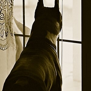
The texture can be recovered by boosting the mid-tone contrast.
Using Lr that can done on the Basic panel with the Clarity slider.

The Basic panel Clarity, Vibrance, and Saturation sliders are collectively known as Presence sliders .
 
I was working off your posted image, and you have the original, so there's a little difference. On my monitor, it looks like you could back off the exposure slightly, lower the shadow slider just a bit and follow KmH's suggestion to adjust the clarity, vibrance and saturation sliders slightly. You can also bring out more of the midtones, by pulling the middle mark on the tone curve down just a bit more.
 
Comes down to an individuals personal preference and I appreciate all of the feedback.
If you're at ease with with multiple opinions, and if every opinion is valid, then why do a poll? Just keep the one you like best and call it a day.
 
Comes down to an individuals personal preference and I appreciate all of the feedback.
If you're at ease with with multiple opinions, and if every opinion is valid, then why do a poll? Just keep the one you like best and call it a day.

Designer,

Mainly as I am an amateur and I appreciate and respect the opinions of others and those more experienced/advanced than I am. I enjoy and appreciate photography but want to be better than I am going forward as I want to create something that is enjoyed by the masses.

Mark
 
"Correcting" the white balance makes this much less-attractive than any of the originals.
I am not sure how it is possible to say that the white balance is out in the first place. Do we actually know that any part of the image was white, rather than ivory, say, or smoke stained or just plain grubby? If we did know that, is that relevant to be the final picture?

I also like version 3 in the opening post.
 
I am not sure how it is possible to say that the white balance is out in the first place.

Considering that 4 out of 4 show a white chip, 3 out of 4 show red and green, and only one shows a blue, I think its a safe bet that the WB is off. That was confirmed with a sampling off several areas using the eye dropper on LR.

While there is nothing wrong with altering the WB or exposure for artistic purposes, it's always wise to know what you're starting with before you make those alterations.
 
My point was that you cannot know that it is a white chip rather than a whitish/cream/dirty/etc chip.
 
My point was that you cannot know that it is a white chip rather than a whitish/cream/dirty/etc chip.

Without benefit of a target card in the scene, all WB settings,are subjective in nature the trick is to look for a neutral value (containing equal RGB values). When dealing with an unknown, I first click on the eye dropper, then click on the value box next to the temperature slider (as if I were going to add a manual value), leave it highlighted and waiting, then move the eye dropper over the image. As I do I watch the readings for RGB, and the values in the box change. When I find a spot where the RGB is equal and as close to the 18% gray value for the color space (118,118,118 for Adobe up to 128, 128, 128 for sRGB) I'm in, I click to set WB. At that point it's a judgement call to adjust if necessary.
 
So, a short rant on color and white balancing images:

My opinion has long been that color-correcting to mathematically-derived formulas results in boring pictures that have nothing but "correct" color as the basis for "quality" of the final picture. It's the picture that counts, not the numerical values that some eyedropper tool spews out. People are tired of predictable, boring, and "accurate" color.

People want color-toning that suits the mood of the picture. If a shot is made in a sidewalk cafe outdoors at twilight, and some 75-watt incandescent lightbulbs from inside the restaurant show up as yellowishly-tinged against cool, blue-toned evening light, we get the idea that we're seeing incandescent light. When the blue hour comes in landscape photography, we expect to see blue-toned stuff. When we shoot a sunrise or sunset, we do NOT "white balance away" the color tones created by that not-noon-in-Washington,D.C., 5,000 degrees Kelvin "daylight". The idea that "daylight" light ought to be 5,000 degrees Kelvin, and not 4,800 or even 5,600, is also absurd. On indoor, poker table shots? What poker world has 5,000 degrees Kelvin lights?
 

Most reactions

Back
Top