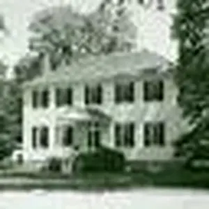
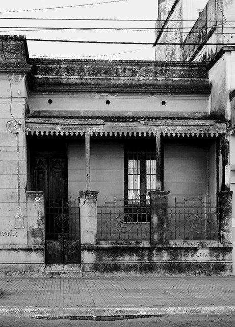
As usual, I think I'm the odd man out. I really like the shot of the house.
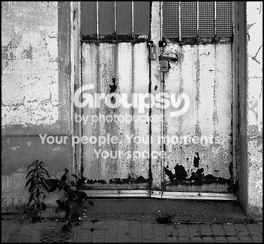
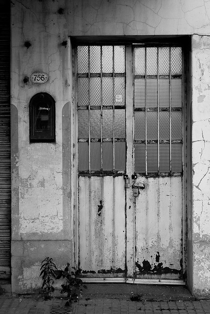
Since I'm the oddball I guess I should really justify why. While the first shot is a simple straightforward and pleasing composition, the house is much more challenging and complex. The way composition plays with the strong horizontal and vertical lines is compelling to me. It's very mechanical in it's own way. Contrasting that though, is the overall uneven aging and the other elements that are more organic, like the coiled, dangleing power line on the left, the streaks in the concrete, even the odd pattern of the metal railing, the grafitti, and the abstract shape of the puddle at the curb.
It wasn't the image that first jumped out at me, but it was the one that stuck.
The processing is a bit harsh and doesn't play up the elements as well as it might, but on the whole I really like the house image.

 and the house is right next to a paint shop!