Navigation
Install the app
How to install the app on iOS
Follow along with the video below to see how to install our site as a web app on your home screen.

Note: This feature currently requires accessing the site using the built-in Safari browser.
More options
You are using an out of date browser. It may not display this or other websites correctly.
You should upgrade or use an alternative browser.
You should upgrade or use an alternative browser.
C&C for portrait
- Thread starter ovvi
- Start date
misstwinklytoes
TPF Noob!
- Joined
- Jun 13, 2010
- Messages
- 2,111
- Reaction score
- 40
- Location
- Texas
- Website
- www.etsy.com
- Can others edit my Photos
- Photos OK to edit
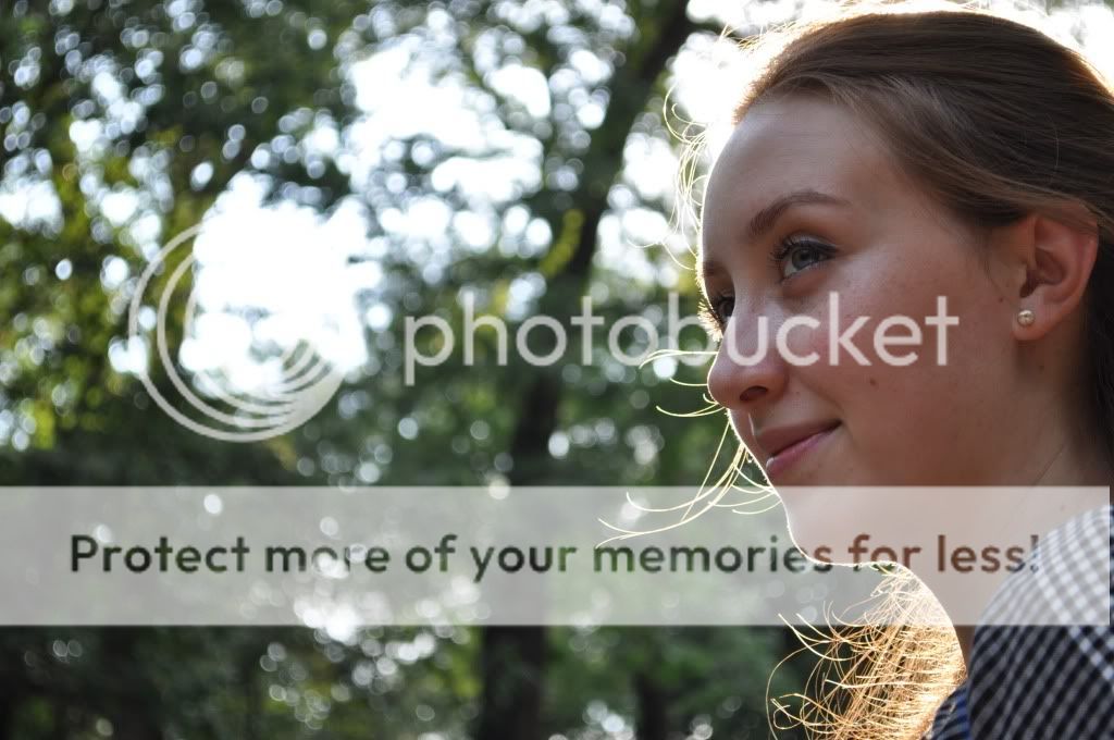
#1, I wish you'd have swiveled around her a little just so that you got more of her, but less bright sun.
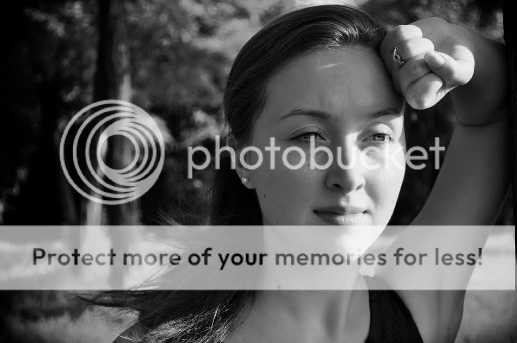
#2 Some shadows are kind of weird, but I like this anyway! It looks like a Reebok or Nike ad or something.
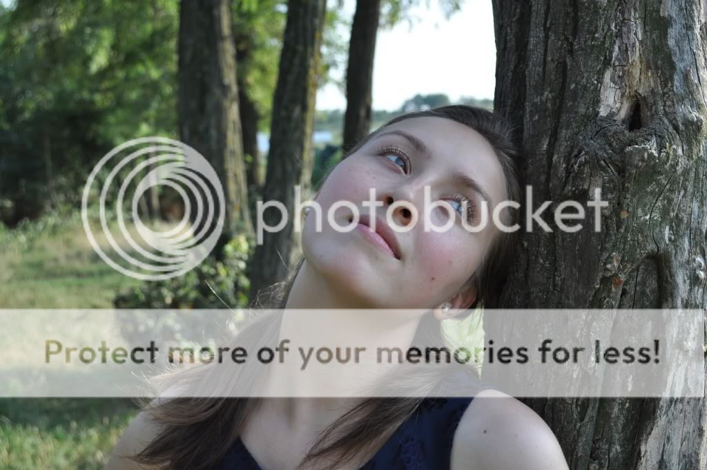
#3 Her chin is a little too far up for my liking and I'd love to have seen some of these vertical.
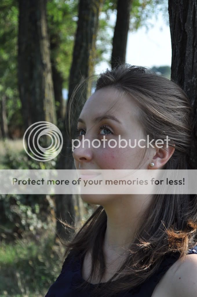
#4 Might just be me but it looks a little soft around the eyes, she's very lovely lady though!
I think these look good over all, but they seem a little ... lifeless? I might try to spruce them up in PP just to make things pop.
I just sharpened her eyes and gave her skin more of a warm tone. EDIT: And I cropped some of the headroom out.
(Lemme know if you want me to take it down. )
)

#2 Some shadows are kind of weird, but I like this anyway! It looks like a Reebok or Nike ad or something.
#3 Her chin is a little too far up for my liking and I'd love to have seen some of these vertical.
#4 Might just be me but it looks a little soft around the eyes, she's very lovely lady though!
I think these look good over all, but they seem a little ... lifeless? I might try to spruce them up in PP just to make things pop.
I just sharpened her eyes and gave her skin more of a warm tone. EDIT: And I cropped some of the headroom out.
(Lemme know if you want me to take it down.

Last edited:
MrBarney
TPF Noob!
- Joined
- Jun 7, 2010
- Messages
- 202
- Reaction score
- 0
- Location
- UK
- Can others edit my Photos
- Photos OK to edit
You could try turning the camera sideways (portrait) more. It tends to work better if your subject is taller than it is wide.
1. has too much of the subject chopped off and doesn't really work for me.
2. Is really very nice. There's a little shadow "V" just to the right of her eye that I might be tempted to clone out so it looks sun-lit.
3. The pose doesn't really work, the subject is centered and not prominent enough, the sky above her is blown out and the white balance looks out (it's a little blue)
4. Also has a blue cast and the same problem with the sky. The pose is much beter and the portrait orientation works better too. There's too much room above her head. Missy's edit is a definite improvement with the warmer tones and the crop of the space removing the problem sky.
Derrel
Mr. Rain Cloud
- Joined
- Jul 23, 2009
- Messages
- 48,225
- Reaction score
- 18,941
- Location
- USA
- Website
- www.pbase.com
- Can others edit my Photos
- Photos OK to edit
You could try turning the camera sideways (portrait) more. It tends to work better if your subject is taller than it is wide.
Hey, that's my quote MrBarney!!!! And yes, totally right!
The woman herself is a total natural beauty,and she seems unafraid to display emotion...the photos are hurt a little bit by that lens and the way it renders the out of focus background...the bokeh is a bit nervous, a bit jittery in the way it renders out of focus foliage...the poses need some work, but the subject in these photos looks good overall. SHot 2 is my favorite, but again, the horizontal framing hurts this photo quite a bit, mainly because the entire left hand side of the frame has that "nervous" bokeh on the out of focus tree and leaves. She is also looking right out of the frame. I can only imagine what the final result would have been if the camera had been swung vertical, or even if the camera had been swung right five or six degrees to eliminate that competing background, which would also have given her some space "to look into".
Despite quibbles with the posing on these, the feeling of genuine-ness of the subject comes through...these may be rough around the edges, but the "feeling" you managed to convey is better than most portrait sessions.
ovvi
TPF Noob!
- Joined
- Jul 13, 2010
- Messages
- 25
- Reaction score
- 0
- Location
- Romania
- Can others edit my Photos
- Photos OK to edit
Thanks to all for posting.
@#1 - I tried to do bokeh, but the lens is limited to 3.5
#2 Is my favorite of all, I will try to experiment more with the camera in the near future, to try some vertical shots or at a degree
#3 it was a different pose, I thought it will give some other effect so I tried it...
#4 misstwinklytoes thanks for you have done there, I admit that with that crop it's better but give me a link to a tutorial or something of what you have done there (the sharpening and more)
misstwinklytoes
TPF Noob!
- Joined
- Jun 13, 2010
- Messages
- 2,111
- Reaction score
- 40
- Location
- Texas
- Website
- www.etsy.com
- Can others edit my Photos
- Photos OK to edit
What software do you use? If you're not looking to invest you can download GIMP and there are TONS of youtube tutorials. 
MrBarney
TPF Noob!
- Joined
- Jun 7, 2010
- Messages
- 202
- Reaction score
- 0
- Location
- UK
- Can others edit my Photos
- Photos OK to edit
I learned something! Sorry if I stole your thunder :mrgreen:Hey, that's my quote MrBarney!!!! And yes, totally right!You could try turning the camera sideways (portrait) more. It tends to work better if your subject is taller than it is wide.
LCARSx32
TPF Noob!
- Joined
- Jun 8, 2010
- Messages
- 641
- Reaction score
- 3
- Location
- Cedar Hill, Missouri, USA
- Website
- www.lcarsx32.com
- Can others edit my Photos
- Photos OK to edit
Not a bad start! Some thoughts, though:
#1: Her face could use some more light. Either a flash bounced off of something or a reflector could help this one.
#2: I agree. This is the best of the bunch. Nice shot.
#3: This may be a personal thing, but when I see someone looking to the right, I like to see more image to the right. So I think this one would have been better with her on the left and more image to the right.
#4: I can't pick out what bugs me about this shot. It just doesn't look natural. Wish I could pinpoint what it was...
Hope to see more!
*EDIT*
I really liked #3 and couldn't let it go. Here's what I would have done in post processing:
-Cropped to remove dead left space, since she's looking right
-Added contrast to bring out the shadows and highlights of the tree and her eyes
-Removed color since I interpret her expression as somewhat somber, like she's reliving an unpleasant memory.

Last edited:
Similar threads
- Replies
- 4
- Views
- 304

