C&C Indoor Shots

Munky

TPF Noob!
Joined
Apr 25, 2009
Messages
356
Reaction score
0
Location
Minneapolis, MN
Website
www.rikogonzalez.com
Can others edit my Photos
Photos OK to edit
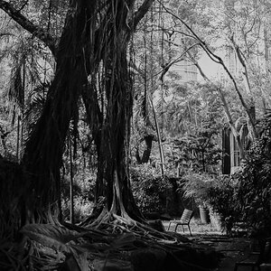
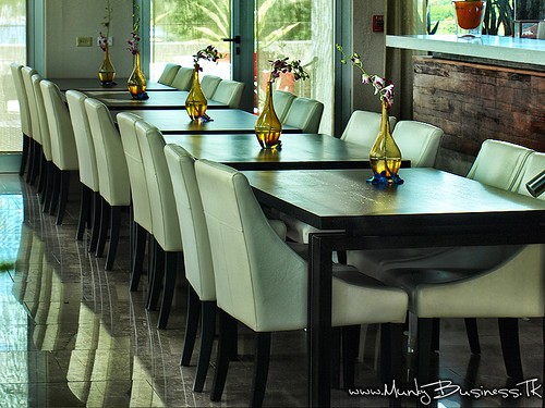
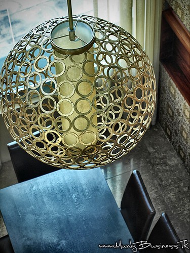
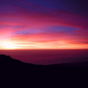
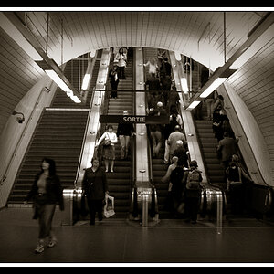
All taken with Olympus E-510 Zuiko 14-42 Natural Light....C&C Please!

1.
4121506801_2d9d385a3f.jpg


2.
4122277628_3bc5c4e05d.jpg


3.
4122278044_2c7858bcaf.jpg
 
For what it's worth:

1. Seems like really hard/harsh light and maybe some sharpening added? Not my favorite pic of the bunch...
2. I like it overall...I wish the flower farthest away from the camera could be seen completely (looks to me like it was cropped/clipped off?). I like the reflection of the chairs
3. I like this one, but maybe for the wrong reason...I think it would be a nice "product" photo for the fixture (maybe without the cropping out of the left border of it?). Overall I think this is my favorite.


You got a reply, I hope it was useful in some way!

Thanks a lot; on this set i was looking for a more "commercial" look; since it was for the Restaurant
So on the First One I Added some Hard Contrast to achieve that look
on the Second the flower is 'full' i should have cropped it less or 'cut' the top of the flower; good eye!
and finally on the third one i went with a less ordinary crop; just 'shaving' the side of the fixture, without cropping much of it; same as the table below it;I have a few more ; but this are my favorites; The owners were pleased with the photos; then again they are 'biased' after all it is their restaurant, that's why i wanted to share them and get C&C here!
Thanks! Again
 
i like them the only one i take issue with is the first pic. I understand you wanted a high contrast on the first pic and I think that is fine....my only issue is the color cast on the pic. It seems as if there is a green color being cast over the pic. It may be the sun hitting the tiles creating the color but the green is a little off putting. I love the composition and i love the red...its just the green cast that is getting to me.
 

Most reactions

Back
Top