Ascentionist
TPF Noob!
- Joined
- Sep 5, 2009
- Messages
- 22
- Reaction score
- 0
- Location
- Golden, CO
- Can others edit my Photos
- Photos OK to edit
Any thoughts?

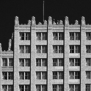
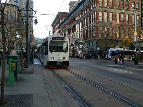
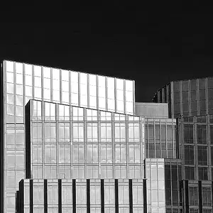
Downtown Denver
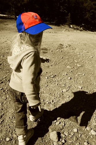
Why can't I be a Cub Scout too?
Downtown Denver
Why can't I be a Cub Scout too?




![[No title]](/data/xfmg/thumbnail/40/40297-5b7d12c4c72c43b505a6f575d338d573.jpg?1734174708)
![[No title]](/data/xfmg/thumbnail/40/40284-f59f6230f0d5b9eacf977f8b0392f087.jpg?1734174694)
![[No title]](/data/xfmg/thumbnail/31/31747-2e2e2bda16938a6a1d5fd6120c558293.jpg?1734160461)
![[No title]](/data/xfmg/thumbnail/31/31746-12607d714ca2713b95250821c881aea9.jpg?1734160460)