rodnunley
TPF Noob!
- Joined
- Sep 7, 2010
- Messages
- 81
- Reaction score
- 1
- Location
- Austin, TX
- Website
- www.flickr.com
- Can others edit my Photos
- Photos OK to edit
Thanks in advance for any feedback you can give. Please let me know what I got right and what I got wrong.
I'm sure we all second guess ourselves and I see what I would like to have done better ... but I wonder if I'm seeing what I need to see.
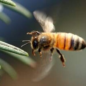
Picture #1

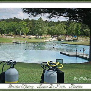
Picture #2

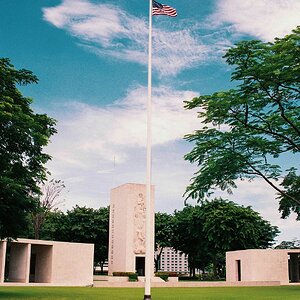
Picture #3

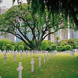
Picture #4

Thanks in advance for any feedback that you can give.
I'm sure we all second guess ourselves and I see what I would like to have done better ... but I wonder if I'm seeing what I need to see.
Picture #1
Picture #2
Picture #3
Picture #4
Thanks in advance for any feedback that you can give.


![[No title]](/data/xfmg/thumbnail/31/31039-558cdb3d311dc67b7a2134527e230488.jpg?1619734582)
![[No title]](/data/xfmg/thumbnail/31/31042-2fcf80c8987688129be89876d12ba006.jpg?1619734584)

![[No title]](/data/xfmg/thumbnail/31/31038-84f0b9d14b7ced20e61bc19a9d4dfcc2.jpg?1619734581)