smakelijk11
TPF Noob!
- Joined
- Feb 28, 2017
- Messages
- 43
- Reaction score
- 32
- Can others edit my Photos
- Photos NOT OK to edit

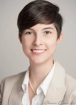
That was the pointYou got her face in focus, but nothing else.

If the intent is to show customers "Suzy Smith, #3 VP in charge of rubber gumboot sales" than it's fine. What's most important is, if there are others, does the light, pose and composition work with them.Is the lighting good?

Well, then it's not really a corporate headshot, is it? You have made this into some kind of artistic expression, but hardly anything that real corporate executives would want. Too bad for the lady.That was the pointYou got her face in focus, but nothing else.
Well, in fairness, if that's what the client requested, it's fine. I agree however, it's an unusual execution for a traditional corporate headshot.Well, then it's not really a corporate headshot, is it? You have made this into some kind of artistic expression, but hardly anything that real corporate executives would want. Too bad for the lady.

’llMy question to you is was your client happy with this photo?
If she was, then my opinion and anyone else's makes no difference.
That aside, I will share my thoughts.
I shoot corporate headshots. I live in Los Angeles so my market may differ than the other two folks that critiqued your shot so take my opinion for what it's worth.
I'm going to disagree quite a bit with the others.
This is a fresh, up-to-date business headshot. It's not your stuffy, business headshot against a blue muslim backdrop. It bucks some of the more traditional rules of portraiture. And keep in mind, a headshot is NOT a portrait. Well, it is technically but it is not meant to serve the same purpose or always follow the same rules.
As far the crop is concerned, it doesn't bother me at all. It doesn't look accidental to me and no one other than another photographer will point this out. In fact, if you take a look at modern headshots you'll find that many don't follow traditional cropping rules.
Now, I always make sure that I leave room at the top in camera just in case this type of crop bothers my client. But I often crop my shots very close to the top like you've done. However, I shoot my headshots, wait for it, in landscape orientation. Wait what?
I do so because most of my clients want their headshots to display online. And when you're dealing with the constraints of an online profile, vertical doesn't work. Further, when a shot is reduce to few hundred pixels across each side, you want the person to take up as much room as possible in that space. This often means cropping tight around the head.
Your use of shallow DOF is a personal, creative touch. Some may not like it but hey, they didn't take the shot. I happen to think you used it well. The front of her face is in focus which is what matters. I personally hate when I see a headshot where the nose is completely OOF. That's fine for a creative portrait but not for a headshot. Again, just my opinion.
The lighting is nice, and flat but still has some slight shadows to add some depth. Flat lighting is pretty popular nowadays with headshots. At least in my market. People seem to think it's hipper or more up to date.
About the only thing I don't like about your shot is the backdrop color. It's not white. It's not gray. Don't get me wrong, I think it really meshes well with the overall photo. But if she wants to use this online, it not going to blend well with a websites true white background. Not a big deal and only relevant if this will be used digitally.
Again, take my opinion for what it's worth... Nothing. What really matters is that your client is happy, that you stay true to your brand and that it results in new customers. All these other technical nits are meaningless.
Sent from my SM-G930F using Tapatalk
Actually, opinions still matter, whether a client likes the product or not.My question to you is was your client happy with this photo? If she was, then my opinion and anyone else's makes no difference.
This is a fresh, up-to-date business headshot.
...modern headshots...
Flat lighting is pretty popular nowadays with headshots. At least in my market. People seem to think it's hipper or more up to date.


She absolutely loves the photo!My question to you is was your client happy with this photo?
If she was, then my opinion and anyone else's makes no difference.
That aside, I will share my thoughts.
I shoot corporate headshots. I live in Los Angeles so my market may differ than the other two folks that critiqued your shot so take my opinion for what it's worth.
I'm going to disagree quite a bit with the others.
This is a fresh, up-to-date business headshot. It's not your stuffy, business headshot against a blue muslim backdrop. It bucks some of the more traditional rules of portraiture. And keep in mind, a headshot is NOT a portrait. Well, it is technically but it is not meant to serve the same purpose or always follow the same rules.
As far the crop is concerned, it doesn't bother me at all. It doesn't look accidental to me and no one other than another photographer will point this out. In fact, if you take a look at modern headshots you'll find that many don't follow traditional cropping rules.
Now, I always make sure that I leave room at the top in camera just in case this type of crop bothers my client. But I often crop my shots very close to the top like you've done. However, I shoot my headshots, wait for it, in landscape orientation. Wait what?
I do so because most of my clients want their headshots to display online. And when you're dealing with the constraints of an online profile, vertical doesn't work. Further, when a shot is reduce to few hundred pixels across each side, you want the person to take up as much room as possible in that space. This often means cropping tight around the head.
Your use of shallow DOF is a personal, creative touch. Some may not like it but hey, they didn't take the shot. I happen to think you used it well. The front of her face is in focus which is what matters. I personally hate when I see a headshot where the nose is completely OOF. That's fine for a creative portrait but not for a headshot. Again, just my opinion.
The lighting is nice, and flat but still has some slight shadows to add some depth. Flat lighting is pretty popular nowadays with headshots. At least in my market. People seem to think it's hipper or more up to date.
About the only thing I don't like about your shot is the backdrop color. It's not white. It's not gray. Don't get me wrong, I think it really meshes well with the overall photo. But if she wants to use this online, it not going to blend well with a websites true white background. Not a big deal and only relevant if this will be used digitally.
Again, take my opinion for what it's worth... Nothing. What really matters is that your client is happy, that you stay true to your brand and that it results in new customers. All these other technical nits are meaningless.
Sent from my SM-G930F using Tapatalk

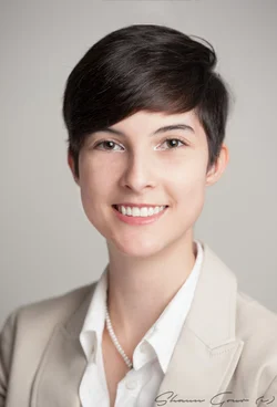
Well, yeah, actually it is. Her ears aren't sharp and the tip of her nose is just barely there.Here is the canvas fixed. I added back some contrast too. I am pleased with it now and I do like the "shallow" depth of field. It's not that shallow actually. I do agree that a lighter background might have worked better.




![[No title]](/data/xfmg/thumbnail/42/42064-76de02ee1a248037351c52c414af9bab.jpg?1734176464)