Bugs81
TPF Noob!
- Joined
- Dec 30, 2009
- Messages
- 67
- Reaction score
- 0
- Location
- NYC
- Can others edit my Photos
- Photos OK to edit
Good morning all-
I'm a relatively new photographer and have taken college courses a few years ago looking to get back in the swing of things.
Figured I would upload a few recent shots and see if I can get a little C&C.
Thanks in advance, looking forward to learning a lot on the site!
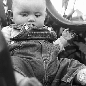
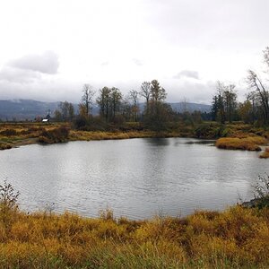
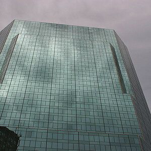
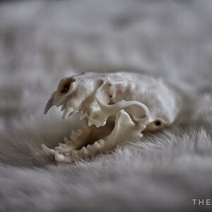
#1

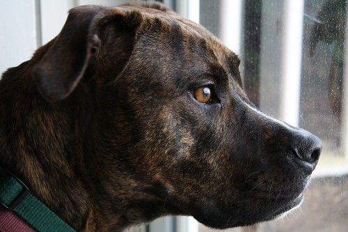
#2
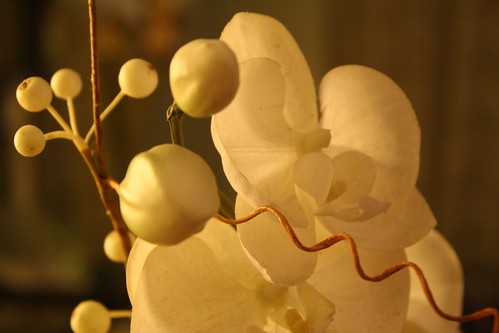
#3

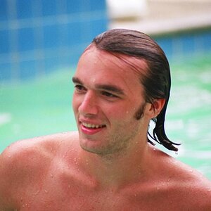
#4

#5
I'm a relatively new photographer and have taken college courses a few years ago looking to get back in the swing of things.
Figured I would upload a few recent shots and see if I can get a little C&C.
Thanks in advance, looking forward to learning a lot on the site!
#1
#2
#3
#4
#5


![[No title]](/data/xfmg/thumbnail/38/38261-db20f6f92ee8f0d4c5cf1536e308638b.jpg?1619738546)


![[No title]](/data/xfmg/thumbnail/42/42066-badd1780980376f04f261f985a608adf.jpg?1619739998)