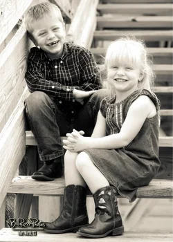
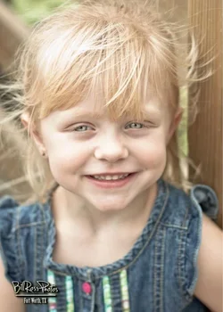
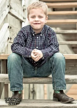
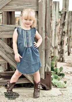
The framing on #1 and #3 is a wee bit too tight...the kids need just a little bit "more room" to "move around in", visually. Shot #1 is a very FUN, and natural-looking shot...the kids seem to be having real FUN!, you know??? The middle shot of the girl seems a tiny bit over-exposed on the highlights, and she looks a bit heavy-lidded on her eyes...but I realize part of that is the way that effect or pre-set makes the image highlights look. Overall, I am sure the parents will like these pictures. The use of the staircase as background in all three shots works very well...and the lumber color coordinates quite well with the hair color of the kids AND it has a rustic quality that suits their western-style clothes quite well. Overall, pretty good portraiture.






![[No title]](/data/xfmg/thumbnail/39/39439-d0a6beaaf39993860b74ccbd81fdd122.jpg?1734173529)

![[No title]](/data/xfmg/thumbnail/35/35948-700e0d840da0ca73727b1bd6d99b4142.jpg?1734167751)