- Joined
- Mar 18, 2013
- Messages
- 16,159
- Reaction score
- 17,016
- Location
- Boston
- Can others edit my Photos
- Photos OK to edit
- Moderator 🛠️
- #1
The red light in the lighthouse was overpowering this in color so I converted it to b&w. This is not something I have a lot of experience with. The shot was pretty dark to begin with and I somehow hit a wrong button while shooting in the dark and ended up with jpeg only which really limited my editing options. So what do you think? Too dark or intriguingly dark? Interesting or not? Suggestions for improvement? Bin it?
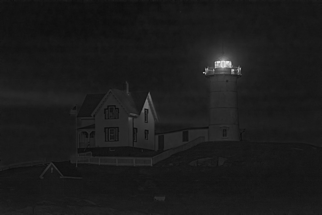 Nubble4 by SharonCat..., on Flickr
Nubble4 by SharonCat..., on Flickr")
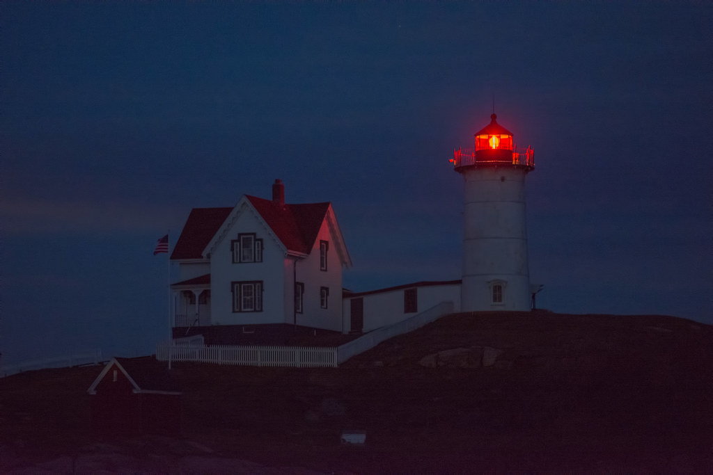 Nubble color
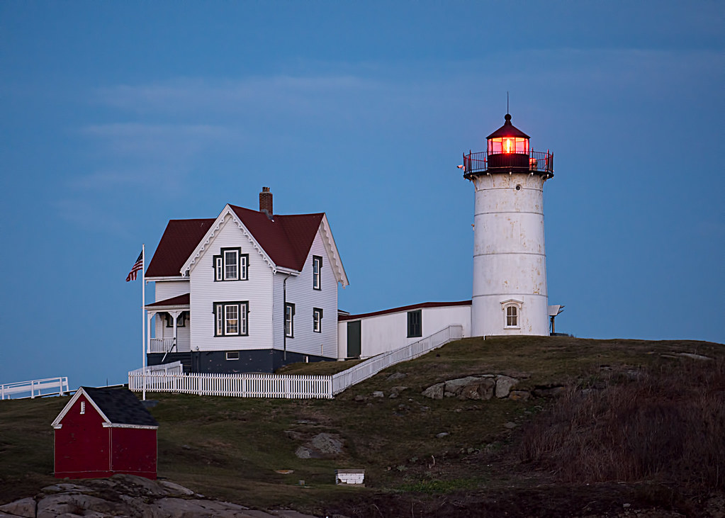 Nubble1


![[No title]](/data/xfmg/thumbnail/35/35263-86f580cf5d28d23109a45984030a79ad.jpg?1734166920)