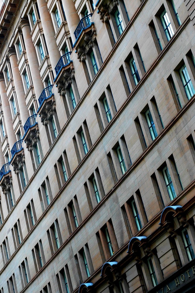
The first one didnt catch my eye. Nothing interesting i guess. Although the second one was very interesting, as i was scrolling down the building got bigger and fatter. kinda trippy lol. the third picture has that same kind of effect too.
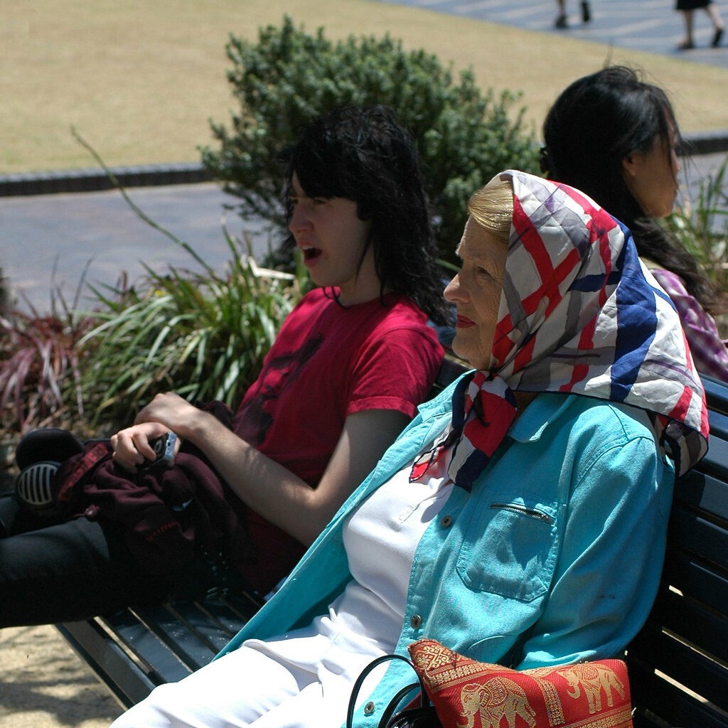
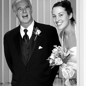
I really like 2 and 3. Good use of those diagonal lines in 3 to create a great texture. The guy in the back is really distracting in 1, but I love the colors and lighting of the woman.
#1 - I think you found out that shooting when the sun is high will give you lots of hard shadows and harsh light. It's a challenge for sure. Many will shoot at people or subjects when they're in shade as the light is still good but not so harsh. Watch your backgrounds...the guy in the red t-shirt looks like the bush is part of his hair.
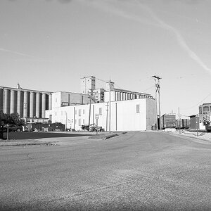
#2 - Not much to say about this one.
#3 - I like the colors in this shot. Would have been nice to see the whole name of the building.
#1 - The guy looks like he has a bush growing out of his head. The woman would be an interesting model alone, with her colors (scarf/clothes...), which are really strong. I do really like the juxtaposition of young/funky v. older/traditional, which I assume you were trying to display, but the composition isn't working for me - the photo has too many things in it that are distracting or just don't enhance the shot, like the woman behind them and the landscaping. Old and Young on a park bench by themselves in B&W in front of something simple (a wall, a blurred building, a fence) would highlight the differences between them better, for example. And lastly, her pants are suffering from the too-bright sun. Try early morning or early evening for better lighting.
#2 - I like this one. Nice sky.
#3 - This one is ok, but not as appealing to me as the second one. It looks like the building has some nice architectural features I might try to get closer to - the building has potential if you are going back to that location. Also, this one seems a bit softer than the second one, but perhaps that's just me.


![[No title]](/data/xfmg/thumbnail/35/35262-02f8eba4a2a92dbae0b55547bba80b4f.jpg?1619736968)


![[No title]](/data/xfmg/thumbnail/32/32698-38e2346942223e17b43fb958f66064c1.jpg?1619735601)
![[No title]](/data/xfmg/thumbnail/35/35264-5ade32b7036391926536661aeb7491c3.jpg?1619736969)