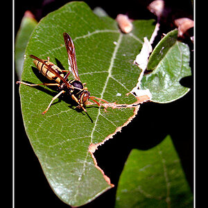
I like the first one. Looks good. Composition looks good.
The second one the blue throws me off. Something I learned from these guys is not to have the background distract the subject. In this case the blue sweater is what my eye is drawn to. and it cuts off you subjects head.
Last one I don't like. There seems to be no composition and for the most part black except the strip of the sunlight. No picture there. In my opinion. Doesn't work for me.
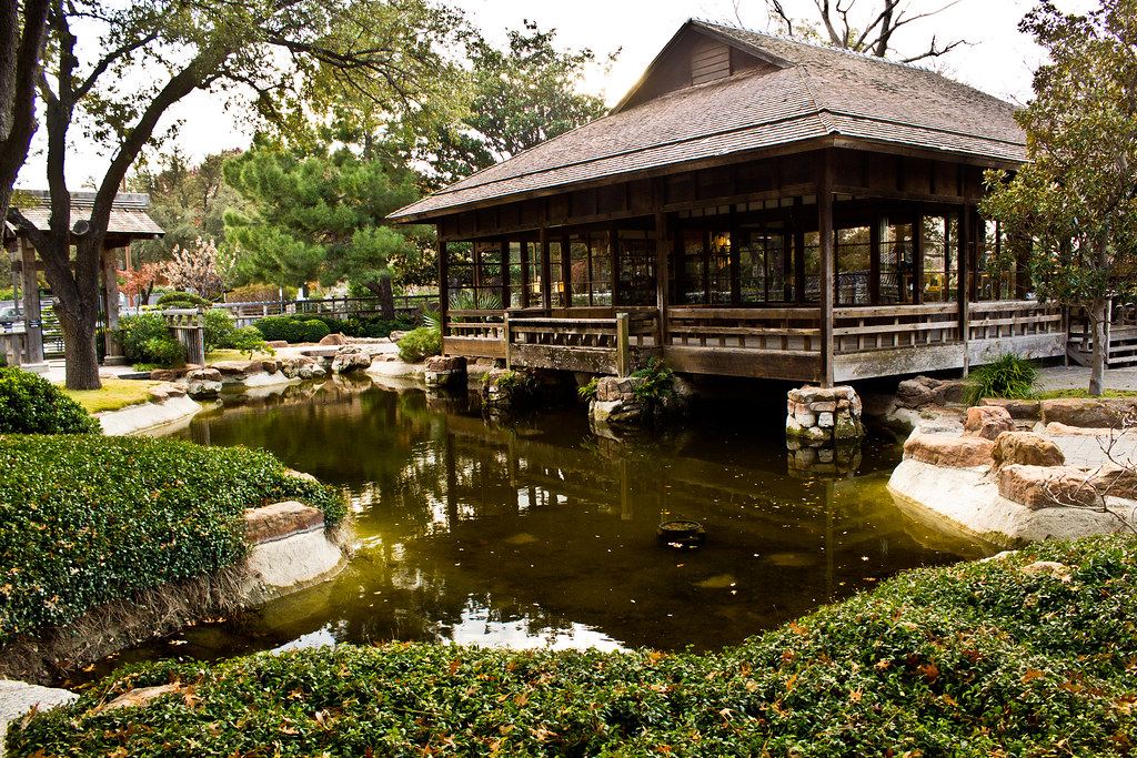
#1 is the best compositionally IMO. It has a main subject, and even though there is a lot going on the background and on the left side, I believe it goes well together to make a complete image. The sky is blown out.
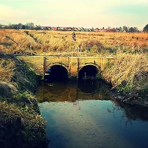
#2 to me is just a snapshot to me personally. I don't see a clear main subject, a very distracting background, and don't know why the guy with the blue sweater is in there.
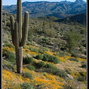
#3 Needs a clear main subject








![[No title]](/data/xfmg/thumbnail/31/31011-439c1242fe08cf6b54f32bf06523a567.jpg?1734159083)