Lets start with #1....I think its a tough shot because of all of the utiltiy lines. Simply you need to either work around the environment or do an awful lot of PS to get the lines out at a minium. Colors look good, sky nice and blue, maybe a bit to dak as the bench and the coat seem to be one in the same. If the guy was looking off into a distance rather than a fence it would also be improved.
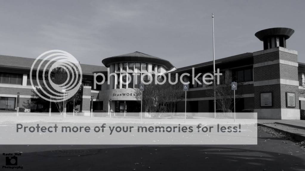
For #2, the use of a paking lot for a foreground in this shot is not good. Rather than trying to get the entire building in, you might want to get serious with the atrium front entry which has really nice dimension and really nice architecture and focus on that aspect of the building. Don't feel because you have a wide angle lens that you must fit the entire subject into the entire frame when you have a situation like this.
In addtion, you appear to be lower than you would want to be. If you did want to capture the entire building, get a bit higher. A ladder or stand on your vehicle and get yourself a bit higher to get that parking lot foreground diminished or at least less prominent. Then PS the ADA parking signs out.
I'd go back when the landscape is in bloom and give it another go.


![[No title]](/data/xfmg/thumbnail/37/37642-b84a3ab0bc05ccd30092514e185e7c01.jpg?1734170765)


